When it comes to analyzing student performance data, educators and administrators need clear, actionable insights. Excel is one of the most powerful and accessible tools for data analysis, and dashboards built in Excel can help visualize complex information in an easy-to-understand format.
In this blog, we’ll explore the Student Performance – Exploratory Data Analysis (EDA) Dashboard, created by Ankit Srivastava, Data Analytics Trainer at SlideScope Institute. Ankit is the creator of the highly rated Beginner to Advanced MS Excel Course on Udemy, where he has trained thousands of students worldwide.
This dashboard is a fantastic example for anyone wanting to learn how to apply Excel skills to real-world problems. Let’s dive into the different sections and see what insights it provides.
Get Dataset Here: Student-performance-records-dataset-for-data-analysis-and-machine-learning-projects
1. Key Highlights (KPIs at the Top)
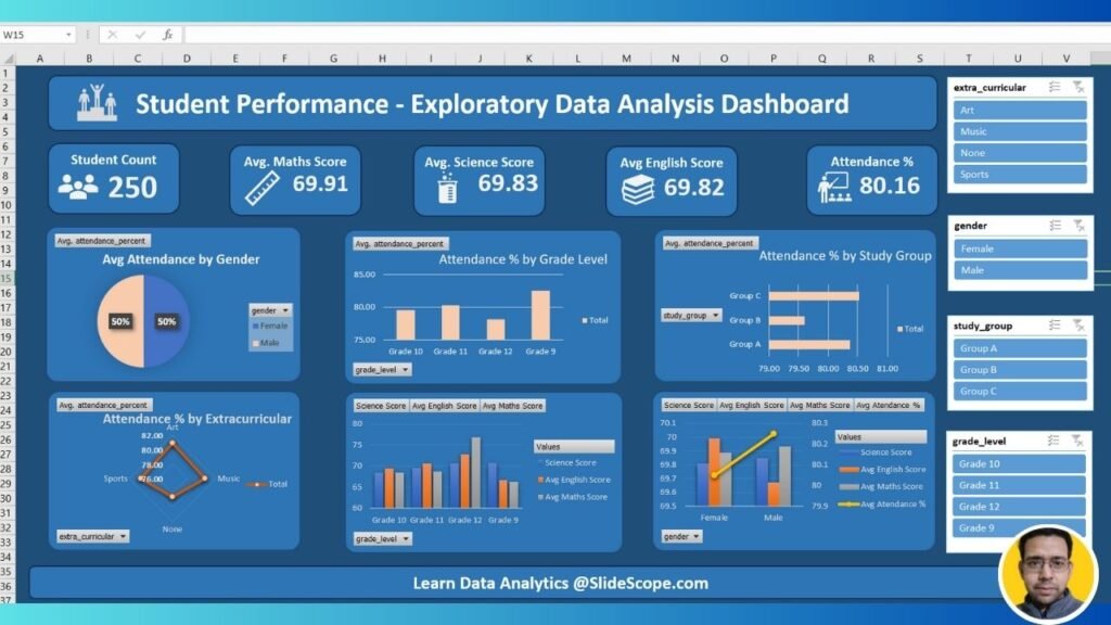
The top section of the dashboard shows high-level KPIs that summarize student performance at a glance:
- Student Count (250): The dataset includes 250 students.
- Average Maths Score (69.91): Overall average performance in Mathematics.
- Average Science Score (69.83): Science scores are consistent with Maths.
- Average English Score (69.82): English performance is nearly identical to Science and Maths.
- Attendance % (80.16): Average attendance across all students is 80%.
👉 These KPIs immediately tell us that the students are performing around the 70% mark in academics, while attendance is slightly lower at 80%. For teachers, this could mean that improving attendance might boost overall academic performance.
2. Attendance by Gender
A pie chart shows that male and female students have equal average attendance (50% each). This suggests that attendance-related issues are not gender-biased and are consistent across both groups.
👉 For educators, this is important because interventions should be directed equally rather than focusing on one gender.
3. Attendance by Grade Level
The bar chart for Attendance % by Grade Level highlights differences among classes:
- Grade 9 students have the highest attendance (above 85%).
- Grade 11 and 12 students show lower attendance percentages compared to Grade 10 and 9.
👉 This tells us that as students move to higher grades, attendance tends to decline—possibly due to increased workload, external coaching, or exam stress.
4. Attendance by Study Group
Another bar chart shows attendance percentage by study groups (A, B, and C):
- Group A has slightly higher attendance compared to Groups B and C.
- Differences are small but meaningful for targeted interventions.
👉 Teachers can analyze group-level dynamics to see why certain groups attend more regularly.
5. Attendance by Extracurricular Activities
A radar chart shows attendance levels for students involved in extracurriculars:
- Art (82%) has the highest average attendance.
- Music (78%) and Sports (76%) are slightly lower.
- Students with no extracurriculars tend to have lower attendance.
👉 This suggests that students engaged in extracurricular activities are more disciplined and attend school more regularly. Schools can use this insight to encourage participation in such programs.
6. Academic Scores by Grade
The grouped bar chart shows the comparison of Maths, Science, and English scores by grade level:
- Grade 9 and 10 students perform better on average compared to Grade 11 and 12.
- Scores across subjects remain consistent, with no subject lagging behind significantly.
👉 This gives educators a way to identify which grades need more academic support.
7. Academic Scores by Gender
The combined bar and line chart shows:
- Male and female students perform almost equally across Maths, Science, and English.
- Attendance % (yellow line) is also consistent across genders.
👉 This means academic performance differences are not gender-specific, and interventions can be applied equally.
Why This Dashboard is Powerful for Beginners
For beginners in Excel and data analysis, this dashboard demonstrates:
- Use of KPIs → Quick summary of important metrics.
- Pie, Bar, and Radar Charts → Different chart types to visualize attendance and scores.
- Filters (Slicers) → Interactive analysis by extracurricular activity, gender, study group, and grade.
- Comparisons Across Categories → Ability to compare performance by gender, grade, and group.
By studying and recreating dashboards like this, students can learn how to present raw data in a structured and meaningful way.
Learn Excel From Ankit Srivastava
This dashboard was created by Ankit Srivastava, a Data Analytics Trainer with years of experience in Excel, Power BI, and Business Intelligence. Ankit has helped thousands of learners and professionals upgrade their skills and use data to make better decisions.
🎓 Enroll in Ankit’s Beginner to Advanced MS Excel Course on Udemy here:
👉 Click to Join the Course
💡 In this course, you’ll learn:
- Excel basics to advanced functions.
- Data cleaning and preparation.
- Charts, pivot tables, and dashboards.
- Hands-on projects to apply what you learn.
Want Personalized Learning?
Ankit also offers live, interactive Excel and Data Analytics classes, where you can:
- Work on real datasets.
- Build dashboards step by step.
- Get one-on-one guidance.
📩 Contact Ankit today if you’re interested in custom training sessions for yourself or your organization.
Final Thoughts
This Student Performance EDA Dashboard in Excel is a great starting point for anyone learning how to analyze and visualize educational data. It shows how Excel can be used not just for calculations but also for meaningful insights into attendance, grades, and extracurricular impact.
Whether you’re a beginner or looking to sharpen your Excel skills, Ankit’s Udemy course and live classes will give you the confidence to build powerful dashboards like this one.
👉 Take the next step in your Excel journey—enroll today and start creating impactful dashboards!
