
Creating maps in Tableau becomes much more interesting when we move beyond simple points, states, and countries and start working with geospatial data. In this project, we will use an official Government of India shapefile containing the river network of India and use Tableau to turn that geographic data into an interactive river map.
The dataset used for this project is the Shapefile of Rivers available through the Government of India’s Open Government Data (OGD) Platform. It is provided by the Department of Water Resources, River Development & Ganga Rejuvenation, Ministry of Jal Shakti, and National Water Informatics Centre. According to the official resource page, the dataset contains information on major and minor rivers across the entire country and represents the rivers as a line layer. (Data.gov.in)
Official Shapefile of Rivers – data.gov.in
In this tutorial, I will explain how I used that data to create the Major Rivers of India map shown above using Tableau.
Understanding the River Shapefile
Before opening Tableau, it is important to understand what we have actually downloaded.
When you download the official river dataset, you don’t receive a single Excel or CSV file. Instead, you receive a collection of files that together form an ESRI Shapefile.
In my downloaded folder, the files included:
Rivers.shpRivers.dbfRivers.shxRivers.prjRivers.sbnRivers.sbxRivers.cpgRivers.shp.xml
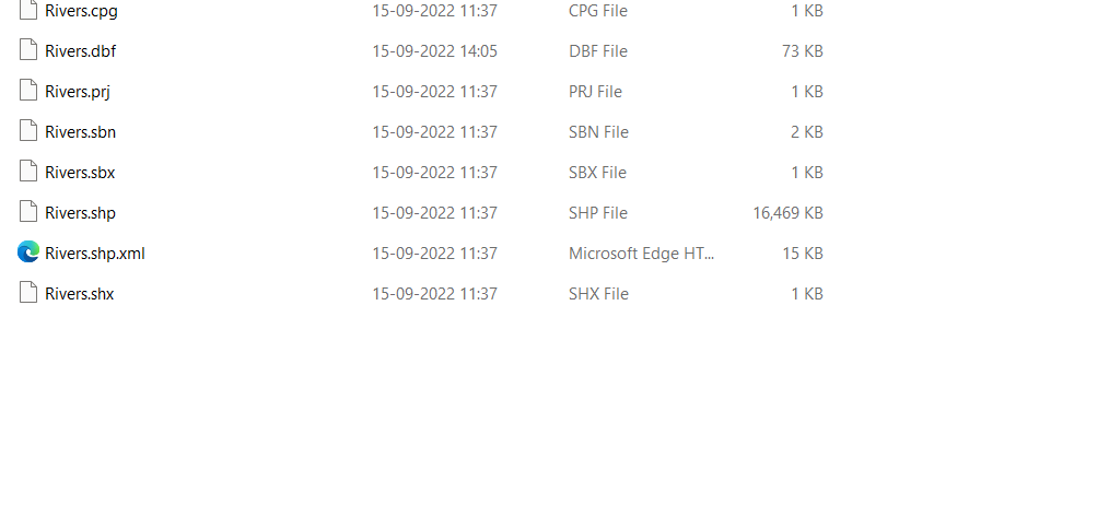
This is important because these files are not separate datasets. They are different components of the same geographic dataset and should remain together in the same folder.
The .shp file contains the actual geometric shape of the rivers — in this case, line geometries representing river paths. The .dbf file stores the attribute information associated with those shapes, such as river names and other descriptive fields. The .shx file acts as an index connecting the geometry information efficiently, while .prj contains the coordinate reference system information needed to correctly position the geographic data. The .sbn and .sbx files provide spatial indexing, and .cpg helps define character encoding. The XML file contains metadata associated with the shapefile. The Government of India’s resource page specifically notes that the ZIP contains these formats and that the river dataset is a line layer covering major and minor rivers across the country. (Data.gov.in)
So, don’t open the .dbf and .shp separately or delete the smaller files. Think of the entire collection as one dataset. Tableau reads the .shp file and uses the supporting files automatically.
Step 1: Download the Official River Data
Start by visiting the official Government of India data portal.
Download the Shapefile of Rivers
The resource is listed under the Boundaries of Water Resources Projects catalog. It was published on September 28, 2022, and is classified as a High Value Dataset. The official description states that the dataset contains information about all major and minor rivers of the country. (Data.gov.in)
Download the ZIP file and extract it.
After extraction, you should see the collection of Rivers.* files.
Keep everything together.
Step 2: Open Tableau
Open Tableau Desktop.
From the start screen, look at the Connect section.
Under To a File, Tableau provides an option called:
Spatial file
This is the option we need.
A common mistake here is to search for something called “Shapefile” or “Shape File”. Tableau’s connector is actually called Spatial file.
Click:
Connect → Spatial file
Step 3: Select Rivers.shp
Navigate to the folder where you extracted the river dataset.
You will see files such as:
Rivers.shpRivers.dbfRivers.shxRivers.prj
Select:
Rivers.shp
and click Open.
You don’t need to manually select the .dbf, .shx, or .prj files.
Tableau reads the shapefile and its supporting components automatically.
Once the connection is established, Tableau will display the fields available in the dataset.
Step 4: Understand the Fields
This is where the dataset becomes particularly interesting.
In my Tableau connection, the data contained fields such as:
- Ba Name
- Bacode
- Major Trib
- Origin
- Rilcode
- Rivname
- Sub Basin
- Geometry
- Object
- shape Leng
The most important field for our map is:
Geometry
This is the geographic field containing the actual river shapes.
Unlike a normal Excel dataset containing latitude and longitude, this dataset already contains the geographic geometry of the rivers.
That means we don’t have to manually create coordinates for every river.
The other important field is:
Rivname
This contains the river name associated with the geographic feature.
This is what allows us to identify rivers such as Ganga, Yamuna, Godavari, Brahmaputra and other river features in the dataset.
Step 5: Create the River Map
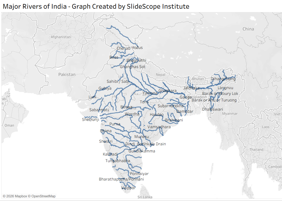
After connecting the dataset, create a new worksheet.
Look at the Data pane on the left.
You should see:
Geometry
with the geographic globe icon.
Double-click Geometry.
Tableau recognizes the geographic geometry and creates a map.
You should now see the river network displayed geographically.
This is the key advantage of using a shapefile.
We are not plotting individual latitude and longitude points.
We are plotting the actual line geometry of the rivers.
Step 6: Use Rivname to Separate the Rivers
Now we want Tableau to understand that the different geographic features represent different rivers.
Drag:
Rivname
to:
Marks → Detail
This gives Tableau additional dimensional information about the geographic features.
You can now work with individual river records rather than treating the entire river layer as one undifferentiated object.
Step 7: Add River Names
To make the map easier to understand, drag:
Rivname
to:
Marks → Label
Tableau will then display the river names directly on the map.
This is how the map begins to transform from a simple geographic visualization into an informative Major Rivers of India map.
However, there is an important practical issue.
The official dataset contains both major and minor rivers. Therefore, displaying every available river name can make the map extremely crowded.
That is why the next step is important.
Step 8: Filter the River Data
The dataset contains a field called:
Major Trib
This can be useful when separating major rivers from tributaries or other river classifications.
Depending on the values contained in your particular dataset, you can use this field as a filter.
Drag:
Major Trib
to the Filters shelf.
Then examine the available values.
Select the category that represents the major river features you want to display.
This allows you to move from a dense national river network toward a cleaner visualization focusing on the principal rivers.
Step 9: Improve the Map
Once the geographic layer is working, we can improve the presentation.
Go to:
Marks → Color
and choose an appropriate color for the river lines.
Then use:
Size
to adjust the thickness of the river lines.
A slightly thicker line can make the river network much easier to see against the background map.
You can also adjust the map background through:
Map → Background Layers
Depending on the version of Tableau and map configuration, you can control elements such as:
- Country borders
- State/province boundaries
- Place names
- Coastlines
- Map style
For an educational map, I prefer a relatively light background because it allows the river network to remain the main visual element.
Step 10: Understanding the Final Visualization
The final visualization gives us a geographic overview of India’s river network.
In the map, we can identify river systems across northern, eastern, western and southern India.
The northern portion includes rivers associated with the Himalayan and Ganga river systems, while the central and southern portions show major peninsular river networks.
The map also makes it easier to understand something that is difficult to communicate through a conventional table:
Rivers are geographic features, not simply rows of data.
For example, a spreadsheet can tell us that a river is named Ganga. But a map can show us where the river flows, how its path relates to surrounding regions, and how different rivers and tributaries are distributed across the country.
That is the real value of geospatial visualization.
Why Use Tableau for This Project?
Tableau is particularly useful here because it allows us to combine geographic data with interactive analytics.
Instead of producing a static image, we can create filters, tooltips and interactive views.
For example, when the user moves the mouse over a river, we can display information such as:
River Name: Ganga
Basin: Ganga
Type: Major River
Origin: Relevant source information
Similarly, we can create filters based on:
- River name
- Basin
- Sub-basin
- Major/tributary classification
- Origin
This turns a simple river map into an interactive geographic analysis dashboard.
Adding Tooltips
One of the easiest improvements is customizing the tooltip.
Go to:
Marks → Tooltip
and create a meaningful tooltip using the available fields.
For example:
River: <Rivname>
Basin: <Ba Name>
Sub Basin: <Sub Basin>
Origin: <Origin>
Now, when a user moves the mouse over a river, Tableau can provide additional information without cluttering the map with permanent labels.
This is particularly useful when there are many rivers close to one another.
What Can We Learn From the Map?
The visualization provides more than just a list of Indian rivers.
It gives us a geographic perspective of India’s drainage network.
We can visually explore how rivers are distributed across the country and how river networks differ between the Himalayan region and the Peninsular region.
The map also demonstrates why spatial data is different from traditional tabular data.
If we had only an Excel sheet containing river names, it would be difficult to understand the actual geographic relationship between those rivers.
The shapefile solves that problem by storing the actual geometry.
And Tableau allows us to turn that geometry into an interactive visualization.
A Useful Tableau Project for Beginners
If you are learning Tableau, this is actually a very good project because it introduces an important area that many beginners don’t explore deeply:
Spatial Analytics.
Most beginner Tableau projects focus on:
- Sales
- Profit
- Customers
- Orders
- Revenue
- Time-series analysis
Those are useful, but geographic datasets introduce another dimension of analytics.
With this river dataset, you learn how to:
- Download government open data
- Understand spatial files
- Connect a shapefile to Tableau
- Work with geographic geometry
- Use geographic dimensions
- Create map layers
- Add labels
- Create filters
- Customize tooltips
- Build an interactive geographic visualization
That makes this more than just a map-making exercise.
Future Scope
We can take this project considerably further.
For example, we could combine the river shapefile with an India states shapefile.
Then we could create multiple map layers:
Layer 1: India state boundaries
Layer 2: Major rivers
Layer 3: River labels
We could also introduce dams, reservoirs and other water-resource datasets.
The Government of India’s same catalog includes other geographic resources covering water-resource features such as reservoirs, dams, barrages, powerhouses and other infrastructure. (Data.gov.in)
That opens the possibility of creating a much larger India Water Resources Dashboard in Tableau.
For example:
India Water Resources
→ Rivers
→ River Basins
→ Dams
→ Reservoirs
→ Barrages
→ States
→ Sub-basins
This would demonstrate how multiple spatial datasets can be combined to create a complete geographic analytics project.
Conclusion
The Major Rivers of India visualization is a great example of how government open data can be transformed into an interactive Tableau project.
The most important lesson here is that geographic data doesn’t always come in the form of latitude and longitude columns. In this project, the river paths are already stored as line geometries inside an ESRI Shapefile.
The Government of India’s official dataset provides the river network, while Tableau provides the tools required to visualize and interact with that geographic information. The official resource describes the dataset as containing major and minor rivers across the country and identifies it as a line layer. (Data.gov.in)
Once we understand how the .shp, .dbf, .shx, .prj and other supporting files work together, connecting the dataset becomes straightforward.
From there, Geometry gives us the actual river paths, while fields such as Rivname, Ba Name, Sub Basin, Origin and Major Trib allow us to add analytical context.
And that is the real purpose of this project: not simply to create a beautiful map, but to demonstrate how government geospatial data can be converted into an interactive analytical story using Tableau.
The next step could be to combine this river network with India’s state boundaries, river basins, dams and reservoirs and build a complete India Water Resources Dashboard.