
Data visualization becomes much more meaningful when it is used to transform raw statistics into a story that is easy to understand. In this tutorial, I have created a Rohit Sharma Cricket Performance Dashboard in Microsoft Power BI, using cricket statistics collected and consolidated from various publicly available sources.
The objective of this project was not simply to display numbers. Instead, the goal was to build an interactive analytical dashboard that allows users to explore Rohit Sharma’s performance against different opponents and across the three major formats of international cricket: Test, ODI and T20.
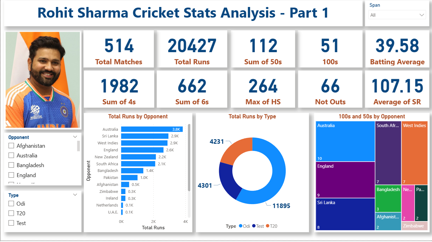
The dataset used in this project is sample/compiled analytical data. It has been collected from various sources and organized into a structured Excel file specifically for the purpose of demonstrating Power BI data analysis and visualization techniques. It should not be treated as an official single-source statistical database.
The dashboard provides an overview of matches, innings, runs, batting average, strike rate, hundreds, fifties, boundaries and other important performance indicators. By using Power BI, these statistics can be converted into interactive visuals where users can filter the analysis by cricket format and opponent.
This project is also a good example of how Power BI can be used beyond traditional business datasets. The same concepts used here—data preparation, KPI creation, filtering, aggregation and visualization—can be applied to sales, finance, marketing, HR, operations and sports analytics.
Introduction to the Dataset
The dataset is stored in an Excel workbook named rohit_sharma_stats.xlsx. It contains opponent-wise performance information for Rohit Sharma across Test, ODI and T20 cricket.
Get the Dataset Here: https://colorstech.net/practice-datasets/practice-datasets-for-data-analysis/
The dataset contains 39 records and 17 columns. Each record represents Rohit Sharma’s performance against a particular opponent and within a particular format.
The major columns include:
- Opponent – The country/team against which Rohit Sharma played.
- Span – The period covered by the available statistics.
- Mat – Number of matches played.
- Inns – Number of innings.
- NO – Number of times the player remained not out.
- Runs – Total runs scored.
- HS – Highest score.
- Avg – Batting average.
- BF – Balls faced.
- SR – Strike rate.
- 100s – Number of centuries.
- 50s – Number of half-centuries.
- 0s – Number of ducks.
- 4s – Number of fours.
- 6s – Number of sixes.
- Type – Cricket format such as Test, ODI or T20.
- NotOut – Indicates whether the relevant record is classified as not out.
One of the most useful fields in the dataset is Type because it allows the dashboard to separate performance across different formats.
For example, the compiled data contains 15 ODI records, 17 T20 records and 7 Test records. When aggregated, the dataset contains 11,895 ODI runs, 4,231 T20 runs and 4,301 Test runs.
These figures are used for dashboard analysis and demonstration rather than being presented as a definitive official career record.
Step 1: Prepare the Excel Dataset
The first step in creating the dashboard was preparing the source data.
I opened the Excel workbook and reviewed the available columns, data types and records. Before importing the data into Power BI, it is important to ensure that numerical fields are actually stored as numbers and categorical fields such as Opponent and Type are stored as text.
I also checked for blank values, inconsistent spellings and unnecessary columns.
Good data preparation is important because Power BI calculations depend heavily on the quality and consistency of the underlying dataset.
Once the data was structured properly, I saved the Excel workbook and opened Microsoft Power BI Desktop.
Step 2: Import the Dataset into Power BI
In Power BI Desktop, I selected:
Home → Get Data → Excel
I then selected the rohit_sharma_stats.xlsx workbook.
Power BI displayed the available worksheet, which contained the Rohit Sharma opponent-wise statistics.
I selected the worksheet and clicked Load.
At this point, the dataset became available inside Power BI’s data model.
Before starting the dashboard design, I switched to the Data View and checked the imported fields.
This is a useful step because it allows us to identify problems before creating visuals.
Step 3: Check Data Types
The next step was checking the data types of individual columns.
Columns such as Opponent, Span, Type and NotOut should be treated as text.
Columns such as:
- Mat
- Inns
- NO
- Runs
- HS
- BF
- SR
- 100s
- 50s
- 0s
- 4s
- 6s
should be numerical.
I also checked that the batting average and strike-rate fields were interpreted correctly as decimal numbers.
Correct data types ensure that Power BI can perform aggregations and calculations properly.
Step 4: Create the Main KPI Cards
The first visual layer of the dashboard consists of KPI cards.
The purpose of KPI cards is to provide an immediate summary of the dataset.
For this dashboard, important metrics include:
Total Runs
This represents the total runs available in the dataset.
Matches
This represents the total number of matches represented by the selected records.
Innings
This represents the number of innings.
Hundreds
This represents the total number of centuries.
Additional KPIs can also be created for fifties, fours, sixes, highest score, batting average and strike rate.
The advantage of using measures rather than manually displaying numbers is that the KPI values automatically respond to filters.
For example, if the user selects ODI, the cards can dynamically update to show ODI-specific results.
Step 5: Add a Cricket Format Filter
One of the most important interactive elements in the dashboard is the Type slicer.
I added the Type field to a slicer visual.
This creates selectable options such as:
- Test
- ODI
- T20
The user can click one format to filter the entire dashboard.
This is particularly useful because cricket statistics can look very different depending on the format.
A player may have a high strike rate in T20 cricket but a completely different statistical profile in Test cricket.
The slicer therefore turns the dashboard from a static report into an interactive analytical tool.
Step 6: Analyze Performance by Opponent
The next step was creating an opponent-wise performance visual.
I used Opponent as the category and Runs as the value.
A bar chart is particularly effective for this type of analysis because it makes differences between opponents easy to compare.
Users can immediately identify which opponents contributed the highest and lowest run totals in the dataset.
I also enabled sorting so that the opponents can be viewed according to their run totals.
This makes the visual much easier to interpret than an unsorted list.
Step 7: Compare Cricket Formats
Another important visual is the format-wise comparison.
I created a chart using:
Type → Runs
This allows the dashboard to compare Test, ODI and T20 performance.
According to the compiled dataset, ODI records contribute the largest run total, followed by T20 and Test.
The visual makes this comparison much easier to understand because users do not need to manually read multiple rows of numbers.
The same approach can be applied to matches, innings, hundreds, fifties, fours and sixes.
Step 8: Visualize Hundreds and Fifties
I also included performance milestone analysis.
Using the 100s and 50s fields, Power BI can show how many centuries and half-centuries are represented against each opponent or across each format.
A clustered column chart can be used to compare hundreds and fifties.
This provides another perspective on batting consistency.
Instead of looking only at total runs, the viewer can examine how often major scoring milestones occurred.
Step 9: Analyze Boundary Hitting
Another interesting component of the dashboard is boundary analysis.
The dataset contains separate fields for:
4s – Fours
6s – Sixes
I used these fields to create visual comparisons.
A chart showing fours and sixes by opponent can reveal differences in the way scoring was achieved.
For example, one opponent may have a higher number of fours while another may have a relatively stronger six-hitting profile.
This type of analysis demonstrates why having detailed columns in a dataset is valuable.
Step 10: Add a Detailed Table
Charts are excellent for identifying patterns, but sometimes users need the exact numbers.
Therefore, I added a detailed table to the dashboard.
The table can include fields such as:
Opponent, Type, Matches, Innings, Runs, Highest Score, Average, Strike Rate, Hundreds and Fifties.
Conditional formatting can also be applied to selected numerical fields.
For example, data bars can be used for Runs or Strike Rate to make larger and smaller values visually distinguishable.
Step 11: Apply Dashboard Formatting
Once the visuals were created, I focused on the overall dashboard design.
I used a clean sports-analysis style with a strong title at the top and KPI cards immediately below it.
The interactive filter was positioned where users could easily find it.
Charts were arranged so that related information appeared together.
I also maintained consistent typography, spacing and alignment throughout the page.
This is an important part of Power BI development because a dashboard should not only be technically correct; it should also communicate information clearly.
Step 12: Add Interactivity
Power BI automatically creates interactions between many visuals.
For example, selecting an opponent in one chart can filter other visuals on the page.
Similarly, selecting ODI from the Type slicer can update the KPI cards, charts and detailed table.
I tested these interactions to ensure that the dashboard behaved as expected.
This is one of the major advantages of Power BI compared with a traditional static Excel report.
Step 13: Validate the Dashboard
Before considering the dashboard complete, I checked the numbers against the original Excel dataset.
I verified:
- Total records
- Total runs
- Format-wise totals
- Opponent-wise totals
- Hundreds
- Fifties
- Fours
- Sixes
- Match and innings values
This validation step is extremely important.
A visually attractive dashboard is not useful if its calculations are incorrect.
I also tested different slicer selections to make sure the visuals changed correctly.
Final Dashboard
After completing the data preparation, modelling, calculations, visualization and formatting, the result was an interactive Rohit Sharma Performance Analysis Dashboard.
The dashboard brings multiple statistical dimensions together in a single Power BI report.
Instead of reading a large Excel sheet row by row, the user can quickly answer questions such as:
- How many runs are represented in the dataset?
- Which opponent has the highest run contribution?
- How does performance differ between Test, ODI and T20?
- How many centuries and fifties are recorded?
- How many fours and sixes were hit?
- How does the analysis change when a particular format is selected?
Conclusion
This project demonstrates a simple but powerful Power BI workflow: collect data, structure it, import it, validate it, create measures, build visuals, add filters and present the results through an interactive dashboard.
Although the subject of this project is cricket, the underlying methodology can be applied to almost any analytical problem.
The Rohit Sharma dataset was compiled from various sources and organized into an Excel structure for this Power BI demonstration. It is intended as sample analytical data and should not be interpreted as an official replacement for source-specific cricket records.
For me, the most important part of this project was converting raw statistics into a dashboard that tells a story. Power BI makes this possible by combining data modelling, calculations, interactive filtering and visualization in one platform.
The same workflow can be used by students, analysts and professionals to build dashboards for sales performance, marketing campaigns, financial reporting, employee analytics, customer behaviour and operational performance.
The key lesson is simple: a dataset contains information, but a well-designed dashboard turns that information into insights.
Rohit Sharma Image Credit: By Prime Minister’s Office (GODL-India), GODL-India, https://commons.wikimedia.org/w/index.php?curid=150011395