
Hi, I’m Ankit, and in this tutorial I will guide you through the complete process of building a Marketing Cluster Data Analysis dashboard in Power BI using an Excel dataset. Exploratory Data Analysis (EDA) is one of the most important stages in data analytics because it helps businesses understand customer behavior, revenue trends, advertising performance, and sales patterns before making strategic decisions. In this project, we will work with marketing and sales data containing customer information, regions, product categories, ad spend, revenue, CSAT scores, and sales channels. Using Power BI, we will transform raw Excel data into an interactive business intelligence dashboard that provides actionable insights. This tutorial is ideal for beginners, business analysts, marketing professionals, and students who want hands-on Power BI dashboard development experience using real-world business data.
Get the Dataset here: https://github.com/slidescope/Marketing-Clustering-Dataset-Explained-Column-Overview-and-Data-Structure-Guide
Step 1: Understanding the Dataset Structure Before Importing
Before creating any dashboard in Power BI, it is important to understand the structure of the dataset. In this project, the Excel file contains structured business data where every row represents a unique customer transaction or business record. The dataset includes fields like Customer_ID, Region, City, Customer_Segment, Sales_Channel, Product_Category, Revenue_INR, Ad_Spend_INR, Units_Sold, and CSAT_Score. These columns help us analyze marketing effectiveness, revenue generation, customer satisfaction, and product performance.
The Customer_ID column acts as a unique identifier, while Region and City provide geographical insights. Customer_Segment helps classify customers into SMB, Enterprise, Startup, or Government categories. Sales_Channel identifies where the sales originated, such as Direct Sales, Retail, or Partner networks. Product_Category helps compare product-wise performance.
Revenue_INR and Ad_Spend_INR are extremely important because they help calculate ROAS (Return on Ad Spend). Units_Sold provides sales volume metrics, while CSAT_Score helps evaluate customer satisfaction levels.
Understanding the dataset beforehand helps in planning visualizations correctly. It also reduces confusion during data transformation and DAX calculation stages. A well-understood dataset always leads to better dashboard architecture and meaningful business insights.
Step 2: Importing the Excel Dataset into Power BI
The next step is importing the Excel dataset into Power BI Desktop. Open Power BI Desktop and click on “Get Data.” From the available options, choose Excel Workbook and browse to your dataset file location. Once selected, Power BI will display available sheets and tables from the Excel workbook.
Select the required sheet and click “Transform Data” instead of directly loading it. This allows you to inspect and clean the data before building visualizations. In the Power Query Editor, verify that all columns have correct data types. Revenue_INR and Ad_Spend_INR should be Decimal Number or Currency types. Units_Sold should be Whole Number, and CSAT_Score should be Decimal Number.
Rename unclear column headers if required. Remove empty rows and duplicate records if they exist. Consistent formatting is essential for accurate reporting. If city names or regions contain spelling inconsistencies, standardize them during this stage.
After cleaning the dataset, click “Close & Apply” to load the data into the Power BI model. The imported data will now appear in the Fields pane. Proper data import and validation ensure that all visuals and calculations function accurately throughout the dashboard development process.
Step 3: Creating Data Relationships and Building the Data Model
Once the data is loaded into Power BI, the next step is building the data model. Even if the project contains only one Excel table, understanding relationships is important for scalable dashboard development. In enterprise projects, multiple tables are often connected using primary and foreign keys.
Open the Model View in Power BI to inspect the dataset structure. If you have separate lookup tables for Regions, Products, or Customer Segments, create relationships using common fields. For example, Product_Category can connect to a product dimension table, while Region can connect to a geography table.
A proper star schema improves performance and makes DAX calculations easier. Fact tables generally contain transactional metrics like Revenue_INR and Units_Sold, while dimension tables contain descriptive information like customer type or location.
In this project, even though the dashboard may primarily use one table, understanding data modeling concepts is valuable for future scalability. Good data modeling practices reduce redundancy and improve dashboard efficiency.
The model view also helps identify cardinality issues or incorrect relationships. Always ensure relationships are set correctly as one-to-many where appropriate. A clean data model creates the foundation for reliable business intelligence reporting and advanced analytics.
Step 4: Creating Key KPI Measures Using DAX
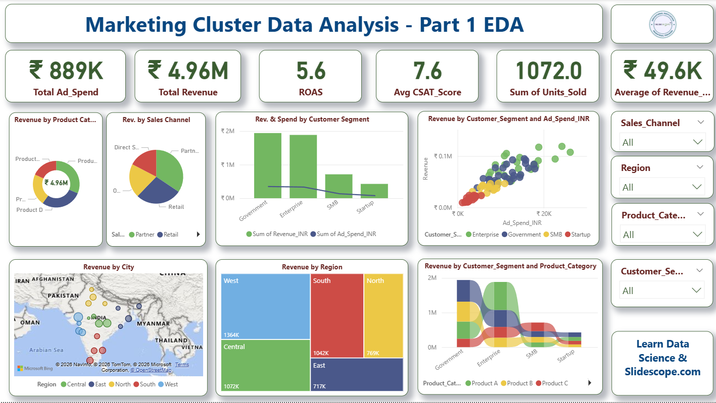
After preparing the data model, the next step is creating important KPI measures using DAX (Data Analysis Expressions). KPIs transform raw numbers into business intelligence insights. In this dashboard, major KPIs include Total Revenue, Total Ad Spend, Units Sold, Average CSAT Score, and ROAS.
For Total Revenue, create a DAX measure:
Total Revenue = SUM(MarketingData[Revenue_INR])For Total Ad Spend:
Total Ad Spend = SUM(MarketingData[Ad_Spend_INR])For ROAS calculation:
ROAS=Total Revenue / Total Spend
In Power BI:
ROAS = DIVIDE([Total Revenue], [Total Ad Spend], 0)For Average CSAT:
Avg CSAT = AVERAGE(SupplyChainData[CSAT_Score])DAX measures make dashboards dynamic because they automatically respond to filters and slicers. KPIs displayed in cards provide quick business summaries for decision-makers. These metrics help organizations evaluate marketing efficiency, customer satisfaction, and sales performance in real time.
Using DAX effectively is one of the most important Power BI skills because it enables advanced analytics, forecasting, segmentation, and performance tracking across dashboards.
Step 5: Designing KPI Cards for Executive Summary
KPI cards are essential for executive dashboards because they provide high-level business summaries in a visually clean format. In this project, KPI cards display Total Ad Spend, Total Revenue, ROAS, Average CSAT Score, Units Sold, and Average Revenue.
In Power BI, select the “Card” visualization and drag your DAX measures into it. Format the cards using professional colors and typography. Use currency formatting for revenue metrics and decimal formatting for ROAS and CSAT scores.
Arrange the KPI cards horizontally at the top of the dashboard for better visibility. This layout allows executives and managers to instantly understand overall business performance without analyzing detailed charts.
You can also apply conditional formatting to indicate positive or negative trends. For example, if ROAS falls below a threshold, the card color can change automatically. Such formatting enhances business monitoring capabilities.
KPI cards are commonly used in sales dashboards, finance reports, marketing analytics systems, and operational monitoring platforms. A well-designed KPI section improves dashboard readability and creates a professional business intelligence interface.
The top-level metrics act as navigation anchors for deeper exploratory analysis throughout the dashboard.
Step 6: Creating Revenue Analysis Visualizations
Revenue analysis is one of the most critical parts of any marketing analytics dashboard. In this project, multiple visualizations help analyze revenue distribution across products, customer segments, and sales channels.
Use donut charts to display Revenue by Product Category and Revenue by Sales Channel. These visuals help identify which products and channels contribute the highest revenue. Bar charts are excellent for comparing revenue across customer segments such as Enterprise, SMB, Startup, and Government sectors.
Scatter plots can be used to compare Ad Spend versus Revenue. This visualization helps identify whether higher advertising investments generate proportional returns. Businesses can use this insight to optimize marketing budgets.
Treemaps are useful for region-wise revenue distribution because they efficiently display hierarchical data in limited space. In Power BI, selecting the correct visualization is important because different charts communicate insights differently.
Always use appropriate labels, titles, legends, and tooltips to improve interpretability. Interactive visualizations help users drill down into business trends and uncover hidden patterns. Revenue analysis dashboards are widely used in retail, SaaS businesses, eCommerce platforms, and digital marketing agencies for decision-making and growth optimization.
Step 7: Building Geographic and Regional Analysis
Geographical analysis helps organizations understand location-based business performance. In this dashboard, map visuals are used to analyze revenue by city and region. Power BI provides built-in map visualizations that integrate geographical data effectively.
Drag City into the location field and Revenue_INR into bubble size. Region can be used for color coding. The resulting map helps identify high-performing locations and revenue clusters across the country.
Regional analysis enables businesses to identify underperforming markets and growth opportunities. For example, if the West region generates higher revenue compared to the North region, businesses may increase advertising investment in high-performing areas.
Treemap visuals can complement geographic maps by providing summarized regional contributions. This combination creates a strong spatial analytics experience.
Geographic dashboards are widely used in logistics, retail chains, telecom companies, banking, and marketing organizations. Businesses use such analysis for territory management, branch expansion planning, and campaign optimization.
Power BI maps also support drill-through functionality, allowing users to explore city-level or state-level details dynamically. Geospatial visualization significantly improves business intelligence storytelling and strategic planning.
Step 8: Creating Interactive Filters and Slicers
Interactivity is one of Power BI’s strongest features. Slicers allow users to dynamically filter dashboard data based on specific criteria. In this project, slicers are created for Sales_Channel, Region, Product_Category, and Customer_Segment.
To create a slicer, select the Slicer visualization and drag the required field into it. Format the slicer using dropdown or list style depending on dashboard layout requirements.
Interactive slicers help users customize the analysis experience. For example, a manager can filter the dashboard to view only Enterprise customers or analyze revenue generated through Partner sales channels. All charts and KPI cards automatically update based on selected filters.
This dynamic behavior makes Power BI dashboards highly flexible and business-friendly. Slicers reduce the need for multiple static reports because users can generate personalized insights in real time.
You can also synchronize slicers across report pages for a consistent filtering experience. Advanced implementations may include date slicers, hierarchical filters, and search-enabled slicers.
Interactive dashboards improve decision-making speed and help organizations move from static reporting to real-time business intelligence systems.
Step 9: Improving Dashboard Design and User Experience
Dashboard design plays a major role in user adoption and readability. Even the best analytics can fail if the interface is cluttered or confusing. In this project, a clean professional layout improves the overall user experience.
Use consistent color palettes throughout the dashboard. Maintain proper spacing between visuals and align all elements carefully. KPI cards should be placed at the top, analytical charts in the center, and filters on the right side for intuitive navigation.
Titles should be concise yet descriptive. Avoid excessive use of colors and unnecessary visual effects. Use shadows and borders minimally to maintain a modern dashboard appearance.
Power BI themes can help maintain consistent styling across reports. Tooltips can provide additional information when users hover over charts. Bookmarks and buttons can be added for advanced navigation and storytelling.
Responsive dashboard design is especially important for business presentations and executive reviews. A visually organized dashboard improves comprehension and helps stakeholders focus on insights instead of struggling with layout complexity.
Professional dashboard design enhances business communication and increases the practical usability of data analytics solutions.
Step 10: Publishing and Sharing the Power BI Dashboard
After completing dashboard development, the final step is publishing the report to the Power BI Service. Click the “Publish” button in Power BI Desktop and select your workspace. Once uploaded, the dashboard becomes accessible online.
Power BI Service allows teams to share dashboards securely with stakeholders. Managers, analysts, and executives can access reports through web browsers or mobile devices. Scheduled refresh can also be configured to automatically update reports when the Excel dataset changes.
You can create dashboards from report visuals and pin important charts for executive monitoring. Row-level security can restrict access to sensitive business data based on user roles.
Publishing dashboards improves collaboration across departments and ensures that all decision-makers work with the same data source. Power BI also supports exporting reports to PDF and embedding dashboards into websites or enterprise portals.
Cloud-based reporting makes business intelligence accessible from anywhere, enabling real-time monitoring and faster strategic decisions. This final deployment stage transforms a local Power BI project into an enterprise-ready analytics solution.
Practical Applications of Marketing Analytics Dashboards
Marketing analytics dashboards like this one have significant real-world business applications across industries. Companies use these dashboards to monitor campaign performance, customer acquisition efficiency, product profitability, and regional sales growth. By integrating revenue, ad spend, customer satisfaction, and sales data into one centralized interface, organizations gain a complete overview of business performance.
Marketing teams use ROAS analysis to determine whether advertising investments are generating profitable returns. If certain campaigns consume high budgets but produce low revenue, businesses can immediately optimize or stop those campaigns. Similarly, customer segment analysis helps companies identify high-value customer groups such as Enterprise or Government clients and create targeted marketing strategies.
Sales teams use channel analysis to understand which sales sources perform best. If Partner channels generate higher revenue than Retail, organizations may strengthen partner networks. Geographic analysis helps businesses identify strong-performing cities and regions for expansion planning.
Customer satisfaction metrics such as CSAT scores help companies evaluate service quality and customer experience. Low satisfaction scores may indicate operational issues, poor product quality, or ineffective support systems.
Executives use dashboard KPIs for strategic planning and budgeting decisions. Data-driven organizations rely on such dashboards to replace manual reporting systems and improve operational efficiency.
These dashboards are also highly valuable for eCommerce businesses, SaaS companies, educational institutions, telecom industries, manufacturing companies, and consulting firms. They support predictive analysis, performance monitoring, and executive reporting.
In the modern digital business environment, Power BI dashboards play a critical role in transforming raw Excel data into actionable intelligence that drives growth, improves decision-making, and enhances competitive advantage.