
See the Dashboard Here:
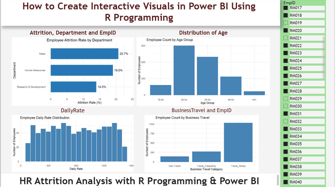
Power BI offers a wide range of built-in charts, including bar charts, line charts, pie charts, scatter plots, and maps. These visuals are useful for most business intelligence requirements, but sometimes you need more flexibility to represent data in a specific way. This is where R programming becomes valuable.
R is a programming language widely used for statistical analysis, data exploration, and visualization. By integrating R with Power BI, you can create custom charts that go beyond the standard visual options. You can build histograms, statistical plots, customized bar charts, distribution charts, and other visualizations using packages such as ggplot2.
In this tutorial, we will learn how to install R on Windows, configure it in Power BI Desktop, install the required visualization package, and create custom visuals using an HR Analytics dataset. We will use employee information such as department, attrition, age group, daily rate, and business travel to demonstrate practical examples.
The tutorial is designed for beginners who want to explore R-powered data visualization without needing extensive programming experience. By the end, you will understand the complete process, from installing R to running your first custom visual inside Power BI.
What You Need Before Starting
Before creating R visuals, make sure you have the following:
- Power BI Desktop: The desktop application used to create reports and dashboards.
- R for Windows: The statistical programming environment that executes your R scripts.
- ggplot2: An R package for creating charts and data visualizations.
- HR Analytics dataset: A sample dataset containing employee-related information.
For this tutorial, we will use the HR_Analytics dataset. You can add your dataset download link here: Download the HR Analytics Dataset.
The examples assume that your dataset contains fields such as Department, Attrition, AgeGroup, DailyRate, and BusinessTravel. Your actual column names may differ, so check them before running the scripts.
Step 1: Download and Install R
The first step is to install R on your Windows computer. Power BI does not execute R scripts independently; it uses a local R installation to run them.
- Visit the official R Project website: https://cran.r-project.org/bin/windows/base/
- Select the download link for the current base version of R for Windows.
- Open the downloaded installer file.
- Follow the installation wizard and accept the default settings unless you have a specific reason to change them.
- Complete the installation.
For this demonstration, we installed R 4.6.1. Your installed version may be different, depending on when you follow this tutorial.
Once the installation is complete, R will be available through the Windows Start menu. Open the R Console to execute commands and install additional packages.
Step 2: Install the ggplot2 Package
R provides many packages for data analysis and visualization. We will use ggplot2 because it makes it easy to create clean, customizable charts.
Open the R Console from the Windows Start menu and enter the following command:
install.packages("ggplot2")Press Enter. R may ask you to select a CRAN mirror. A CRAN mirror is simply a server from which R downloads packages. You can select 0-Cloud [https] when that option is available.
If R asks permission to create a personal library for installing packages, allow it. This is a normal situation when your Windows account does not have permission to write to the system-wide R library.
Wait for the installation to finish. Once the console prompt returns, verify that the package works by running:
library(ggplot2)If the command executes without an error, the package is ready to use. If an error appears, check the installation message and confirm that you are using the same R installation that you intend to configure in Power BI.
Step 3: Find Your R Installation Path
Power BI needs to know where R is installed. This requires identifying the correct R home directory.
On our Windows computer, R was installed at:
C:\Program Files\R\R-4.6.1The directory may differ on your computer if you installed another version or selected a different location.
Notice that the R home directory is the main R-4.6.1 folder, not the bin or bin\x64 subfolder. Those subfolders contain executable files used to run R.
You can open File Explorer and navigate to C:\Program Files\R\ to check which version folders are available. Note the main installation directory because we will select it in Power BI.
Step 4: Configure R in Power BI Desktop
Now that R and ggplot2 are installed, configure Power BI to use your local R installation.
- Open Power BI Desktop.
- Select File from the top menu.
- Choose Options and settings, then select Options.
- Under the Global settings, select R scripting.
- Locate the detected R home directories section.
- Select your installed R version if it appears in the list.
If you need to browse for the installation directory, select the main R home folder, such as:
C:\Program Files\R\R-4.6.1Do not select the bin or bin\x64 folder as the R home directory.
Click OK to save your settings. Restart Power BI Desktop if necessary so the configuration is applied.
At this point, Power BI should be configured to execute R scripts using your local installation.
Step 5: Load the HR Analytics Dataset
Open your Power BI report and load the HR_Analytics dataset.
If you have a CSV file, select Home → Get data → Text/CSV, browse to your file, preview the data, and select Load.
Inspect the available columns in the Data pane. For our examples, we will use fields such as Department, Attrition, AgeGroup, DailyRate, and BusinessTravel.
The Attrition field typically contains values such as Yes and No, indicating whether an employee left the organization. The department field identifies the employee’s department, while DailyRate contains a numerical employee-related rate.
Before proceeding, verify that the column names match those used in the scripts below. If your dataset uses different names, replace the script references accordingly.
Step 6: Create Your First R Visual
Our first visualization will display the employee attrition rate by department. This chart helps HR teams compare the percentage of employees who left across different departments.
- Open the Visualizations pane in Power BI Desktop.
- Select the R visual icon.
- Power BI will add an R visual to the report canvas.
- Drag the
DepartmentandAttritionfields into the R visual’s Values area. - Click inside the R Script Editor.
Power BI automatically creates a dataset for the fields you select. You will see a preamble similar to this:
# The following code to create a dataframe and remove duplicated rows
# is always executed and acts as a preamble for your script:

# dataset <- data.frame(Department, Attrition)
# dataset <- unique(dataset)

# Paste or type your script code here:
Keep this automatically generated preamble in place. Paste the following code underneath the final comment:
library(ggplot2)

df <- dataset

df$Department <- as.character(df$Department)
df$Attrition <- trimws(as.character(df$Attrition))

result <- aggregate(
  Attrition ~ Department,
  data = df,
  FUN = function(x) mean(x == "Yes", na.rm = TRUE) * 100
)

names(result)[2] <- "AttritionRate"

ggplot(result, aes(
  x = reorder(Department, AttritionRate),
  y = AttritionRate
)) +
  geom_col(fill = "#2878B5", width = 0.65) +
  geom_text(
    aes(label = sprintf("%.1f%%", AttritionRate)),
    hjust = -0.15,
    size = 4
  ) +
  coord_flip() +
  scale_y_continuous(
    limits = c(0, max(result$AttritionRate) * 1.15)
  ) +
  labs(
    title = "Employee Attrition Rate by Department",
    x = "Department",
    y = "Attrition Rate (%)"
  ) +
  theme_minimal(base_size = 12)
Click the Run script button, represented by the play icon in the R Script Editor.
Power BI will execute the script and display the resulting horizontal bar chart. Each bar represents a department, and the percentage label indicates its calculated attrition rate.
Important: Power BI’s automatic preamble removes duplicate rows. For accurate employee-level calculations, include a unique employee identifier, such as EmpID or EmployeeNumber, in the R visual’s Values area. Also verify that the identifier is genuinely unique in the source data. This helps prevent duplicate removal from changing the attrition calculation.
Step 7: Create a Simple Employee Count by Age Group Chart
Let’s create another visual using the same dataset. This time, we will display employee counts across age groups.
Select another R visual on the report canvas. Add AgeGroup to its Values area and, if needed to preserve employee-level records, add the unique employee identifier as well.
Keep Power BI’s automatic preamble and paste the following code underneath it:
library(ggplot2)

df <- dataset

ggplot(df, aes(x = AgeGroup)) +
  geom_bar(fill = "steelblue") +
  labs(
    title = "Employee Count by Age Group",
    x = "Age Group",
    y = "Number of Employees"
  ) +
  theme_minimal()
Click Run script to render the chart.
The horizontal position of each category on the x-axis represents an age group, while the height of each bar indicates the number of rows in that group. With one record per employee, this corresponds to the employee count for each age group.
This is a simple example of how R can help you create a visualization directly inside a Power BI report.
Step 8: Create a Daily Rate Distribution Histogram
Histograms are useful when you want to understand how numerical values are distributed. For this example, we will examine the DailyRate column.
Add a new R visual and drag DailyRate into its Values area. Preserve the unique employee identifier as well if required to avoid duplicate-row removal.
Paste the following code underneath the automatic preamble:
library(ggplot2)

df <- dataset

ggplot(df, aes(x = DailyRate)) +
  geom_histogram(
    bins = 20,
    fill = "steelblue",
    color = "white"
  ) +
  labs(
    title = "Employee Daily Rate Distribution",
    x = "Daily Rate",
    y = "Number of Employees"
  ) +
  theme_minimal()
Click Run script. The histogram divides the DailyRate values into intervals and displays the number of records within each interval. The bins = 20 setting requests 20 intervals, allowing you to explore where values are concentrated.
You can change the number of bins to make the histogram more detailed or simpler.
Step 9: Understand Common Problems
While creating R visuals in Power BI, beginners may encounter a few common issues.
- R installation not detected: Open Power BI’s R scripting settings and select the correct R home directory.
- Package not found: Run
install.packages("ggplot2")in the R installation configured for Power BI. - Incorrect column names: Check the fields added to the R visual and update the script to match their exact names.
- Unexpected counts or percentages: Check whether Power BI’s automatic preamble removed duplicate rows and whether a unique employee identifier has been included.
- Visual does not render: Review the R Script Editor for error messages and confirm that the required fields are present.
Remember that Power BI supplies the data to R through the dataset object. The columns available to the script depend on the fields added to the selected R visual.
Conclusion
R programming adds another dimension to Power BI by allowing users to create customized charts and statistical visualizations beyond the built-in chart options. In this tutorial, we installed R, configured its path in Power BI Desktop, installed ggplot2, and created practical HR Analytics visuals using department, attrition, age group, and daily rate data.
The best way to learn is to experiment with different columns and chart types. Once you understand how Power BI passes data to R, you can adapt these examples for sales analysis, finance reports, supply chain analytics, and other business intelligence projects. Start with simple charts, validate your calculations, and gradually explore more advanced statistical visualizations.