
Hello Students, I am Ankit. Over the years, I have built and analyzed multiple dashboards across industries, and one common mistake I see is people relying only on basic averages and counts. Real analytics begins when you start thinking in terms of performance indicators, contribution, efficiency, and behavior patterns.
Here is a dashboard we created in part 1 while doing EDA of this Dataset:
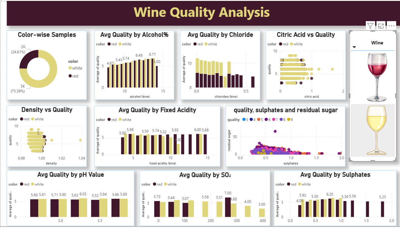
In this project, we are working with a Wine Quality dataset where different chemical properties like alcohol, sulphates, chlorides, pH, and residual sugar influence the final quality score. You have already created a solid dashboard, which is great. Now the goal is to elevate it using meaningful KPIs and smart visual analysis.
This tutorial focuses on transforming raw data into decision-making insights using DAX. Instead of basic calculations, we will create KPIs that reflect real performance and visuals that tell a story. This is exactly how dashboards are built in real-world analytics projects.
Dataset Description
The dataset contains chemical properties of wines along with their quality rating. Each row represents a wine sample, and the columns describe measurable attributes that affect taste and grading.
Key columns include alcohol, sulphates, chlorides, citric acid, residual sugar, density, and pH. These variables help in understanding how composition impacts wine quality. The dataset also includes a color column that categorizes wines into red and white, allowing comparative analysis.
Additionally, binned columns have been created in Power BI such as alcohol bins, pH bins, sulphates bins, and chlorides bins. These bins help in segmenting continuous data into meaningful ranges, making it easier to visualize patterns and trends.
The target variable is quality, which represents the rating assigned to each wine. This becomes the core metric for all KPIs and analysis.
Know more about the dataset and get it here: What-is-the-wine-quality-dataset-from-the-uci-machine-learning-repository
KPI Measures (Advanced and Meaningful)
1. Premium Wine Percentage
Premium Wine % =
DIVIDE(
    CALCULATE(COUNTROWS(wines), wines[quality] >= 7),
    COUNTROWS(wines)
)
This KPI measures the proportion of high-quality wines in the dataset. It directly reflects product excellence and is one of the most important business indicators.
2. Quality Performance Index
Quality Index =
AVERAGEX(
    wines,
    wines[quality] * (1 + wines[alcohol]/10 + wines[sulphates])
)
This KPI creates a composite performance score by combining alcohol strength and sulphates with quality. It gives a more realistic measure than a simple average.
3. Quality Consistency Score
Quality Consistency =
1 - DIVIDE(
    STDEV.P(wines[quality]),
    AVERAGE(wines[quality])
)
This KPI evaluates how consistent the wine quality is across samples. Lower variation results in a higher consistency score, which is critical in production environments.
4. High Alcohol Premium Ratio
High Alcohol Premium % =
DIVIDE(
    CALCULATE(
        COUNTROWS(wines),
        wines[alcohol] > 10,
        wines[quality] >= 7
    ),
    CALCULATE(COUNTROWS(wines), wines[alcohol] > 10)
)
This KPI checks whether high alcohol wines are actually delivering better quality. It connects product strength with performance.
5. Quality Efficiency Score
Quality Efficiency =
DIVIDE(
    AVERAGE(wines[quality]),
    AVERAGE(wines[residual sugar])
)
This KPI measures how efficiently sugar content translates into quality. It helps identify optimal composition.
Visualization-Based Analysis
1. Alcohol vs Quality Trend
Visual: Ribbon Chart
Fields:
- Axis → alcohol (bins)
- Values → Quality Index
- Legend → color
This visual shows how wine types compete across alcohol ranges and how ranking changes dynamically.
2. Wine Distribution by Type
Visual: Donut Chart
Fields:
- Legend → color
- Values → COUNTROWS(wines)
This gives a quick overview of dataset composition.
3. Chlorides Impact on Quality
Visual: Clustered Bar Chart
Fields:
- Axis → chlorides (bins)
- Values → Quality Index
- Legend → color
This helps identify thresholds where chlorides reduce quality.
4. Sulphates vs Residual Sugar Analysis
Visual: Scatter Plot
Fields:
- X-Axis → sulphates
- Y-Axis → residual sugar
- Size → quality
- Legend → color
This reveals relationships and clustering behavior between chemical properties.
5. pH Influence on Quality
Visual: Line Chart
Fields:
- Axis → pH (bins)
- Values → Quality Consistency
- Legend → color
This shows how acidity stability affects quality.
6. Segment-wise Quality Distribution
Visual: Treemap
Fields:
- Group → fixed acidity (bins)
- Values → Quality Index
- Details → color
This highlights dominant segments contributing to overall quality.
Why Wine Quality Datasets Are Powerful for Learning Data Analytics and Real-World Applications
Datasets like Wine Quality are extremely valuable for learners because they strike the perfect balance between simplicity and analytical depth. At first glance, the dataset appears straightforward—just numerical columns representing chemical properties and a quality score. However, once you begin working with it in tools like Power BI, it quickly reveals multiple layers of complexity that mirror real-world data problems.
One of the biggest advantages of this dataset is that it introduces learners to multi-variable relationships. In real-world scenarios, outcomes are rarely driven by a single factor. Similarly, wine quality is not dependent on just alcohol or acidity alone; it is influenced by a combination of variables such as sulphates, chlorides, pH, and residual sugar. This teaches learners an important mindset: analytics is not about isolated metrics but about understanding how variables interact with each other.
Another key benefit is that this dataset encourages feature interpretation and domain thinking. Even though a student may not be from a chemical or food science background, they are forced to interpret what each column represents and how it might impact quality. This builds the habit of asking the right questions—Why does higher alcohol improve quality? Why do higher chlorides reduce it? This curiosity-driven approach is exactly what is required in real-world analytics roles, where understanding the business context is as important as writing formulas.
The presence of a target variable (quality) makes this dataset highly effective for performance analysis. In business environments, there is always a measurable outcome—sales, profit, customer satisfaction, conversion rate, or risk score. Learning how to analyze what drives “quality” in this dataset directly translates to understanding what drives business KPIs in real scenarios. It trains learners to think in terms of cause and effect rather than just reporting numbers.
Additionally, the dataset is ideal for learning data transformation techniques like binning and segmentation. Continuous variables such as alcohol or pH are converted into bins, which makes patterns easier to analyze. This is exactly what analysts do in real projects—grouping customers into segments, categorizing products into ranges, or clustering performance metrics. By practicing this here, learners develop the ability to simplify complex data into meaningful categories for decision-making.
From a Power BI and DAX perspective, this dataset is excellent for mastering context-based calculations. Since there are multiple dimensions (like color, bins, and chemical properties), learners can experiment with filters, slicers, and advanced DAX functions. They learn how CALCULATE changes context, how FILTER works within measures, and how ALL can override existing filters. These are not just technical skills; they are core to building dynamic dashboards that respond intelligently to user interaction.
Another major advantage is that it supports visual storytelling. The dataset allows the use of diverse visuals such as scatter plots for relationship analysis, ribbon charts for ranking changes, treemaps for segmentation, and bar charts for comparisons. This helps learners understand that choosing the right visual is not about aesthetics but about effectively communicating insights. In real-world reporting, stakeholders often rely on visuals to make decisions quickly, so this skill becomes extremely valuable.
Working with this dataset also builds a strong foundation in analytical thinking and hypothesis testing. For example, a learner might hypothesize that higher alcohol leads to better quality, then test it using visuals and DAX measures. This process of forming assumptions, validating them with data, and refining conclusions is exactly how data analysts operate in business environments. It moves learners away from passive reporting toward active problem-solving.
In real-world tasks, the learning from this dataset directly applies to multiple domains. In marketing, similar techniques are used to analyze customer segments and campaign performance. In finance, analysts evaluate risk factors and performance indicators using comparable multi-variable datasets. In operations, quality control and process optimization rely on identifying which factors influence outcomes the most. Even in product management, teams analyze user behavior and product metrics in ways that closely resemble this type of analysis.
Moreover, this dataset prepares learners for dashboard development and stakeholder communication. Building KPIs like premium percentage, consistency score, or efficiency metrics mirrors how business dashboards are designed. Companies do not rely on raw data; they rely on indicators that summarize performance and guide decisions. By learning to create such KPIs here, students develop the ability to design dashboards that are not just informative but actionable.
Finally, working on datasets like Wine Quality helps bridge the gap between theoretical learning and practical implementation. Many learners understand concepts like averages, filters, or charts in isolation, but struggle to apply them in a cohesive project. This dataset provides a complete playground where data cleaning, transformation, modeling, DAX, and visualization all come together. It simulates a mini real-world project, giving learners confidence to handle actual business data.
In conclusion, the value of this dataset lies not in the domain of wine itself but in the analytical skills it develops. It teaches learners how to think, question, analyze, and present data in a structured way. These are transferable skills that apply across industries and roles. Whether someone becomes a data analyst, business analyst, digital marketer, or consultant, the core learning remains the same—understand the data, find the drivers, and communicate insights effectively.
Conclusion
A strong dashboard is not built on visuals alone but on the logic behind the metrics. In this Wine Quality project, we moved beyond basic aggregation and introduced performance-driven KPIs such as premium ratio, consistency score, and efficiency metrics. These KPIs reflect real analytical thinking and align closely with business decision-making.
Using DAX functions like CALCULATE, AVERAGEX, DIVIDE, and STDEV, we created measures that go deeper into the data and uncover patterns that are not visible through simple averages. Each KPI answers a specific question—how good the wines are, how consistent they are, and which factors truly drive quality.
The visual layer complements this by presenting insights in an intuitive manner. Ribbon charts highlight ranking changes, scatter plots reveal relationships, and treemaps show distribution across segments. Choosing the right visual ensures that insights are not just calculated but also communicated effectively.
As you continue working with Power BI, focus on combining strong DAX logic with purposeful visuals. This combination is what separates a basic report from a powerful analytical dashboard.