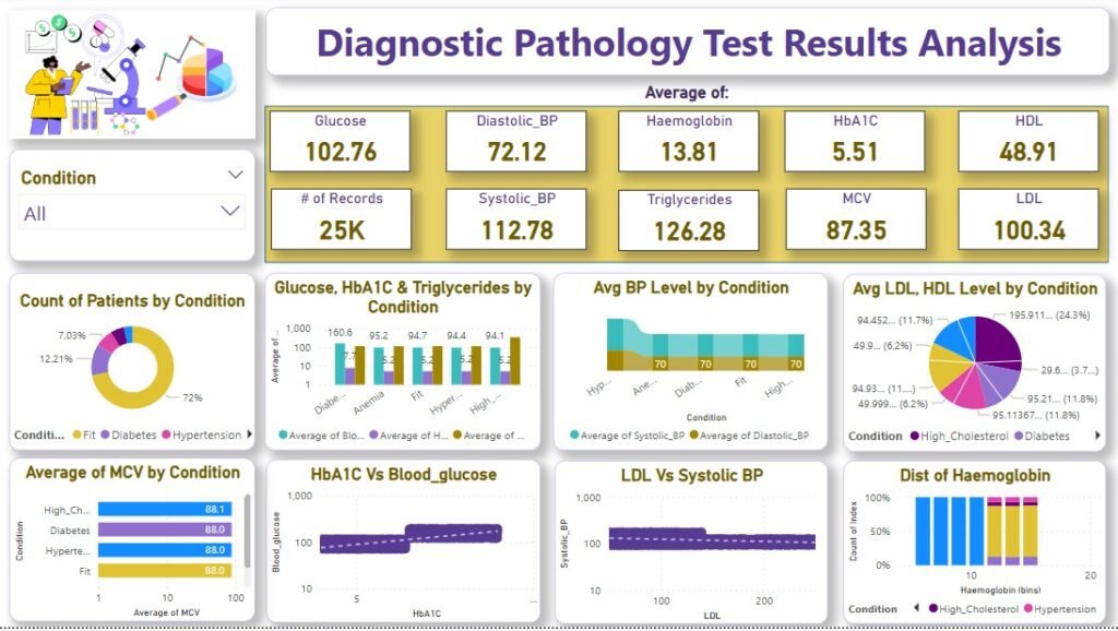
This Power BI dashboard provides an analytical overview of diagnostic pathology test results, offering insights into various health parameters across different conditions. The report enables users to explore key metrics such as glucose levels, blood pressure, hemoglobin, cholesterol, and other biomarkers.
Dataset to perform the analysis can be downloaded from here: https://www.kaggle.com/datasets/pareshbadnore/diagnostic-pathology-test-results
Key Highlights:
- Summary Metrics: Displays key averages including glucose (102.76), diastolic and systolic blood pressure (72.12 & 112.78), hemoglobin (13.81), HbA1C (5.51), HDL (48.91), LDL (100.34), and triglycerides (126.28) based on 25K records.
- Filter by Condition: Users can filter the report to analyze specific health conditions such as diabetes, hypertension, or high cholesterol.
- Patient Distribution: A pie chart showcases the proportion of patients by condition, indicating the prevalence of different health issues.
- Comparative Analysis:
- Bar and scatter plots illustrate relationships between multiple factors, such as HbA1C vs. blood glucose and LDL vs. systolic blood pressure.
- The distribution of hemoglobin levels among different conditions is represented with histogram-like visuals.
- Lipid Profile Overview: A pie chart displays the average levels of LDL and HDL cholesterol by condition, highlighting cholesterol-related concerns.
- Blood Pressure Trends: A stacked bar chart shows the average systolic and diastolic BP for different conditions.
- MCV Levels by Condition: A horizontal bar chart compares the mean corpuscular volume (MCV) across conditions, providing insights into blood cell characteristics.
This interactive dashboard helps in identifying trends, correlations, and anomalies in diagnostic pathology test results, aiding in better decision-making for medical professionals and researchers.
