
At Colorstech Institute of Data Analytics, we believe data tells powerful stories when visualized effectively. With over 15+ years of teaching experience, our trainers have helped professionals from MNCs and state government projects turn raw data into actionable insights. In this tutorial, we’ll walk through creating a Sales Agent Performance Dashboard in Tableau, similar to the one you see above.
Get the Dataset here: https://github.com/slidescope/data/blob/master/Company%20Sales%20Agent%20Performance.xlsx
Why Use Tableau for Sales Dashboards?
Tableau is one of the most powerful tools for business intelligence and data visualization. For sales teams, it allows you to:
- Track calls made, calls connected, and deals closed.
- Monitor agent performance in real-time.
- Visualize deal values and conversion trends by month or quarter.
- Identify top-performing agents and areas needing improvement.
With just a few drag-and-drop actions, you can build interactive dashboards that provide insights at a glance.
Step 1: Preparing the Data
For this tutorial, the dataset contains sales agents’ details, including:
- Agent Name
- Calls Made
- Calls Connected
- Deal Value (USD)
- Deals Closed
You can import your dataset into Tableau by connecting to Excel, CSV, or SQL databases. Once connected, drag the relevant fields into your Data Pane.
Step 2: Creating Key KPIs
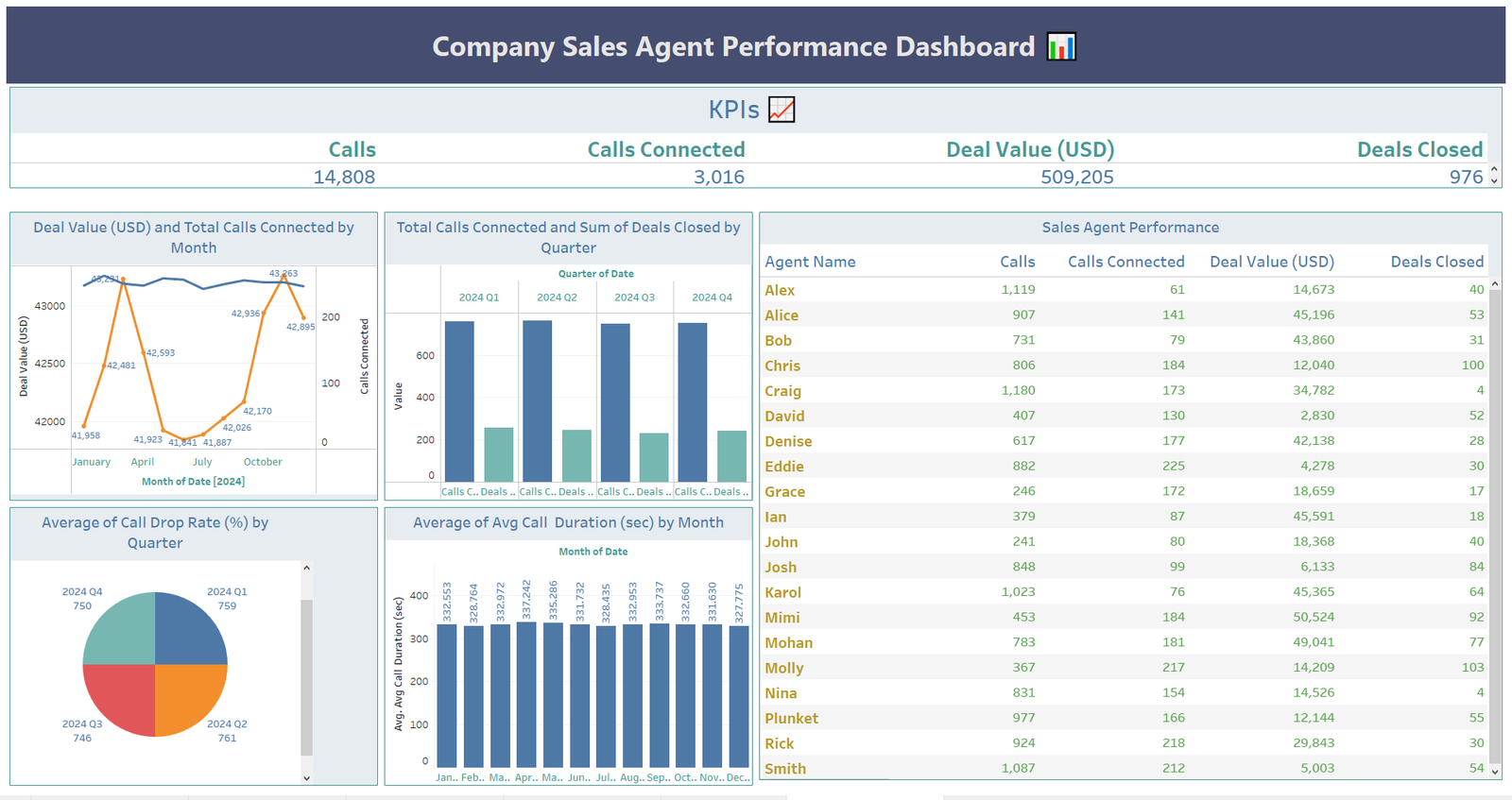
Every dashboard should start with high-level KPIs. In our example, the following values are displayed:
- Calls Made (14,808)
- Calls Connected (3,016)
- Deal Value ($509,205)
- Deals Closed (976)
In Tableau, you can create these metrics using SUM() functions and place them in KPI cards for quick reference.
Step 3: Visualizing Trends
1. Deal Value and Calls by Month
We used a dual-axis line and bar chart to compare monthly deal values with calls connected. This reveals how activity levels align with revenue performance.
2. Calls Connected vs Deals Closed by Quarter
A clustered bar chart helps track quarterly progress. Managers can instantly see which periods had the strongest performance.
3. Call Drop Rate & Call Duration
Pie charts and bar charts were used to monitor drop rates and average call durations. These metrics highlight operational efficiency beyond sales results.
Step 4: Sales Agent Performance Table
At the core of the dashboard lies a detailed agent performance table, where each agent’s:
- Total Calls
- Calls Connected
- Deal Value (USD)
- Deals Closed
are tracked. Sorting and filtering allow managers to identify top agents like Chris (100 deals closed) or areas where more support is needed.
Step 5: Designing the Dashboard
Finally, bring all sheets together into a dashboard view. Use containers and layout options to arrange charts neatly. Add interactive filters so managers can drill down into specific months, quarters, or agents.
Conclusion
This dashboard empowers sales leaders to track both efficiency (calls made, connected) and effectiveness (deals and revenue). At Colorstech, we train our students to not just build dashboards, but to think like data analysts—identifying patterns, solving problems, and enabling better business decisions.
If you want to master Tableau and become a data-driven professional, join Colorstech Institute of Data Analytics for online training programs designed by experts with 15+ years of experience in MNCs and government projects.
👉 Learn more and start your data analytics journey with us today!