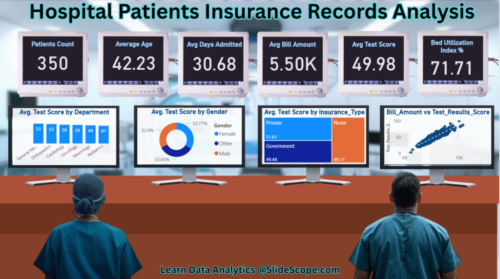
Analyzing healthcare data requires a structured approach, as patient records contain multiple variables such as demographics, medical test results, insurance details, and hospital stay durations. The dashboard created here is designed to provide a comprehensive exploratory analysis of hospital patient records with a focus on performance indicators, insurance impact, and utilization metrics. Let’s walk through how this dashboard was built in Power BI, step by step.
Dataset description and Questions : Hospital-patients-medical-bill-and-insurance-dataset-for-analysis-and-ml-projects
1. Data Preparation
The dataset used contains patient-level information including:
- Patient demographics (age, gender)
- Hospital stay details (days admitted, bed allocation)
- Insurance type (private, government, none)
- Test result scores
- Billing amount
Before loading into Power BI, the dataset was cleaned in Excel/Python to ensure there were no missing or inconsistent values. Once imported into Power BI, relationships were defined between tables if required (e.g., patient details and department).
2. Key Metrics Cards
The top section of the dashboard highlights summary metrics such as patient count, average age, average length of stay, average bill amount, average test score, and bed utilization index. These cards are created using DAX measures.
For example, to calculate the average length of stay, the following measure can be written:
Avg Days Admitted = AVERAGE ( hospital_patient_records[Days_Admitted] )
Similarly, the average bill amount is calculated as:
Avg Bill Amount = AVERAGE ( hospital_patient_records[Bill_Amount] )
By placing these measures into card visuals, users quickly understand the scale and nature of the dataset.
3. Bed Utilization Index Calculation
Hospital administrators often need to monitor bed usage efficiency. In this dashboard, the Bed Utilization Index (%) is derived using DAX. The logic assumes that patients admitted for more than a certain threshold (e.g., 20 days) represent long-term bed usage.
Bed Utilization Index (%) =
VAR TotalPatients =
    COUNTROWS ( hospital_patient_records )
VAR LongStayPatients =
    CALCULATE (
        COUNTROWS ( hospital_patient_records ),
        hospital_patient_records[Days_Admitted] > 20
    )
RETURN
DIVIDE ( LongStayPatients, TotalPatients, 0 ) * 100
This creates a percentage metric that reflects the proportion of patients requiring extended care.
4. Department-Wise Test Scores
Understanding how patients perform across different departments helps track medical outcomes. A bar chart was used to visualize the average test score by department.
Measure for test score:
Avg Test Score = AVERAGE ( hospital_patient_records[Test_Results_Score] )
Then, this measure was plotted against department categories, giving an instant view of which departments maintain higher or lower average scores.
5. Gender Analysis
Patient outcomes often vary across demographics. A donut chart was created to show test score averages by gender.
Here’s how the gender-based average can be calculated:
Avg Test Score by Gender =
CALCULATE (
    AVERAGE ( hospital_patient_records[Test_Results_Score] ),
    ALLEXCEPT ( hospital_patient_records, hospital_patient_records[Gender] )
)
This ensures that filtering by gender provides a clear view of performance distribution.
6. Insurance Type Impact
One of the key business intelligence insights in healthcare is the impact of insurance type on patient outcomes and billing. A treemap visual was used to break down average test scores by insurance type.
The measure is the same Avg Test Score but grouped by Insurance_Type. This helps administrators compare private vs. government vs. uninsured patient outcomes.
7. Relationship Between Billing and Test Results
Finally, a scatter plot was created to analyze whether there is a correlation between bill amount and test result scores. Each point represents a patient, with bill amount on the X-axis and test score on the Y-axis.
DAX measures used:
Bill Amount = SUM ( hospital_patient_records[Bill_Amount] )
Test Results Score = AVERAGE ( hospital_patient_records[Test_Results_Score] )
The trend line in Power BI helps detect whether higher bills correspond with improved test outcomes or not, which can be crucial for performance and cost analysis.
8. Filters and Interactivity
The dashboard also uses slicers for filtering by gender, department, and insurance type. This interactivity allows users to deep dive into specific subsets of patients and understand performance differences.
9. Insights for Decision Makers
Such dashboards are not just about visuals—they enable hospital administrators, doctors, and insurers to:
- Monitor patient distribution and utilization trends
- Understand financial performance through billing analysis
- Track outcome metrics like test scores across demographics and insurance coverage
- Optimize resources (e.g., beds) based on utilization rates
10. Learn with Ankit Srivastava
This dashboard is an example of how Power BI can be used for healthcare analytics.
👉 Ankit Srivastava is a Data Analytics Instructor with expertise in Excel, Power BI, and Business Intelligence.
He offers a Beginner to Advanced MS Excel Course on Udemy and also conducts live interactive classes for students and professionals who want hands-on training.
📌 Enroll in the full course here: Beginner to Advanced MS Excel Course
📌 Contact Ankit for live Power BI training and personalized mentorship.
This dashboard shows how raw patient records can be transformed into actionable healthcare insights with the right use of Power BI measures, visuals, and storytelling.

