
Power BI is one of the most powerful business intelligence tools for turning raw data into interactive insights. In this tutorial, we’ll walk through a Customer Purchase Behavior and Shipping Analysis Dashboard that highlights revenue, purchase patterns, and customer demographics.
This example dashboard demonstrates how different visuals in Power BI can be combined to analyze sales, customer preferences, and shipping data.
🎯 Dashboard Objective
The goal of this dashboard is to:
- Track total revenue and category-wise performance.
- Analyze purchase behavior across time, states, seasons, and product sizes.
- Identify customer preferences by gender, age group, and product type.
- Monitor revenue generated by different payment methods.
- Visualize customer counts and purchase diversity.
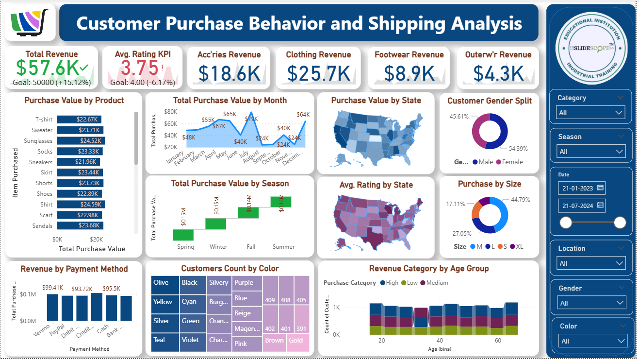
📊 Key Metrics at the Top
- Total Revenue ($57.6K)
- Compared against the goal of $50K (+15.12%).
- This KPI card helps monitor progress towards targets.
- Average Rating KPI (3.75)
- Shows customer satisfaction vs. goal (4.0).
- Useful for understanding customer experience beyond sales.
- Revenue by Category
- Accessories Revenue: $18.6K
- Clothing Revenue: $25.7K
- Footwear Revenue: $8.9K
- Outerwear Revenue: $4.3K
- Displayed using simple KPI cards for quick category-level performance tracking.
📦 Purchase Behavior Analysis
1. Purchase Value by Product
- A vertical bar chart listing items (T-shirt, Sweater, Sunglasses, Socks, etc.) with purchase values.
- Allows easy comparison of which product categories are driving the most sales.
2. Total Purchase Value by Month
- Line chart showing revenue trends across months.
- Peaks in May ($67K) and August ($65K) highlight seasonal demand.
3. Total Purchase Value by Season
- Column chart comparing Spring, Winter, Fall, and Summer.
- Fall ($0.14M) performs slightly better than Winter and Spring.
4. Purchase Value by State
- Filled map visualization displaying state-wise revenue.
- Darker shades = higher purchase value.
5. Average Rating by State
- Another map showing customer satisfaction distribution.
- Useful for identifying geographic regions needing service improvement.
👥 Customer Insights
1. Gender Split
- Donut chart showing 54.39% Female vs. 45.61% Male buyers.
- Indicates women are slightly more active customers in this dataset.
2. Purchase by Size
- Donut chart comparing clothing sizes.
- Large (44.79%) dominates, followed by Small (27.05%), Medium (17.11%), and XL (11.05%).
3. Revenue Category by Age Group
- Stacked bar chart by age group (20–60 years).
- Shows contribution of Low, Medium, and High revenue customers.
4. Customers Count by Color
- Treemap with colors (Olive, Black, Silvery, Purple, etc.).
- Useful for understanding design preferences.
💳 Revenue by Payment Method
- Bar chart comparing payment channels like Venmo, PayPal, Debit, Credit, Cash, and Bank.
- Venmo ($99.41K) leads slightly, followed by PayPal and Credit/Debit.
- Helps businesses decide which payment modes to promote or streamline.
🎛 Interactive Filters (Slicers on the Right Panel)
- Category: Filter by product type (Clothing, Accessories, etc.).
- Season: View data for specific seasons.
- Date Range: Choose start and end dates.
- Location: State or region-based filtering.
- Gender: Male/Female analysis.
- Color: Filter products by customer color preference.
These slicers make the dashboard dynamic, letting users drill down into specific details.
🛠 How You Can Build This in Power BI
- Data Preparation
- Import data from Excel/SQL/CSV.
- Clean data in Power Query (remove nulls, format columns, create calculated fields).
- Modeling
- Create relationships between tables (Customers, Products, Orders, Payments).
- Add calculated columns and measures (Total Revenue, Avg Rating, Purchase Value by Category).
- Visualizations
- Use KPI cards for revenue and ratings.
- Use Bar/Column charts for product, payment, and seasonal analysis.
- Use Line charts for time-series purchase value.
- Use Maps for state-level analysis.
- Use Donut/Pie charts for gender and size split.
- Use Treemap for customer preference by color.
- Formatting & Design
- Apply consistent theme colors.
- Add slicers on the side for interactivity.
- Align visuals neatly for storytelling.
✅ Conclusion
This Customer Purchase Behavior and Shipping Analysis Dashboard in Power BI provides a holistic view of sales, customer demographics, seasonal patterns, and satisfaction metrics.
By combining KPIs, charts, maps, and slicers, you can empower decision-makers to:
- Identify top-selling products and categories.
- Understand customer preferences (size, gender, color).
- Monitor performance across time and geography.
- Improve strategies for sales, inventory, and marketing.
With Power BI, such dashboards can be refreshed automatically and shared across teams for data-driven business growth.