
By Ankit Srivastava – Data Analyst & BI Consultant
Data visualization can turn complex medical data into life-saving insights. In this Power BI project, I’ve analyzed heart failure clinical records from a Kaggle dataset to identify the key factors influencing patient survival.
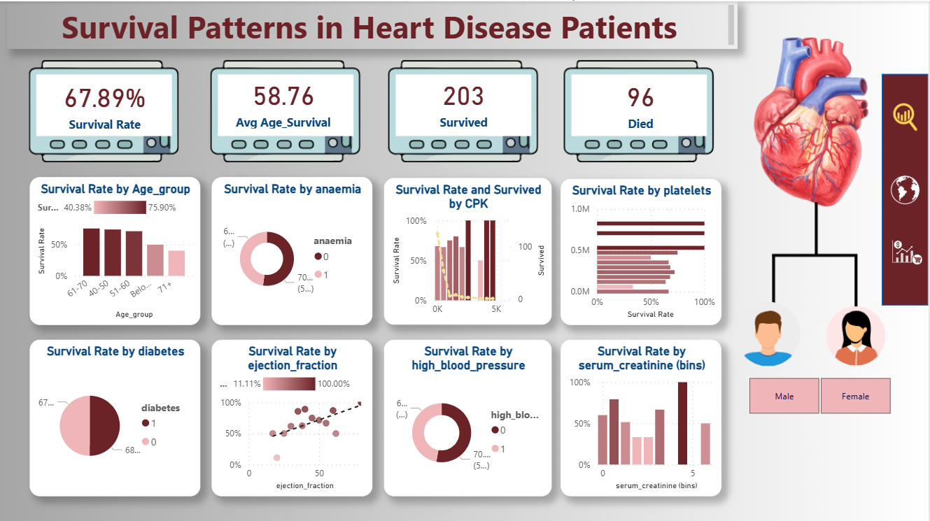
This dashboard, titled “Survival Patterns in Heart Disease Patients,” visually explores relationships between multiple clinical indicators such as age, anaemia, diabetes, blood pressure, serum creatinine, and more — all affecting patient outcomes.
🎯 Objective
The primary goal of this dashboard is to analyze and visualize how different health parameters affect survival among patients diagnosed with heart disease.
Instead of just looking at individual metrics, we used Power BI’s interactive visuals and DAX measures to calculate survival-related KPIs and highlight patterns between variables.
The target field is DEATH_EVENT, a Boolean indicator where:
1= Patient Died0= Patient Survived
📘 Dataset Overview
We’re using the Heart Failure Clinical Records Dataset, available on Kaggle:
🔗 Predict Survival of Patients with Heart Failure
It contains 12 clinical attributes and one target field (DEATH_EVENT).
| Column | Description | Type / Unit |
|---|---|---|
| age | Patient’s age | Years |
| anaemia | Decrease of red blood cells (1 = Yes, 0 = No) | Boolean |
| creatinine_phosphokinase (CPK) | CPK enzyme level | mcg/L |
| diabetes | If patient has diabetes | Boolean |
| ejection_fraction | Blood percentage pumped with each heartbeat | % |
| high_blood_pressure | If patient has hypertension | Boolean |
| platelets | Platelets in the blood | kiloplatelets/mL |
| sex | 0 = Female, 1 = Male | Binary |
| serum_creatinine | Level of serum creatinine | mg/dL |
| serum_sodium | Level of serum sodium | mEq/L |
| smoking | If patient smokes | Boolean |
| time | Follow-up period | Days |
| DEATH_EVENT | Target variable (1 = Died, 0 = Survived) | Boolean |
🧮 Step 1: Importing and Cleaning Data
- Open Power BI Desktop.
- Click Get Data → CSV and load the dataset.
- Rename the table to
heart_failure_clinical_records_dataset. - Verify that all Boolean columns (anaemia, diabetes, etc.) are correctly recognized as Whole Numbers.
To enhance readability:
- Replace
0and1insexwith “Female” and “Male.” - Create an Age Group column for better visualization.
👉 Calculated Column (Age Group):
Age_group =
SWITCH(
    TRUE(),
    heart_failure_clinical_records_dataset[age] < 40, "Below 40",
    heart_failure_clinical_records_dataset[age] < 50, "40-50",
    heart_failure_clinical_records_dataset[age] < 60, "51-60",
    heart_failure_clinical_records_dataset[age] < 70, "61-70",
    "71+"
)
📊 Step 2: Creating DAX Measures
We’ll create a few key DAX measures to summarize survival statistics.
1️⃣ Survival Rate (%)
Survival Rate =
DIVIDE(
    CALCULATE(
        COUNTROWS('heart_failure_clinical_records_dataset'),
        'heart_failure_clinical_records_dataset'[DEATH_EVENT] = 0
    ),
    COUNTROWS('heart_failure_clinical_records_dataset'),
    0
)
2️⃣ Average Age of Survivors
Average_Age_Survival =
CALCULATE(
    AVERAGE('heart_failure_clinical_records_dataset'[age]),
    'heart_failure_clinical_records_dataset'[DEATH_EVENT] = 0
)
3️⃣ Total Survived
Survived =
CALCULATE(
    COUNTROWS('heart_failure_clinical_records_dataset'),
    'heart_failure_clinical_records_dataset'[DEATH_EVENT] = 0
)
4️⃣ Total Died
Died =
CALCULATE(
    COUNTROWS('heart_failure_clinical_records_dataset'),
    'heart_failure_clinical_records_dataset'[DEATH_EVENT] = 1
)
5️⃣ Gender Label
Gender = IF('heart_failure_clinical_records_dataset'[sex] = 0, "Female", "Male")
These measures will power our KPI cards and comparison visuals.
🎨 Step 3: Designing the Dashboard Layout
To make the report visually appealing, I designed the dashboard background in Canva.
It includes:
- A heart illustration on the right
- Icons for gender representation
- A professional layout with space for 4 KPI cards and 8 visuals
Import the background:
Go to Insert → Image → Set as Canvas Background
🧠 Step 4: Adding Key Metrics
At the top of the dashboard, place KPI cards for:
- Survival Rate
- Average Age (Survived)
- Total Survived
- Total Died
Each KPI uses the measures created above.
You can customize card visuals with teal or clinical red colors for contrast.
Example:
- 67.89% Survival Rate
- 58.76 Years Avg Age of Survivors
- 203 Survived
- 96 Died
📈 Step 5: Visuals and Insights
Now we’ll add visualizations to analyze how survival changes with different parameters.
🔹 1. Survival Rate by Age Group
Visual Type: Clustered Column Chart
- Axis:
Age_group - Values:
Survival Rate
Insight: Patients between 40–60 years show higher survival (≈75%), while rates drop sharply after 70.
🔹 2. Survival Rate by Anaemia
Visual Type: Donut Chart
- Legend:
anaemia - Value:
Survival Rate
Insight: Anaemia reduces survival likelihood, as oxygen transport efficiency decreases.
🔹 3. Survival vs. CPK Levels
Visual Type: Combo Chart (Bar + Line)
- X-axis:
creatinine_phosphokinase - Left Y-axis:
Survival Rate - Right Y-axis:
Survived
Insight: Higher CPK spikes (above 5000 mcg/L) correspond to poor survival, indicating cardiac muscle stress.
🔹 4. Survival Rate by Platelets
Visual Type: Bar Chart
- Axis:
platelets - Value:
Survival Rate
Insight: Both very high and very low platelet counts are linked to lower survival probability.
🔹 5. Survival by Diabetes
Visual Type: Donut Chart
- Legend:
diabetes - Values:
Survival Rate
Insight: Diabetic patients show slightly reduced survival, reflecting cardiovascular strain.
🔹 6. Survival by Ejection Fraction
Visual Type: Scatter Plot with Trendline
- X-axis:
ejection_fraction - Y-axis:
Survival Rate
Insight: A clear positive correlation — patients with ejection fraction > 50% have the highest survival rate.
🔹 7. Survival by High Blood Pressure
Visual Type: Donut Chart
- Legend:
high_blood_pressure - Values:
Survival Rate
Insight: Hypertensive patients have lower survival rates, emphasizing the importance of BP control.
🔹 8. Survival by Serum Creatinine
Visual Type: Column Chart
- X-axis:
serum_creatinine(binned) - Y-axis:
Survival Rate
Insight: As serum creatinine increases, survival decreases — indicating renal dysfunction as a major risk factor.
🧩 Step 6: Gender-Based Visual Segmentation
Create slicers for:
- Gender
- Diabetes
- High Blood Pressure
This allows viewers to filter patterns for male/female patients or comorbidities.
⚙️ Step 7: Interactivity and Design Polish
- Align visuals symmetrically for readability.
- Use consistent color palettes (dark maroon for low survival, pink for higher rates).
- Add subtle drop shadows for modern look.
- Enable cross-filtering so that clicking on any visual updates others dynamically.
📚 Step 8: Interpretation of Results
After building this dashboard, we can infer that:
- Patients aged below 60 have significantly better outcomes.
- Anaemia, diabetes, and high blood pressure directly correlate with higher mortality.
- Ejection fraction is the strongest positive predictor of survival.
- High serum creatinine and CPK indicate poor survival prognosis due to heart and kidney stress.
- Gender differences are minimal but present in older cohorts.
🔍 Step 9: Export and Publish
- Save your Power BI file.
- Publish to Power BI Service for sharing.
- Optionally, export it as a PDF or image to share on LinkedIn or your portfolio.
💬 Step 10: Learning Outcome
This project beautifully combines data analytics with clinical understanding.
Using Power BI and DAX, we turned raw medical data into a decision-support dashboard that can help researchers and healthcare professionals identify key survival factors.
It demonstrates:
✅ How to preprocess and model health data
✅ How to calculate DAX-based KPIs
✅ How to design clear, professional dashboards
✅ How to interpret visual patterns
🧠 Bonus Tip
You can extend this dashboard in Part 2 by:
- Using Power BI Q&A for natural language insights
- Predicting survival using Machine Learning models integrated with Python visuals
- Adding trend analysis by follow-up time
🎨 Final Thoughts
Data visualization is not just about numbers — it’s about saving lives through insights.
This Power BI dashboard is a perfect example of how analytics bridges the gap between data science and medical research.
By using publicly available data, anyone can learn to tell impactful stories with Power BI.
🧩 Created by: Ankit Srivastava
💼 Data Analyst | Power BI | Python | Tableau
🌐 Learn more tutorials at SlideScope.com