
By Ankit Srivastava — Head of IT Training, Slidescope Institute
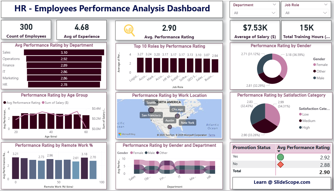
In this tutorial I’ll walk you step-by-step to recreate the HR — Employees Performance Analysis dashboard (the image you shared). We’ll start from a CSV, prepare the data, create a few calculated columns and measures (including AVERAGE(hrdata[Performance Rating]) and the Satisfaction Category using SWITCH), then design the report page with KPIs, charts, and slicers — just like a polished Power BI report.
1) Files & tools you need
- Power BI Desktop (latest)
- Your CSV file (example first row included in your message). Name it
hrdata.csv. - Optional: a company color theme JSON or font preferences.
- Here is the dataset : Human-resources-hr-employee-performance-dataset
CSV columns (from your example)
Employee ID, Employee Name, Department, Job Role, Joining Date, Experience (Years),
Age, Gender, Work Location, Working Hours (Per Week), Performance Rating,
Salary ($), Bonus ($), Training Hours (Per Year), Job Satisfaction Score,
Leave Days Taken, Remote Work (%), Promotion Status
2) Import & initial data prep (Power Query)
- Get Data → Text/CSV → hrdata.csv. Click Transform Data.
- In Power Query:
- Ensure column data types:
Employee ID→ Text,Joining Date→ Date/Time, numeric columns (Experience,Age,Working Hours,Performance Rating,Salary ($),Bonus ($),Training Hours,Job Satisfaction Score,Leave Days Taken,Remote Work (%)) → Decimal/Whole Number as appropriate. - Trim whitespace on text columns (
Employee Name,Department,Job Role,Work Location,Gender,Promotion Status). - Check for nulls and duplicates: decide how to handle duplicates (keep last record / flag).
- If
Joining Dateis2018-11-21 00.00.00style, change locale or useSplit Column -> By Delimiterto isolate date and convert to proper Date type.
- Ensure column data types:
- Create simple transformations here if required (e.g., fill down/up, remove rows with missing
Employee ID).
When done, click Close & Apply.
3) Create helper columns (Power Query or DAX)
You can create bins and categories either in Power Query or as DAX calculated columns. I usually do stable categorical transforms in Power Query and dynamic measures in DAX. Example helpful columns:
- Age Bin (Power Query or DAX):
0-25,26-35,36-45,46-55,56+ - Remote Work Bin: create intervals (0-25, 26-50, etc.)
- Satisfaction Category: user requested
SWITCHlogic — we’ll implement in DAX (next step).
4) Calculated column: Satisfaction Category (DAX)
You said: Low less than 3; Medium 4-7; above 7 high. There is a small gap for exact value 3 and values between 3 and 4 — I’ll make a clear rule:
Low= Job Satisfaction Score < 3Medium= Job Satisfaction Score >= 4 and <= 7High= Job Satisfaction Score > 7- For scores >=3 and <4 (e.g., 3.0–3.99) we’ll classify as Low for conservative grouping (you can change easily).
Create this calculated column in Data view → New column:
Satisfaction Category =
SWITCH(
    TRUE(),
    ISBLANK( hrdata[Job Satisfaction Score] ), "Unknown",
    hrdata[Job Satisfaction Score] < 3, "Low",
    hrdata[Job Satisfaction Score] >= 4 && hrdata[Job Satisfaction Score] <= 7, "Medium",
    hrdata[Job Satisfaction Score] > 7, "High",
    "Low"  -- fallback for 3 to <4, adjust if you prefer Medium
)
Explanation: SWITCH(TRUE(), ...) is a flexible pattern to evaluate ranges. Adjust the fallback to suit your policy.
5) Core DAX measures (KPIs)
Create measures in Modeling → New measure. Important base measures:
-- Count of Employees
CountEmployees = DISTINCTCOUNT( hrdata[Employee ID] )

-- Average Experience
AvgExperience = AVERAGE( hrdata[Experience (Years)] )

-- AVERAGE Performance Rating (as you requested)
AvgPerformanceRating = AVERAGE( hrdata[Performance Rating] )

-- Average Salary
AvgSalary = AVERAGE( hrdata[Salary ($)] )

-- Total Training Hours
TotalTrainingHours = SUM( hrdata[Training Hours (Per Year)] )
Additional measures you’ll find useful:
-- Avg Recovery by Department (example)
AvgPerf_ByDept = CALCULATE( [AvgPerformanceRating], ALLEXCEPT(hrdata, hrdata[Department]) )
Format these measures (Modeling pane) — set decimal places, currency for salary, display units (K) for training hours if large.
6) Page layout & KPIs (visual design)
- Set page size (16:9 or custom).
- Add a top title textbox: HR – Employees Performance Analysis Dashboard.
- Top row: create 5 KPI cards using Card or Multi-row card visuals and place them horizontally:
CountEmployeesAvgExperienceAvgPerformanceRatingAvgSalary(format currency)TotalTrainingHours(display as 15K or raw)
- Style: remove card backgrounds, set border/shadow, use company colors.
7) Visuals — replicate the dashboard
Below are the visuals you see in the image and what to drag/drop:
- Avg Performance Rating by Department
- Visual: Clustered Bar Chart
- Axis:
Department| Value:AvgPerformanceRating - Sort by value descending; show data labels.
- Top 10 Roles by Performance Rating
- Visual: Bar Chart (horizontal) with
Job Roleon Y andAvgPerformanceRatingon X; apply Top N filter (Top 10) onJob Roleby measureAvgPerformanceRating.
- Visual: Bar Chart (horizontal) with
- Performance Rating by Gender
- Visual: Donut Chart
- Legend:
Gender| Values:AvgPerformanceRating(or count/average depending display preference).
- Performance Rating by Age Group
- Visual: Combo (Clustered Column for avg rating by age bin; line for Salary sum if desired)
- Axis:
Age Bin| Values:AvgPerformanceRating&SUM(Salary ($))(secondary axis for salary).
- Performance Rating by Work Location (Map)
- Visual: Map / Filled Map or Bubble Map
- Location:
Work Location| Size:AvgPerformanceRatingorCountEmployeesas bubble size. Use categorical tooltips.
- Performance Rating by Satisfaction Category
- Visual: Donut / Pie showing average rating per
Satisfaction Category. Place percentages and labels.
- Visual: Donut / Pie showing average rating per
- Performance Rating by Remote Work % (bins)
- Visual: Clustered Column — create
RemoteWorkBincolumn usingGroupingor DAXBINand plotAvgPerformanceRating.
- Visual: Clustered Column — create
- Performance Rating by Gender and Department
- Visual: Stacked Area / Stream Graph / Stacked Bar with
Departmenton X,AvgPerformanceRatingas Y,Genderas Legend — to create the banded look.
- Visual: Stacked Area / Stream Graph / Stacked Bar with
- Promotion Status Table with Avg Performance
- Visual: Table or Matrix with rows
Promotion Statusand column showingAvgPerformanceRating. Add KPI markers via conditional formatting (e.g., color icons).
- Visual: Table or Matrix with rows
8) Filters and Interactivity
On the right pane add slicers (drop-down style) and sync them if you have multiple pages:
DepartmentJob RoleGenderWork LocationPromotion Status
Enable Edit interactions so slicers filter the visuals as required. Turn on cross-report tooltips or custom tooltip pages for richer hover content.
9) Formatting & polish
- Use a consistent theme (corporate colors). Import a JSON theme if you have one.
- Add shadows to card visuals (
Visual effects), rounded shapes with images, and ensure text sizes are legible. - For data labels: show value and maybe 1 decimal for ratings.
- Use Bookmarks and Buttons for storytelling (e.g., “View Top Performers”, “View Low Satisfaction”).
10) Validate & Publish
- Test slicer combinations and cross-filtering.
- Check performance: if dataset is large, consider aggregating in Power Query or a data model.
- Publish to Power BI Service and configure row-level security if necessary. Share with stakeholders via apps or embed in internal portals.
Closing notes (practical tips from my training experience)
- Keep your measures simple and well-named — this helps non-technical stakeholders understand the model.
- Document how
Satisfaction Categoryis created (note the convention for edge values like 3.0). If stakeholders prefer different boundaries, change the DAX accordingly. - Use tooltips to show supporting metrics (count of employees, median rating) so the chart tells a story without clutter.
- For live HR systems, schedule dataset refreshes and keep performance in mind — incremental refresh helps for large tables.