To create a KPI visualization in Power BI where Actual Sales is compared to Sales Target, follow these steps:
Step 1: Load Data into Power BI
- Open Power BI Desktop.
- Click on Home > Get Data > Excel and import the dataset.
- Click Load to add the data to Power BI.
Step 2: Create a KPI Visual
- Go to the Report view.
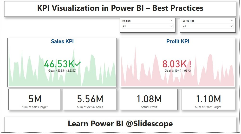
- Click on KPI Visual from the Visualizations pane.
- Drag and drop:
- Actual Sales → “Indicator” field.
- Sales Target → “Target Goals” field.
- Order Date → “Trend Axis” field (optional, for trend over time).
Step 3: Add Conditional Formatting (Red/Green Indicator)
- Click on the Format pane (paint roller icon).
- Go to Indicator → Enable Color Coding.
- Set Rules for Colors:
- If Actual Sales ≥ Sales Target → Green (Success ✅).
- If Actual Sales < Sales Target → Red (Alert ❌).
Alternative: Using Card Visual with Conditional Formatting
- Insert a Card Visual.
- Drag Actual Sales into the card.
- Click Format Pane > Data Label → Enable Conditional Formatting.
- Create a DAX Measure for color formatting:
Sales Performance = IF(SUM('Table'[Actual Sales]) >= SUM('Table'[Sales Target]), "Green", "Red") - Apply this measure to the Data Label Color in Conditional Formatting.
Final Output:
- A KPI visual that shows sales performance.
- Green indicator if Actual Sales ≥ Target.
- Red indicator if Actual Sales < Target.