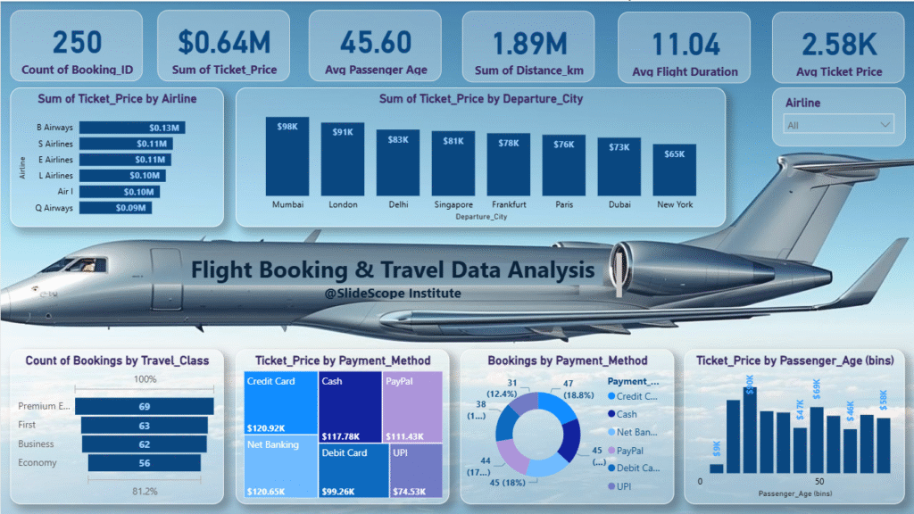
Data visualization is one of the most powerful skills in data analytics. It helps us understand complex datasets and extract meaningful insights quickly. Today, we’ll walk through a Flight Booking & Travel Data Analysis Dashboard, created by Ankit Srivastava, a Data Analytics Trainer at SlideScope Institute with over 10,000 students on Udemy.
This tutorial is designed for beginners who want to learn how to read and interpret dashboards. Let’s explore the different sections step by step.
1. High-Level KPIs (Top Section)
At the top of the dashboard, we see six key performance indicators (KPIs). These are summary metrics that give us a quick snapshot of the dataset:
- Count of Booking_ID (250): This means there are 250 flight bookings recorded in the dataset.
- Sum of Ticket Price ($0.64M): The total ticket sales revenue is $640,000.
- Average Passenger Age (45.60 years): On average, travelers are around 45 years old.
- Sum of Distance (1.89M km): Total distance covered by all flights combined is nearly 1.89 million kilometers.
- Average Flight Duration (11.04 hours): The average flight length is about 11 hours, which suggests many long-haul flights are included.
- Average Ticket Price ($2.58K): The typical ticket price is $2,580, indicating premium routes or higher-class travel.
👉 These KPIs are essential for executives who want a quick overview without diving into details.
2. Airline-Wise Ticket Sales
On the left side, we see a bar chart showing the sum of ticket prices by airline.
- B Airways ($0.13M) generated the highest revenue.
- Other airlines like S Airlines, E Airlines, L Airlines, and Air I contributed around $0.10M each.
- Q Airways had the lowest revenue ($0.09M).
👉 This helps compare airline performance and identify top contributors to revenue.
3. Ticket Price by Departure City
In the middle section, we see a column chart of ticket revenue by departure city.
- Mumbai ($98K) leads the chart, followed by London ($91K) and Delhi ($83K).
- Other major departure cities include Singapore, Frankfurt, Paris, Dubai, and New York.
👉 Airports and travel hubs with higher sales can be targeted for marketing and better partnerships.
4. Travel Class Distribution
At the bottom left, a bar chart shows booking counts by travel class:
- Premium Economy (69 bookings) is the most popular.
- First Class (63) and Business Class (62) are almost equal.
- Economy (56) is slightly less frequent.
👉 Interestingly, unlike many datasets where economy dominates, here we see strong representation from premium classes—suggesting a luxury travel market.
5. Payment Method Analysis
There are two visualizations for payment methods:
- Tree Map of Ticket Price by Payment Method
- Credit Card ($120.92K) and Net Banking ($120.65K) are the top contributors.
- Cash ($117.78K) and PayPal ($111.43K) also play significant roles.
- Debit Card ($99.26K) and UPI ($74.53K) contribute the least.
- Donut Chart of Bookings by Payment Method
- Shows the number of bookings by method.
- For example, Credit Card (47 bookings, 18.8%) is the most used.
👉 Combining both charts, we see not only how much money each method generated but also how many people used it.
6. Passenger Age vs Ticket Price
On the bottom right, we see a bar chart of ticket revenue by passenger age groups (bins).
- Passengers in their 30s and 40s generated the highest revenue.
- Younger and older passengers contribute less.
👉 This insight helps airlines with targeted marketing—offering premium services to middle-aged passengers who spend more.
7. Putting It All Together
This dashboard tells a story:
- The dataset represents 250 bookings worth $640K.
- Premium travelers dominate, and average ticket prices are high.
- Mumbai and London are major departure hubs.
- B Airways is the top revenue-generating airline.
- Credit Cards and Net Banking are the most preferred payment methods.
- Middle-aged travelers spend the most on tickets.
8. Why This Matters for Beginners
As a beginner, you should focus on:
- Reading KPIs first → Get a quick snapshot.
- Comparing categories → Airlines, cities, and travel classes.
- Understanding customer behavior → Payment preferences and age trends.
- Drawing actionable insights → For example, airlines can run targeted campaigns for 30–50 age groups.
This dashboard is a great learning example because it combines different chart types (bar, column, donut, tree map) and uses KPIs to summarize data effectively.
Final Thoughts
Dashboards like this transform raw data into a story. By looking at visuals, even someone without a data background can understand where the revenue comes from, who the customers are, and how they pay.
If you are just starting in data analytics, practice reading dashboards like this and try building your own using tools like Power BI, Tableau, or Excel.

