
This dataset represents internal operations and finance transactions within an organization. Each record captures a single business process activity such as procurement, maintenance, training, licensing, or support, along with its financial and operational details. The dataset is designed to help analyze budget planning versus actual spending, process efficiency, vendor dependency, and quality outcomes across departments and regions. By combining cost, time, and quality indicators in one structure, the dataset enables realistic business intelligence scenarios, including budget control analysis, operational performance tracking, and department-level cost optimization using tools like Power BI.
Dataset Columns and Their Meaning
| Column Name | Description |
|---|---|
| TransactionID | Unique identifier for each business transaction or process record |
| TransactionDate | Date on which the transaction or process activity occurred |
| Department | Internal department responsible for the transaction (e.g., Finance, Operations, HR, IT, Procurement) |
| Process | Type of business process performed, such as Procurement, Maintenance, Training, Licensing, or Support |
| Region | Geographic region where the transaction or process was executed |
| VendorType | Indicates whether the service or item was sourced internally, externally, or via contract |
| ExpenseCategory | Classification of expense type such as CapEx, OpEx, Services, or Subscriptions |
| PaymentMode | Method used to make the payment (Online, Cheque, or Bank Transfer) |
| Units | Number of units involved in the transaction or service |
| UnitCost | Cost per individual unit |
| ApprovedBudget | Budget amount approved for the transaction or process |
| ActualCost | Final cost incurred after execution |
| ProcessingDays | Number of days taken to complete the process |
| ProcessQualityScore | Quality rating of the process outcome on a defined scale (higher is better) |
Layout Setup
Step 1: Rename Excel Sheet
Download Sheet here: https://colorstech.net/wp-content/uploads/2026/02/Integrated_Operations_Finance_Dataset_200.xlsx
- Open Integrated_Operations_Finance_Dataset_200.xlsx
- Right-click the sheet tab
- Rename the sheet to:
finance_data
- Save and close the Excel file
Step 2: Load Dataset in Power BI Desktop
- Open Power BI Desktop
- Click Home → Get Data → Excel
- Select your Excel file
- In the Navigator:
- Select the sheet finance_data
- Click Load
✅ The table is now loaded into Power BI
Step 3: Prepare the Canvas (Before Adding Visuals)
- Go to View → Page Size
- Set:
- Page Size: 16:9
- Turn Gridlines ON (View → Gridlines)
- Keep Snap to grid ON
This helps keep alignment clean like your layout.
Step 4: Add the Title (Text Box)
- Go to Insert → Text box
- Paste this text:
Internal Operations & Finance Transactions Data Analysis
- Place it at the top center (as shown in your layout)
Formatting
- Font: Segoe UI / Arial
- Size: 28–32
- Font Color: Dark Blue
- Background: White
- Add Shadow ON (optional, matches your design)
Step 5: Add Bottom Banner (Shape)
This is the large blue rounded rectangle at the bottom.
- Go to Insert → Shapes → Rounded Rectangle
- Draw it across the full bottom width
Shape Formatting
- Fill color: Dark Blue
- Border: OFF
- Corner radius: High (rounded)
- Height: Enough to act as footer
This will act as a footer / branding strip.
Step 6: Add Image (Bottom-Left Icon)
- Go to Insert → Image
- Select your icon/illustration image
- Place it on the left side of the bottom banner
Tips
- Keep image small and clean
- Ensure transparent background (PNG preferred)
- Align vertically centered inside the banner
Step 7: Lock the Layout (Very Important)
After placing text, shape, and image:
- Select each element
- Use Format → Lock
This prevents accidental movement when you add charts later.
Step 8: What NOT to Add Yet
At this stage, do NOT add:
- Charts
- KPI cards
- Tables
- Slicers
This page is your dashboard shell.
Final Result (What You Have Now)
✔ Title at the top
✔ Clean white workspace
✔ Bottom branding banner
✔ Image aligned to footer
✔ Dataset loaded and ready
This is exactly how professional Power BI dashboards are started.
Filters Setup
Tutorial: How to Add and Style Filters (Slicers) Like This in Power BI
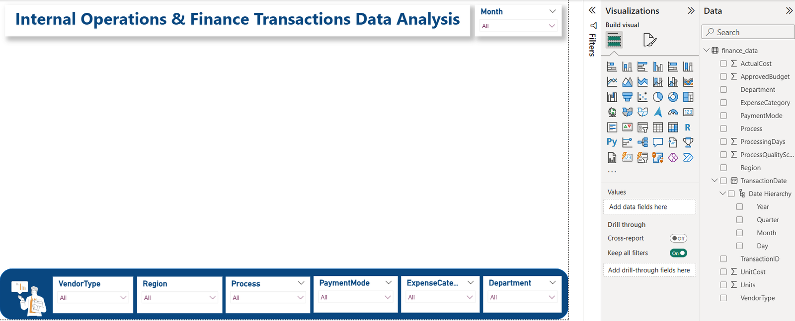
Step 1: Add the First Slicer (VendorType)
- Click anywhere on the canvas (empty area)
- In Visualizations pane, click Slicer (filter icon)
- A blank slicer appears
Assign Field
- Drag VendorType → drop it into the slicer Field
Step 2: Convert Slicer to Dropdown Style
- Select the slicer
- Click the three dots (⋯) on the slicer
- Choose Dropdown
Now it behaves exactly like your screenshot (All + dropdown).
Step 3: Format the Slicer (Important for Clean Look)
With slicer selected:
A) Slicer Header
- Go to Format → Slicer header
- Turn OFF
B) Title
- Go to Format → Title
- Turn ON
- Title text:
VendorType - Font size: 11–12
- Font color: Dark blue
- Alignment: Left
C) Values
- Go to Format → Values
- Font size: 10–11
- Color: Dark gray
Step 4: Resize and Place Inside Bottom Banner
- Resize slicer to small rectangle
- Place it inside the blue footer shape
- Align vertically center
📌 Do NOT stretch slicer too tall — keep it compact.
Step 5: Duplicate Slicer (Fastest Way)
Instead of recreating each one:
- Select the slicer
- Press Ctrl + C
- Press Ctrl + V
- Move copy to the right
Now just change the field.
Step 6: Change Fields for Each Filter
Repeat the following for each duplicated slicer:
| Slicer Title | Field to Drag |
|---|---|
| Region | Region |
| Process | Process |
| PaymentMode | PaymentMode |
| ExpenseCategory | ExpenseCategory |
| Department | Department |
For each slicer:
- Replace field in Field well
- Update Title text
- Keep formatting same
Step 7: Align All Filters Perfectly
- Select all slicers (Ctrl + click each)
- Go to Format → Align → Align Middle
- Then Format → Distribute Horizontally
This gives that professional straight line look.
Step 8: Remove Background & Border (Clean Look)
For EACH slicer:
- Format → Background → OFF
- Format → Border → OFF
This makes them blend into the footer.
Step 9: Lock the Filters (Very Important)
Once aligned:
- Select each slicer
- Format → Lock
This prevents accidental movement later.
Step 10: Add Month Filter (Top Right)
You already did this correctly 👍
But for completeness:
- Add slicer
- Drag TransactionDate → Month
- Convert to Dropdown
- Title:
Month - Place at top-right near title
Final Result Checklist (Match Your Screenshot)
✔ Dropdown slicers
✔ Inside footer banner
✔ Clean titles
✔ No borders
✔ Perfect alignment
✔ Month filter separate
You’ve built a real enterprise dashboard filter bar.
Step-by-Step: Creating Single-Value KPI Cards in Power BI
Assumption
Table name: finance_data
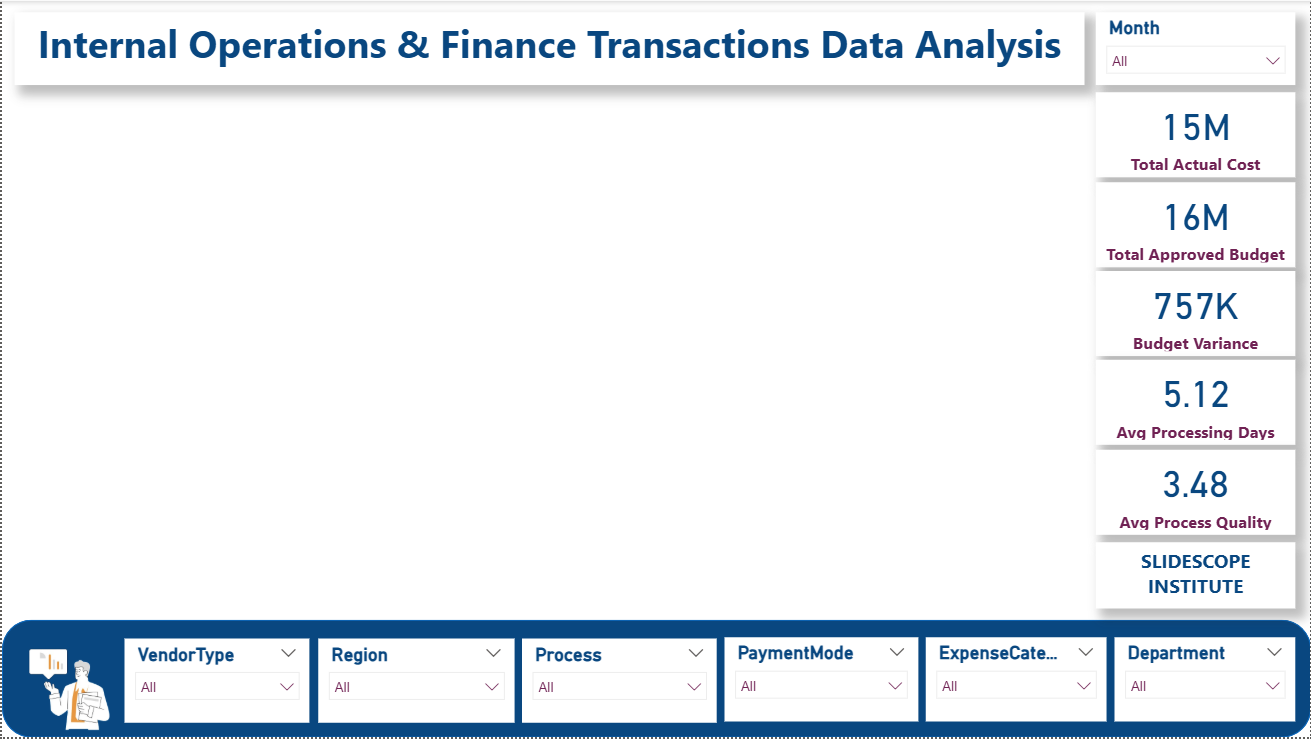
KPI 1: Total Actual Cost
Step 1: Create the Measure
- Go to Modeling → New measure
- Paste:
Total Actual Cost =
SUM(finance_data[ActualCost])
Press Enter
Step 2: Add Card Visual
- Click Card visual
- Drag Total Actual Cost → Fields
- Place the card below the title, above the main canvas
Step 3: Format the Card
- Callout value: ON
- Display units: Auto
- Decimal places: 0
- Category label: ON
Text:Total Actual Cost - Background: OFF
- Border: OFF
KPI 2: Total Approved Budget
Create Measure
Total Approved Budget =
SUM(finance_data[ApprovedBudget])
Add Card
- Duplicate first card (Ctrl+C → Ctrl+V)
- Replace field with Total Approved Budget
- Label:
Total Approved Budget
KPI 3: Budget Variance
Create Measure
Budget Variance =
[Total Approved Budget] - [Total Actual Cost]
Add Card
- Duplicate previous card
- Use Budget Variance
- Label:
Budget Variance
📌 Optional:
- Color → Green if positive, Red if negative (later step)
KPI 4: Average Processing Days
Create Measure
Avg Processing Days =
AVERAGE(finance_data[ProcessingDays])
Add Card
- Duplicate card
- Use Avg Processing Days
- Display units: None
- Decimal places: 1
- Label:
Avg Processing Days
KPI 5: Average Process Quality Score
Create Measure
Avg Process Quality =
AVERAGE(finance_data[ProcessQualityScore])
Add Card
- Duplicate card
- Use Avg Process Quality
- Display units: None
- Decimal places: 1
- Label:
Process Quality Score
Step: Align All KPI Cards
- Select all 5 cards (Ctrl + click)
- Format → Align → Align Top
- Format → Distribute Horizontally
They should sit neatly below the title, above the main visual area.
Step: Make KPIs Look Professional
For ALL cards:
- Font color: Dark Blue
- Callout value size: 28–32
- Category label size: 11–12
- Shadow: OFF (clean dashboard)
- Background: OFF
Final KPI Summary
| KPI Name | Purpose |
|---|---|
| Total Actual Cost | Shows real spending |
| Total Approved Budget | Shows planned budget |
| Budget Variance | Shows over/under spend |
| Avg Processing Days | Measures efficiency |
| Process Quality Score | Measures quality |
✅ You Now Have
✔ 5 Single-value KPIs
✔ Fully interactive with slicers
✔ Executive-ready KPI row
Step-by-Step: Adding 6 Visuals (2 Rows × 3 Visuals)
Table:
finance_data
All visuals will respond to slicers automatically
🔹 ROW 1 – Financial & Cost Analysis
✅ Visual 1: BAR CHART
Title: Actual Cost by Department
KPI / Measure Used
We will reuse:
Total Actual Cost =
SUM(finance_data[ActualCost])
Steps
- Insert → Clustered Bar Chart
- Drag:
- Department → Y-axis
- Total Actual Cost → X-axis
- Sort by Total Actual Cost (Descending)
Why this visual?
Shows which departments consume the most cost.
✅ Visual 2: PIE CHART
Title: Cost Distribution by Expense Category
KPI / Measure Used
Reuse:
Total Actual Cost
Steps
- Insert → Pie Chart
- Drag:
- ExpenseCategory → Legend
- Total Actual Cost → Values
- Turn Data labels ON
- Show Percentage
Insight
Quick view of CapEx vs OpEx vs Services vs Subscriptions.
✅ Visual 3: TREEMAP
Title: Actual Cost by Process
KPI / Measure Used
Reuse:
Total Actual Cost
Steps
- Insert → Treemap
- Drag:
- Process → Group
- Total Actual Cost → Values
Insight
Identifies cost-heavy processes at a glance.
🔹 ROW 2 – Efficiency, Budget & Trends
✅ Visual 4: FUNNEL CHART
Funnel Chart Tutorial: Budget Variance by Department
This funnel chart is used to analyze how budget variance is distributed across departments and to identify which departments contribute the most to overall budget deviation.
Step 1: Insert Funnel Chart
- In Power BI Desktop, click on an empty area of the canvas
- From the Visualizations pane, select Funnel Chart
A blank funnel visual will appear on the report canvas.
Step 2: Assign Fields to the Funnel
In the Fields section of the visual:
- Drag Department → Category
- Drag Budget Variance → Values
- Drag Total Actual Cost → Tooltips
- Drag Total Approved Budget → Tooltips
This configuration allows the funnel to rank departments based on their budget variance while providing financial context on hover.
Step 3: Sort the Funnel
- Click the three dots (⋯) on the funnel visual
- Select Sort by → Budget Variance
- Choose Descending
This ensures departments with the highest budget variance appear at the top of the funnel.
Step 4: Format the Funnel for Clarity
Data Labels
- Turn Data Labels ON
- Display Units: Auto
- Decimal Places: 0
Title
- Turn Title ON
- Title Text:
Budget Variance by Department - Alignment: Center
Background & Border
- Background: OFF
- Border: OFF
Step 5: Resize and Position
- Place the funnel in the second row of the dashboard layout
- Align it with other visuals using:
- Format → Align
- Format → Distribute
What This Funnel Shows
- Departments at the top have larger budget variance
- Narrowing sections represent lower variance
- Tooltips reveal:
- Actual spending
- Approved budget
- Slicers (Region, Process, Month, etc.) dynamically affect the funnel
When to Use This Funnel
This funnel is ideal for:
Management dashboards focused on cost discipline
Budget control analysis
Department-level financial reviews
✅ Visual 5: RIBBON CHART
Title: Department Spend Rank by Region
KPI / Measure Used
Reuse:
Total Actual Cost
Steps
- Insert → Ribbon Chart
- Drag:
- Region → X-axis
- Total Actual Cost → Y-axis
- Department → Legend
Insight
Shows how department spending rank changes across regions.
📌 This is exactly what Ribbon charts are meant for.
✅ Visual 6: AREA CHART
Title: Actual Cost Trend Over Time
KPI / Measure Used
Reuse:
Total Actual Cost
Steps
- Insert → Area Chart
- Drag:
- TransactionDate (Month) → X-axis
- Total Actual Cost → Y-axis
- Turn Continuous axis ON
Insight
Shows monthly spending trend and seasonality.
📐 Layout Instructions (Very Important)
Positioning
- Place 3 visuals in Row 1
- Place 3 visuals directly below in Row 2
- Keep equal height and width
Alignment
- Select visuals row-wise
- Format → Align Top
- Format → Distribute Horizontally
📊 Final Visual Summary (Clean)
| Visual | Type | KPI / Measure | Insight |
|---|---|---|---|
| 1 | Bar | Total Actual Cost | Department cost comparison |
| 2 | Pie | Total Actual Cost | Expense category mix |
| 3 | Treemap | Total Actual Cost | Process cost impact |
| 4 | Funnel | Budget vs Actual | Budget efficiency |
| 5 | Ribbon | Total Actual Cost | Rank change by region |
| 6 | Area | Total Actual Cost | Time trend |
✅ What You Have Now
✔ Executive KPIs
✔ Interactive slicers
✔ 6 meaningful visuals
✔ Clean, professional layout
✔ Interview & portfolio ready dashboard