
This tutorial explains how to design a professional HR analytics dashboard in Microsoft Excel to analyze employee job satisfaction across departments, roles, gender, promotion status, location, and salary. The final dashboard is fully interactive using PivotTables, PivotCharts, slicers, and formatting best practices.
Get The dataset here: https://github.com/slidescope/hr-job-satisfaction-excel-dashboard
1. Understanding the Dataset
Before starting, it’s critical to understand the dataset structure. Your dataset contains typical HR analytics fields such as:
- Employee ID
- Department
- Job Role
- Gender
- Work Location
- Salary (USD)
- Promotion Status (Yes / No)
- Job Satisfaction Score (numerical scale, e.g., 1–10)
Best Practice
- Ensure no blank headers
- Ensure consistent spellings (e.g., “HR” vs “Hr”)
- Convert the dataset into an Excel Table
Steps
- Select the entire dataset
- Press Ctrl + T
- Name the table (e.g.,
HR_Data) from Table Design → Table Name
This ensures dynamic updates when new data is added.
2. Defining Dashboard KPIs
The dashboard focuses on Average Job Satisfaction Score as the core metric, analyzed by:
- Department
- Job Role
- Gender
- Location
- Promotion Status
- Salary (distribution)
This clarity helps you plan charts before building them.
3. Creating PivotTables (Foundation)
All charts in this dashboard are driven by PivotTables.
Create a Pivot Sheet
- Go to Insert → PivotTable
- Select table
HR_Data - Place PivotTables on a new worksheet named
Pivots
This keeps raw data, pivots, and dashboard separate (clean architecture).
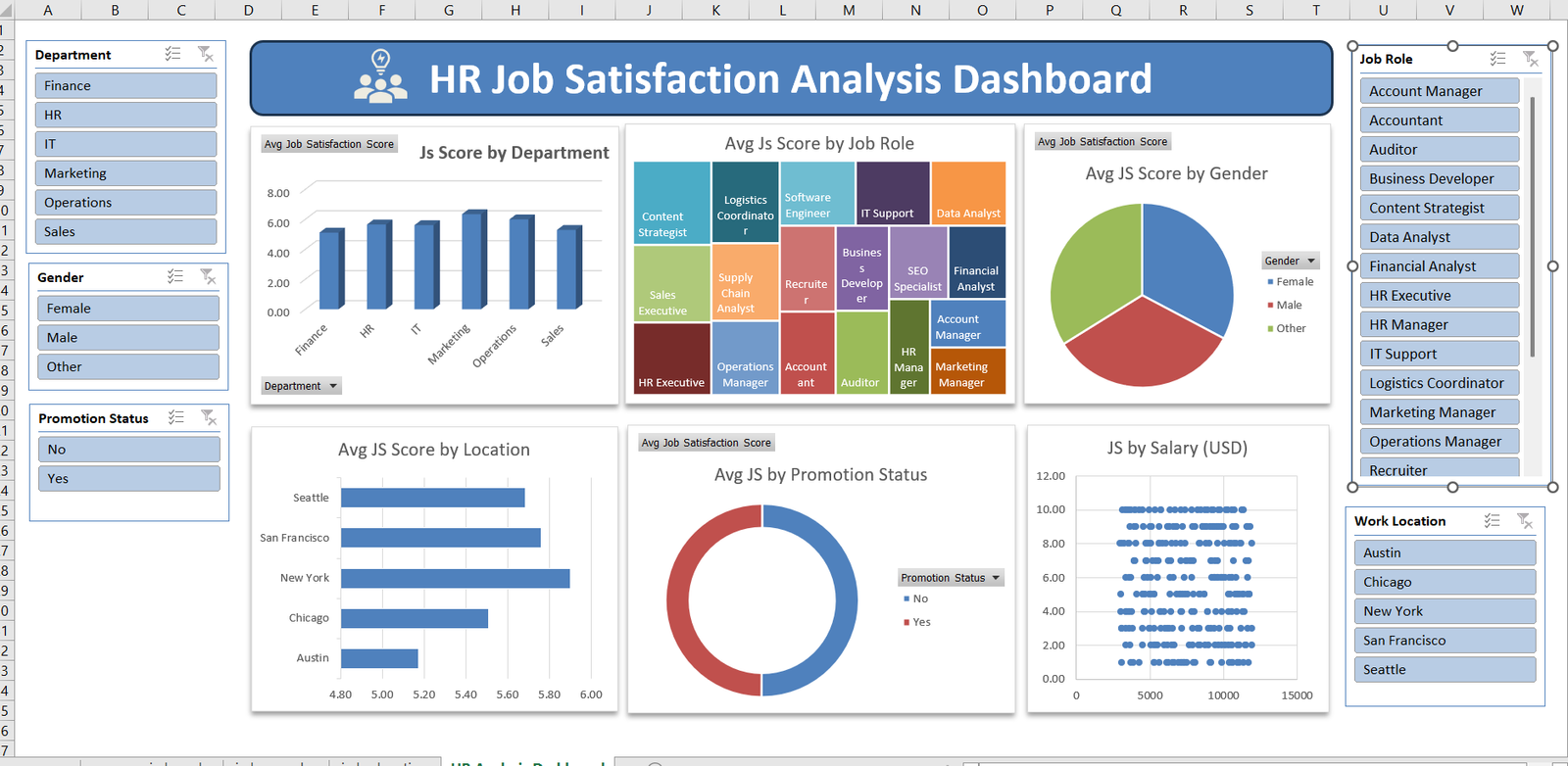
4. Avg Job Satisfaction Score by Department (Column Chart)
PivotTable Setup
- Rows → Department
- Values → Job Satisfaction Score
- Value Field Settings → Average
Chart
- Select PivotTable
- Insert → Column Chart → Clustered Column
- Rename chart title to
“Avg JS Score by Department”
Formatting Tips
- Remove gridlines
- Set Y-axis range (e.g., 0–10)
- Use a single professional color (blue)
This chart helps HR quickly identify which departments are most satisfied.
5. Avg Job Satisfaction Score by Job Role (Treemap)
This visualization highlights relative satisfaction by role.
PivotTable Setup
- Rows → Job Role
- Values → Avg Job Satisfaction Score
Chart
- Insert → Treemap Chart
- Title: “Avg JS Score by Job Role”
Why Treemap?
- Best for many categories
- Quickly shows top and low satisfaction roles
- Space-efficient for dashboards
6. Avg Job Satisfaction Score by Gender (Pie Chart)
PivotTable Setup
- Rows → Gender
- Values → Average Job Satisfaction Score
Chart
- Insert → Pie Chart
- Title: “Avg JS Score by Gender”
- Add legend on the right
Best Practices
- Use contrasting colors
- Avoid data labels clutter
- Keep pie charts limited to ≤ 4 categories (perfect here)
7. Avg Job Satisfaction Score by Location (Horizontal Bar)
PivotTable Setup
- Rows → Work Location
- Values → Average Job Satisfaction Score
Chart
- Insert → Bar Chart → Clustered Bar
- Sort values descending
- Title: “Avg JS Score by Location”
Horizontal bars improve readability for city names.
8. Avg Job Satisfaction by Promotion Status (Donut Chart)
This shows how promotions impact satisfaction.
PivotTable Setup
- Rows → Promotion Status
- Values → Average Job Satisfaction Score
Chart
- Insert → Doughnut Chart
- Inner hole size: ~60%
- Title: “Avg JS by Promotion Status”
Insight
This chart clearly shows whether promotions correlate with higher satisfaction.
9. Job Satisfaction vs Salary (Scatter Plot)
This is the most analytical chart on the dashboard.
Steps
- Insert → Scatter Chart
- X-Axis → Salary
- Y-Axis → Job Satisfaction Score
Purpose
- Identify correlation between pay and satisfaction
- Spot anomalies (high salary, low satisfaction)
Formatting
- Small markers
- No trendline (optional if teaching basics)
- Axis labels clearly defined
10. Adding Slicers (Interactivity Layer)
Slicers turn this into a dynamic HR decision tool.
Insert Slicers For:
- Department
- Gender
- Promotion Status
- Job Role
- Work Location
Steps
- Click any PivotTable
- PivotTable Analyze → Insert Slicer
- Select fields
Connect Slicers
- Right-click slicer → Report Connections
- Select all PivotTables
This ensures one slicer filters the entire dashboard.
11. Dashboard Layout Design
Sheet Setup
- Create new sheet →
Dashboard - Remove gridlines
- Use light background color
Structure
- Top: Dashboard Title
- Left: Slicers
- Center: Main charts
- Right: Additional filters (Job Role, Location)
Title Styling
- Use merged cells
- Bold font
- Icon (people / HR symbol)
- Blue background with white text
12. Formatting for Professional Look
Fonts
- Segoe UI / Calibri
- Consistent font size
Colors
- Blue for primary metrics
- Avoid too many colors
- Same color palette across charts
Alignment
- Use Align → Snap to Grid
- Equal spacing between visuals
13. Testing the Dashboard
Test scenarios:
- Filter one department → all charts update
- Select a job role → satisfaction recalculates
- Combine filters (e.g., IT + Female + Promoted)
This ensures leadership can ask real-time questions without manual analysis.
14. Business Use Cases
This dashboard enables:
- HR satisfaction audits
- Promotion impact analysis
- Departmental benchmarking
- Pay vs morale evaluation
- Strategic workforce planning
15. Final Notes
This Excel dashboard demonstrates that advanced HR analytics does not require Power BI or Tableau. With structured data, PivotTables, and thoughtful design, Excel becomes a powerful analytics platform.
Conclusion
This HR Job Satisfaction Analysis Dashboard clearly demonstrates how Microsoft Excel can be transformed into a powerful decision-support tool when data is structured, visualized, and interpreted correctly. By moving beyond basic spreadsheets and leveraging PivotTables, PivotCharts, slicers, and thoughtful dashboard design, Ankit’s approach showcases how HR analytics can be both insightful and accessible without relying on advanced BI tools.
One of the biggest strengths of this dashboard is its interactivity. The use of slicers allows HR managers, business leaders, and decision-makers to explore data dynamically—filtering by department, job role, gender, promotion status, and work location in real time. This eliminates the need for repetitive manual reports and enables instant insights during meetings, reviews, or strategic planning sessions. Instead of asking “Can we see this by department or by role?”, stakeholders can now answer those questions themselves in seconds.
The dashboard also excels in balanced visualization selection. Each chart type is chosen with a clear purpose: column charts highlight departmental comparisons, treemaps reveal job-role-level patterns, pie and donut charts summarize categorical differences, bar charts improve location readability, and the scatter plot uncovers the relationship between salary and job satisfaction. Together, these visuals tell a complete story of employee sentiment across the organization rather than presenting isolated metrics.
From a business perspective, the insights generated from this dashboard are highly actionable. HR teams can identify departments with lower satisfaction scores and investigate root causes such as workload, leadership, or growth opportunities. The promotion status analysis helps validate whether internal career progression is actually improving employee morale. The salary versus satisfaction scatter plot challenges the common assumption that higher pay always leads to higher satisfaction, encouraging organizations to focus equally on culture, recognition, and work-life balance.
Another key takeaway is scalability. Because the dataset is converted into an Excel Table and all visuals are Pivot-driven, the dashboard automatically updates when new employee data is added. This makes it suitable for monthly, quarterly, or annual HR reviews without redesigning the entire model. It also serves as an excellent foundation for more advanced analytics, such as trend analysis, attrition prediction, or performance-linked satisfaction scoring.
Finally, this project highlights an important learning outcome: Excel is still one of the most relevant analytics tools in 2025. For students, HR professionals, and analysts, mastering dashboards like this builds strong fundamentals in data modeling, visualization, and business storytelling. It bridges the gap between raw HR data and executive-level insights, proving that impactful analytics is less about tools and more about clarity, structure, and intent.
In summary, this HR Job Satisfaction Dashboard is not just a reporting artifact—it is a strategic analytics asset. It empowers organizations to make informed, people-centric decisions while offering learners a practical, real-world example of how data analytics drives measurable business value.