
By Ankit Srivastava
Understanding real estate pricing is one of the most important analytical skills today. Whether you’re a data analyst, business student, machine learning beginner, or someone interested in real estate investments—housing data gives you deep insights into how various property attributes influence price.
In this tutorial, I’ll walk you through how I built the Real Estate – Housing Price Analysis Dashboard in Power BI using the dataset available on Kaggle. We will explore:
✔ What the dataset contains
✔ Where to download it
✔ How to clean and transform the data
✔ How to build visualizations step-by-step
✔ Interpretation of each chart
✔ How exploratory analysis helps us choose ML model features
Let’s begin.
📥 Dataset Description & Download Link
The dataset comes from Kaggle and can be downloaded here:
Dataset Overview
This dataset contains housing sale records, along with key structural and amenity-based attributes. These include:
| Column | Description |
|---|---|
| price | Selling price of the house (Target variable for ML) |
| area | Total built-up area in square feet |
| bedrooms | Number of bedrooms |
| bathrooms | Number of bathrooms |
| stories | Number of floors |
| mainroad | Whether the house has access to the main road |
| guestroom | Whether there is an extra guest room |
| basement | Presence of a basement |
| hotwaterheating | Availability of hot water system |
| airconditioning | Whether AC is installed |
| parking | Number of parking spaces |
| prefarea | Whether the house is in a preferred locality |
| furnishingstatus | Furnish condition – furnished/semi/unfurnished |
Here are the first two rows:
| price | area | bedrooms | bathrooms | stories | mainroad | guestroom | basement | hotwaterheating | airconditioning | parking | prefarea | furnishingstatus |
|---|---|---|---|---|---|---|---|---|---|---|---|---|
| 13300000 | 7420 | 4 | 2 | 3 | yes | no | no | no | yes | 2 | yes | furnished |
| 12250000 | 8960 | 4 | 4 | 4 | yes | no | no | no | yes | 3 | no | furnished |
This dataset is perfect for exploratory data analysis, dashboarding, and machine learning.
📊 Step 1 – Importing Data Into Power BI
- Open Power BI Desktop
- Click Get Data → Text/CSV
- Select the downloaded dataset
- Power BI will preview the data
- Click Load
The dataset is clean, so no major transformations are required.
📘 Step 2 – Cleaning & Understanding the Data
Before building visuals, we must check:
✔ Data Types
- price → numeric
- area → numeric
- bedrooms, bathrooms, stories, parking → whole number
- mainroad, airconditioning… → text/categorical
✔ Missing Values
The dataset does not contain NULL values, which makes analysis smooth.
✔ Outliers
- Price ranges between approx 3M to 13M INR
- Area ranges from 1,500 to 16,000 sq ft
You can identify outliers in Power BI using scatter charts or in Power Query.
📊 Step 3 – Building the Dashboard Visuals
My dashboard includes:
- KPI Cards
- Bar Charts
- Donut Charts
- Stacked Bar Visuals
- Scatter Plot with Trendline
- Slicers for interactivity
Let’s go through each section.
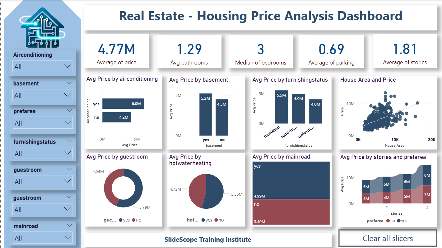
📍 KPI Section – The Summary of the Housing Market
1️⃣ Average Price
Shows the mean house price across dataset.
Useful for understanding baseline pricing.
2️⃣ Avg Bathrooms
Bathroom count strongly influences house valuation.
3️⃣ Median Bedrooms
Using median reduces skewness caused by luxury houses.
4️⃣ Average Parking
Indicates availability of parking space.
5️⃣ Avg Stories
Helps segment houses by structure.
These KPIs help the user quickly understand the typical property in the dataset.
📉 Visualization 1 – Avg Price by Airconditioning
Chart: Horizontal Bar Chart
Insight:
- Houses with air conditioning cost ~6M
- Houses without AC cost ~4.2M
This clearly shows AC adds significant value.
📉 Visualization 2 – Avg Price by Basement
Presence of a basement increases the price by nearly 1M INR.
Basements are rare in Indian cities, so they add premium value.
📉 Visualization 3 – Avg Price by Furnishing Status
Three categories:
- Furnished → highest price
- Semi-furnished → mid tier
- Unfurnished → lowest
This helps identify amenity-based premiums.
📉 Visualization 4 – Scatter Plot: Area vs Price
This is one of the most important visuals.
Why scatter plot?
Because it reveals:
✔ Correlation between area and price
✔ Outliers
✔ Trend line for predictive insights
Insight:
Bigger area = Higher price (positive correlation)
This feature will be crucial for ML models.
📉 Visualization 5 – Avg Price by Guestroom
Guestroom presence results in a clear price increase.
This helps evaluate layout-related features.
📉 Visualization 6 – Avg Price by Hot Water Heating
Hot water heating is a premium feature and increases price noticeably.
Urban premium properties often have this feature.
📉 Visualization 7 – Avg Price by Main Road
Properties connected to main roads have 6M+ pricing, compared to 3.4M for those that do not.
Main road access drastically influences real estate valuation.
📉 Visualization 8 – Avg Price by Stories and Prefarea
This combined bar chart helps compare:
✔ Multi-story vs. Single-story pricing
✔ Homes in preferred areas vs non-preferred
Key insights:
- 4-story houses have highest prices
- Preferred locality always costs more
This combined view is useful for urban planning and investment decisions.
🎛 Slicers Section
I added slicers for:
- Airconditioning
- Basement
- Prefarea
- Furnishingstatus
- Guestroom
- Mainroad
- Hotwaterheating
- Bedrooms
- Bathrooms
These slicers allow users to interact with the dashboard and isolate trends.
🔍 Step 4 – What We Learn From Exploratory Data Analysis (EDA)
Before building any machine learning model, EDA tells us:
✔ Which features impact price
✔ Which variables show strong correlation
✔ Which fields may be irrelevant
✔ Whether data is linear or non-linear
✔ Whether normalization/encoding is required
Let’s analyze key features.
1️⃣ Numerical Features (Continuous Variables)
- area
- bedrooms
- bathrooms
- stories
- parking
These are important for ML because they have:
✔ Clear range
✔ Strong correlation with price
✔ Predictive power
2️⃣ Categorical Features (Binary/Yes-No Variables)
- mainroad
- guestroom
- basement
- hotwaterheating
- airconditioning
- prefarea
These features also affect price significantly and will need label encoding for ML.
3️⃣ Furnished Status (Categorical – 3 Classes)
Needs one-hot encoding for ML models.
Furnished houses have clear price uplift.
4️⃣ Checking Multicollinearity
Some features may be correlated:
- bedrooms ↔ area
- bathrooms ↔ area
- stories ↔ furnished/perarea
These must be checked during the ML feature selection stage using:
✔ VIF
✔ Correlation Matrix
✔ Feature Importance Graph
🧠 Step 5 – Selecting Features for ML Model
After EDA, we can shortlist which features should be used for predicting price.
Let’s review feature usefulness:
| Feature | Should We Use it in ML? | Reason |
|---|---|---|
| area | ✔✔✔ | Strongest correlation with price |
| bedrooms | ✔✔ | Affects layout & price |
| bathrooms | ✔✔✔ | Strong pricing factor |
| stories | ✔✔ | Higher floors cost more |
| parking | ✔✔ | Premium amenity |
| mainroad | ✔✔✔ | Strong price separator |
| guestroom | ✔✔ | Moderate influence |
| basement | ✔✔ | Price uplift |
| airconditioning | ✔✔✔ | Significant price increase |
| hotwaterheating | ✔✔ | Niche but relevant |
| prefarea | ✔✔✔ | Premium locality marker |
| furnishingstatus | ✔✔ | Expensive amenity |
Discard?
None — every field contributes something.
Target Variable:
price
📈 Step 6 – How EDA Helps in ML Training
Machine Learning Models Applicable:
- Linear Regression
- Decision Trees
- Random Forest
- Gradient Boosting
- XGBoost
How EDA helps:
✔ Identifies important variables
✔ Helps detect non-linear relationships
✔ Guides feature engineering
✔ Helps decide whether log transformation is required
✔ Reveals outliers which may distort regression models
For example:
If scatter plot shows price has a non-linear pattern with area → use Random Forest instead of Linear Regression.
🎨 Step 7 – Design & Formatting Tips (Ankit’s Style)
To make the dashboard visually clean:
- Use uniform colors
- Keep KPI cards minimal
- Use icons for relatable storytelling
- Use Canva for background
- Keep slicers aligned and grouped
- Add a “Clear All Slicers” button
Power BI dashboards should feel smooth, intuitive, and professional.
📌 Final Takeaways
This real estate analysis dashboard helps answer:
✔ Which amenities increase house prices?
✔ How much does area influence price?
✔ What features matter most in valuation?
✔ Which fields should be used in ML models?
✔ Where do premium houses appear?
Through this Power BI project, you learn:
- Data import
- Cleaning
- KPI creation
- Visual design
- DAX basics
- Real estate analytics
- Feature selection for machine learning
A perfect combination of analytics + visualization + ML readiness.