
A Practical, Analytics-Driven Guide for Students, Professionals & Data Enthusiasts
As someone who has spent over a decade helping businesses grow using data-driven marketing, analytics, and automation, one of the biggest lessons I have learned is this: data tells a story, but only if you visualize it correctly. Whether I’m building an enterprise Looker Studio dashboard for a global brand, integrating GA4 + GSC + LinkedIn Insights for B2B funnels, or teaching data analytics at Slidescope Institute—visual storytelling remains the foundation of impactful decision-making.
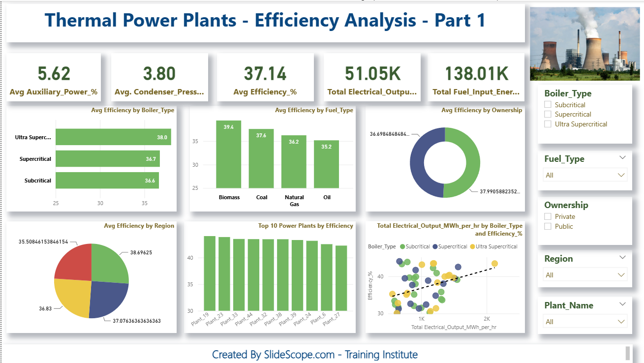
In this tutorial, I’ll walk you step-by-step through how to create a fully interactive Thermal Power Plant Efficiency Analysis Dashboard in Power BI—the same dashboard you see in the screenshot above. Our goal is simple:
✔ Convert raw plant-level operational data into meaningful insights
✔ Build slicers, DAX measures, KPI cards, charts, and drill-downs
✔ Understand how to structure a clean analytical story in Power BI
✔ Create a modern, professional dashboard suitable for industry use
This guide is written with beginners and working professionals in mind, and the steps are exactly the way I teach in my live IT training sessions at Slidescope Institute.
1. Understanding the Dataset
Before we open Power BI, we must understand the data model. For this dashboard, we use a dataset of 50 thermal power plants, each with parameters such as:
- Fuel Input Energy (GJ/hr)
- Electrical Output (MWh/hr)
- Steam Temperature & Pressure
- Condenser Pressure
- Auxiliary Power %
- Boiler Type
- Fuel Type
- Ownership
- Region
- Efficiency (%)
As I always tell my students:
“Good dashboards don’t start in Power BI. They start with good data understanding.”
Efficiency is calculated later using a DAX measure, but in the dataset, we already have the calculated percentage. Still, I encourage creating your own measure as a best practice.
2. Importing Data into Power BI
- Open Power BI Desktop
- Click Home → Get Data → Text/CSV/Excel
- Load your dataset
- Check column types (Power BI sometimes marks numeric columns as text)
A simple cleaning step:
- Select columns like fuel input, output, pressure, and temperature
- Format them as Decimal Number
Clear, well-formatted data ensures smooth DAX calculations later.
3. Creating Essential DAX Measures
If there’s one thing I emphasize repeatedly in training, it’s this:
DAX is the backbone of professional dashboards.
Here are the core measures we create:
1. Average Efficiency
Avg Efficiency % = AVERAGE('Data'[Efficiency_%])
2. Total Electrical Output
Total Electrical Output (MWh) = SUM('Data'[Electrical_Output_MWh_per_hr])
3. Total Fuel Input Energy
Total Fuel Input (GJ) = SUM('Data'[Fuel_Input_Energy_GJ_per_hr])
4. Average Auxiliary Power
Avg Auxiliary Power % = AVERAGE('Data'[Auxiliary_Power_%])
5. Average Condenser Pressure
Avg Condenser Pressure = AVERAGE('Data'[Condenser_Pressure_bar])
These measures directly power the KPI cards you see at the top of the dashboard.
4. Designing the Dashboard Layout
One thing I learned while designing Looker Studio dashboards for Vectra International is the importance of hierarchy and visual flow. The same principles apply in Power BI.
Here’s the exact layout structure I use:
Section 1 → KPI Cards (High-Level Metrics)
- Avg Auxiliary Power (%)
- Avg Condenser Pressure
- Avg Efficiency (%)
- Total Electrical Output
- Total Fuel Input Energy
These KPIs answer the question:
“What is happening at the fleet level?”
Section 2 → Breakdown Charts
- Bar chart: Avg Efficiency by Boiler Type
- Column chart: Avg Efficiency by Fuel Type
- Donut chart: Avg Efficiency by Ownership
- Pie chart: Avg Efficiency by Region
- Bar chart: Top 10 Power Plants by Efficiency
- Scatter chart: Output vs Efficiency (with Boiler Type legend)
This section addresses:
“Why is it happening?”
“Which plant types are performing better?”
Section 3 → Filter Panel
On the right side:
- Boiler Type
- Fuel Type
- Ownership
- Region
- Plant Name
This allows decision-makers to slice the entire dashboard instantly.
5. Building Each Visual (Step by Step)
Let’s walk through the visuals just like I do during classroom training.
A. KPI Cards
Go to:
Visualizations → Card
Use these measures:
- Avg Auxiliary Power %
- Avg Condenser Pressure
- Avg Efficiency %
- Total Electrical Output
- Total Fuel Input
Format with:
- Bold headers
- No background or transparent
- Rounded corners
- Green color for good performance metrics
B. Avg Efficiency by Boiler Type (Bar Chart)
Steps:
- Select Clustered Bar Chart
- Axis → Boiler_Type
- Values → Efficiency_% (Average)
- Sort by descending efficiency
Observation (as seen in the dashboard):
- Ultra Supercritical → Highest efficiency
- Subcritical → Lowest
This mirrors real-world performance patterns.
C. Avg Efficiency by Fuel Type
Use a Column Chart.
Axis → Fuel_Type
Values → Efficiency_%
In real engineering scenarios, Biomass often appears more efficient due to specific plant designs—our chart reflects that pattern.
D. Avg Efficiency by Ownership (Donut Chart)
I prefer donut charts for categorical percentages when the dataset has only two categories (Public vs Private).
Steps:
- Visual: Donut
- Legend: Ownership
- Values: Average Efficiency
E. Avg Efficiency by Region (Pie Chart)
Steps:
- Visual: Pie chart
- Legend: Region
- Values: Average Efficiency
This also works well when you want a geographic slice without map visuals.
F. Top 10 Plants by Efficiency (Bar Chart)
Steps:
- Select Bar Chart
- Axis: Plant_Name
- Values: Efficiency_%
- Filter → Top N → 10 by Efficiency %
This instantly highlights high-performing plants.
G. Scatter Chart – Output vs Efficiency
This visual tells a powerful story.
Steps:
- Visual: Scatter
- X-Axis: Electrical Output
- Y-Axis: Efficiency
- Legend: Boiler Type
- Add a Trend Line (Analytics → Trend Line)
In my digital marketing dashboards, scatter + trend lines help identify high-ROI campaigns; here they highlight high-output, high-efficiency plants.
6. Adding Slicers (Filters)
Go to Visualizations → Slicer
Create slicers for:
- Boiler_Type
- Fuel_Type
- Ownership
- Region
- Plant_Name
Use dropdown style for a clean, professional look.
7. Report theming and final touches
In my corporate dashboards (GA4, LI Insights, Meta Ads, CRM), branding and aesthetics matter just as much as analysis.
Apply these finishing touches:
✔ Use a consistent color palette
Green for performance
Blue for outputs
Yellow/red for variations
✔ Add borders & drop shadows for depth
✔ Use a clean header
“Thermal Power Plants – Efficiency Analysis – Part 1”
✔ Add your institute or brand tagline
“Created by Slidescope.com – Training Institute”
Small design details dramatically improve the dashboard’s impact.
8. Analyzing Insights (How to Read the Dashboard)
Key insight 1: Boiler Type Performance
Ultra Supercritical boilers show the highest average efficiency (~38%).
This is expected—higher pressure and temperature mean better thermodynamic performance.
Key insight 2: Fuel Type Variation
Biomass plants show the highest efficiency here.
Coal follows closely.
Key insight 3: Ownership Trends
Private plants tend to have slightly higher efficiencies, often due to better maintenance and modernization cycles.
Key insight 4: Regional Differences
Regions show different efficiency levels due to ambient temperature, cooling water availability, and plant age.
Key insight 5: Scatter Chart Trend
A positive trend line suggests that higher electrical output often correlates with better efficiency—common in large, modern plants.
This is why interactive dashboards matter:
You move from data → insights → decisions.
9. Exporting the Report
Once done:
File → Export → PDF or Publish to Power BI Service
You can even publish it to your own workspace and share with management or clients.
10. Final Advice (From My Experience as a Trainer & Analyst)
Whether it’s digital marketing analytics, power plant performance, or eCommerce conversion funnels—the principles are the same:
- Build clean data
- Use meaningful visualizations
- Add slicers for interactivity
- Keep the layout simple and consistent
- Convert numbers into insights
- Always ask: “What decision can this visual support?”
Power BI is not just a dashboard tool—it’s a decision engine.
If you practice dashboards like this regularly, you’ll soon be able to deliver industry-level analytics that drive real business impact.
And that’s exactly the skill I train professionals and students for at Slidescope Institute.