
By Ankit Srivastava
If you’ve ever wanted to analyze your business data visually — from total revenue to city-wise performance — Power BI is the tool you’ve been looking for. In today’s tutorial, we’ll go step-by-step through how I created this Electrical Appliances Sales Analysis Dashboard using a simple CSV dataset of appliance sales across multiple cities and stores in India.
We’ll explore how to connect data, model relationships, create calculated measures, and design an interactive dashboard that tells the full story of your sales performance.
So let’s dive in!
🧾 Dataset Overview
Here’s a quick look at the dataset I used:
| Column Name | Description |
|---|---|
| Date | The date of each transaction |
| City | City where the sale occurred (e.g., Delhi, Lucknow) |
| Store | Store identifier (Store_1 to Store_10) |
| Category | Product category (e.g., AC, Heater, Fan) |
| Product | Specific appliance name (e.g., CoolBreeze AC, AquaHot) |
| Quantity_Sold | Number of units sold |
| Unit_Price | Price per unit in INR |
| Discount_% | Discount percentage applied |
| Revenue | Total amount before discount |
| Final_Price | Net amount after discount |
| Temperature_C | Outdoor temperature (°C) on sale day |
Get the Dataset Here: https://colorstech.net/practice-datasets/data-driven-insights-sales-patterns-of-electrical-appliances-vs-daily-temperature/
Each record represents a single transaction.
Step 1: Import Data into Power BI
Open Power BI Desktop → Click Get Data → Text/CSV → Browse to your file.
Once imported, you’ll see Power BI automatically detect column types (like Date, Text, and Number). Verify everything looks correct before loading it into your model.
If you have a large dataset, apply data profiling in the Power Query editor to check for missing values, duplicates, or inconsistent text entries (for example, “Lucknow” vs “Lucknow City”). Clean them up early for smooth visuals later.
Step 2: Data Preparation and Measures
Once loaded, we’ll create key DAX measures to calculate KPIs like total revenue, average discount, and total final price.
Example DAX Measures:
Revenue = SUM(Sales[Revenue])

Final_Price = SUM(Sales[Final_Price])

Avg_Revenue = AVERAGE(Sales[Revenue])

Avg_Discount_% = AVERAGE(Sales[Discount_%])

Total_Discount_Value = SUMX(Sales, Sales[Revenue] - Sales[Final_Price])
💡 Tip: Using measures instead of calculated columns keeps your model efficient and ensures calculations update dynamically with slicers and filters.
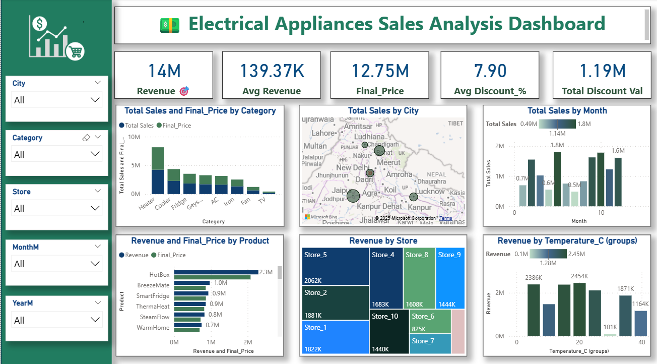
Step 3: Create KPI Cards
At the top of the dashboard, I created KPI cards for a quick summary view:
- Revenue (14M) – Total sales before discount
- Avg Revenue (139.37K) – Average revenue per transaction
- Final Price (12.75M) – Net sale after discounts
- Avg Discount % (7.90%) – Average discount offered
- Total Discount Value (1.19M) – Cumulative discount amount
Use the Card visual in Power BI and select your DAX measures. Adjust font size and background to make them visually appealing.
To add a goal icon 🎯 (like mine), insert a small image beside the card or use Power BI icons.
Step 4: Build Visuals for Detailed Insights
Now that our KPIs are ready, let’s move to the most interesting part — the visuals!
1. Total Sales and Final Price by Category
Visual Type: Clustered Column Chart
Fields:
- X-axis → Category
- Y-axis → Revenue and Final_Price
This chart helps compare which appliance category performs best both before and after discounts.
You can see in my dashboard that Heaters and Coolers contribute the most, while smaller categories like Fan and TV show minimal impact.
2. Total Sales by City (Map Visual)
Visual Type: Filled Map
Fields:
- Location → City
- Size → Revenue
Power BI automatically maps each city based on name. This visualization shows which cities drive the most sales.
From the dashboard, you can clearly see that Delhi, Kanpur, and Lucknow dominate in terms of total sales — indicating strong regional demand.
3. Total Sales by Month
Visual Type: Clustered Column Chart
Fields:
- X-axis → Month
- Y-axis → Total Sales
Create a calculated column for Month using:
MonthM = FORMAT(Sales[Date], "MM")
This helps group transactions by month.
You’ll notice some months like March and October show peak sales — possibly due to seasonal promotions or temperature-driven demand.
4. Revenue by Store
Visual Type: Tree Map
Fields:
- Group → Store
- Values → Revenue
This visualization helps identify which stores perform best.
From my dashboard, Store_5 leads with ₹2.06M in sales, while smaller stores like Store_6 or Store_7 show lower contributions.
It’s a great way to visualize proportional performance at a glance!
5. Revenue by Temperature (°C Groups)
Visual Type: Column Chart
Since the dataset includes outdoor temperature, I grouped them into bins (0–10°C, 10–20°C, etc.) using Power BI’s Grouping feature.
This chart reveals how weather influences appliance sales. For example, Heaters spike in colder temperatures, while Coolers and ACs perform better around 25–30°C.
It’s a beautiful way to combine environmental data with business metrics for smarter insights.
6. Revenue and Final_Price by Product
Visual Type: Bar Chart
Fields:
- Y-axis → Product
- X-axis → Revenue, Final_Price
Products like HotBox and BreezeMate lead the revenue charts, showing consistent high demand.
If you hover on bars, tooltips show exact values, helping store managers analyze performance product-by-product.
Step 5: Add Interactive Filters (Slicers)
On the left side of the dashboard, you’ll notice a vertical panel of slicers for dynamic filtering:
- City
- Category
- Store
- MonthM
- YearM
These slicers let you filter visuals in real-time. For example:
- Choose Lucknow → instantly all charts update for that city.
- Select Heater → see its performance across stores and months.
💡 Pro tip: Use single-select slicers for city or category, but allow multi-select for month or year for deeper comparisons.
Step 6: Dashboard Design and Formatting
Here’s what gives your Power BI report a professional touch:
✅ Color Theme
I used a green and white theme to represent sustainability and energy — perfectly matching the “Electrical Appliances” concept.
You can customize it under View → Themes → Customize Current Theme.
✅ Consistent Shadows and Borders
Use slight shadows (4–6%) for each visual container. It adds depth and gives a clean, modern UI.
✅ Custom Icons
I added icons for “Sales,” “Discount,” and “Analytics” in the left header using Power BI’s Insert → Image.
✅ Header Alignment
All KPIs are evenly spaced on the top row with consistent font sizes (typically Segoe UI, 18–24pt).
✅ Page Setup
Set your report canvas size to 16:9 ratio (1280×720) to ensure perfect viewing on both desktop and online Power BI Service.
Step 7: Insights from the Dashboard
After analyzing the dashboard, here are a few quick business insights we can draw:
- Top Categories: Heaters and Coolers dominate, accounting for over 60% of total revenue.
- City Performance: Delhi and Lucknow lead in sales, showing strong northern region demand.
- Seasonal Trends: Colder months boost heater sales, while warm months favor coolers.
- Discount Impact: Average 7.9% discount led to ₹1.19M in total deductions — indicating room to optimize pricing strategies.
- Store Performance: Store_5 and Store_2 outperform others — their sales strategy could be replicated across low-performing outlets.
- Temperature Correlation: Sales correlate directly with external temperatures — showcasing potential for predictive sales models using weather data.
Step 8: Publish and Share
Once your dashboard looks perfect:
- Click Publish → Choose Power BI Workspace.
- Share it with your team using Power BI Service.
- You can also embed it in Microsoft Teams, SharePoint, or your business portal.
Set up scheduled refresh if your CSV file updates regularly — ensuring your insights always stay up to date.
Step 9: Future Enhancements
To take this dashboard further, here’s what I’d suggest:
- Add Profit Margin = (Final_Price – Cost).
- Introduce Forecast visuals to predict seasonal sales.
- Connect real-time weather API to correlate live data.
- Create a Store Ranking KPI to highlight top 3 outlets dynamically.
- Build a Drill-through page for deep dive into each city.
Final Thoughts
This Power BI project beautifully shows how a simple CSV can turn into a professional, interactive business dashboard.
It doesn’t just display data — it tells a story of how sales fluctuate across cities, stores, months, and even temperatures.
For business managers, such dashboards enable quick decisions:
- Where to push inventory?
- Which store to reward?
- When to run seasonal discounts?
And that’s the real power of Power BI.