
📘 Introduction
Managing hospital operations efficiently requires data-driven insights. This tutorial walks you through creating a Hospital Management System: Staff Availability Dashboard in Power BI using a Kaggle dataset. The dashboard visualizes staff distribution, patient flow, morale, and refusal rates—helping administrators optimize hospital performance.
By the end of this project, you’ll learn data modeling, DAX formulas, custom table creation, and visualization techniques in Power BI.
Step 1: Download the Dataset
You can download the dataset from Kaggle:
👉 Hospital Beds Management Dataset
After downloading, unzip the dataset folder. It contains the following four CSV files:
hospital_staff.csv– List of hospital staff (doctors, nurses, assistants)hospital_patients.csv– Patient admission and service datahospital_service_weekly.csv– Weekly data on services and operationshospital_staff_schedule.csv– Weekly staff schedule and availability
⚠️ Note: This is a synthetic dataset created for educational and analytical use only. It doesn’t represent real hospital or patient data.
Step 2: Load Data into Power BI
- Open Power BI Desktop.
- Click Home → Get Data → Text/CSV.
- Load all four CSV files one by one.
- After loading, rename them as:
staffpatientsservice_weeklystaff_schedule
- Click Transform Data to open the Power Query Editor.
- Verify column headers, data types, and remove any blank or null rows.
Step 3: Data Modeling – Building Relationships
Now it’s time to create relationships among the tables:
staff_schedule[staff_id]→staff[staff_id]staff_schedule[service]→service_weekly[service]staff_schedule[week]→service_weekly[week]patients[service]→service_weekly[service]
Also, create one date dimension table and a month dimension table to support time-based analysis.
Step 4: Create a Month Dimension Table
In Power BI, go to Modeling → New Table and create the following table:
MonthTable =
DATATABLE(
    "Month", INTEGER,
    "MonthName", STRING,
    {
        {1, "January"},
        {2, "February"},
        {3, "March"},
        {4, "April"},
        {5, "May"},
        {6, "June"},
        {7, "July"},
        {8, "August"},
        {9, "September"},
        {10, "October"},
        {11, "November"},
        {12, "December"}
    }
)
Then link your service_weekly[month] column to MonthTable[Month].
This ensures all visuals follow chronological order (Jan–Dec) instead of alphabetical.
Step 5: Create Calculated Tables for Staff Roles
Now create a summarized table showing staff count by week, month, and role.
staff_by_role =
SUMMARIZE(
    staff_schedule,
    staff_schedule[week],
    staff_schedule[month],
    staff_schedule[service],
    staff_schedule[role],
    "staff_count", DISTINCTCOUNT(staff_schedule[staff_id])
)
This summarizes staff members by role, week, and service.
Next, create a pivot-style summarized table for chart-friendly data.
staff_by_role_pivot =
SUMMARIZE(
    staff_by_role,
    staff_by_role[month],
    staff_by_role[service],
    "doctor", CALCULATE(AVERAGE(staff_by_role[staff_count]), staff_by_role[role] = "doctor"),
    "nurse", CALCULATE(AVERAGE(staff_by_role[staff_count]), staff_by_role[role] = "nurse"),
    "nursing_assistant", CALCULATE(AVERAGE(staff_by_role[staff_count]), staff_by_role[role] = "nursing_assistant")
)
This table allows easy visual comparison between doctors, nurses, and assistants.
Step 6: Create Key Measures
Now create a few key DAX measures for KPIs shown at the top of the dashboard:
Patients Count = COUNTROWS(patients)
Doctors Count = CALCULATE(DISTINCTCOUNT(staff[staff_id]), staff[role] = "doctor")
Staff Count = DISTINCTCOUNT(staff[staff_id])
Avg Patient Satisfaction = AVERAGE(patients[patient_satisfaction])
Avg Staff Morale = AVERAGE(staff_schedule[staff_morale])
These measures will power the KPI cards.
Step 7: Build Visualizations
Now let’s design visuals step by step.
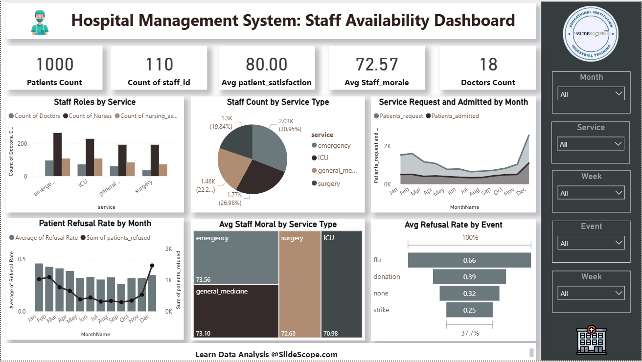
🟩 KPI Cards
- Patients Count
- Count of Staff
- Avg Patient Satisfaction
- Avg Staff Morale
- Doctors Count
Use the Card visual in Power BI and assign the above measures.
Staff Roles by Service (Clustered Column Chart)
- Axis:
service - Values:
doctor,nurse,nursing_assistant(fromstaff_by_role_pivot)
This compares staff composition per service (Emergency, ICU, etc.).
🟧 Staff Count by Service Type (Donut Chart)
- Legend:
service - Values: Staff count
This shows the distribution of total staff among different departments.
🟪 Service Request and Admitted by Month (Area Chart)
- Axis:
MonthName - Values:
Patients_request,Patients_admitted - Legend: Type of metric
It tracks patient requests and admissions across months.
🟨 Patient Refusal Rate by Month (Combo Chart)
- Columns: Average of
Refusal Rate - Line: Sum of
Patients Refused
This visual combines refusal trends with patient count for better correlation.
🟫 Avg Staff Morale by Service Type (Treemap)
- Group:
Service - Values: Average
Staff Morale
It highlights which service has higher or lower morale.
⬛ Avg Refusal Rate by Event (Bar Chart)
- Axis:
Event - Value: Average
Refusal Rate
This chart shows which events (e.g., flu season, donation drive, strike) lead to higher patient refusals.
Step 8: Add Filters and Slicers
Add slicers on the right panel for dynamic filtering:
- Month
- Service
- Week
- Event
These slicers make the dashboard interactive and suitable for presentation or analysis.
Step 9: Format the Dashboard
To make your dashboard professional:
- Use a light gray background with subtle drop shadows on visuals.
- Apply a consistent color palette: teal, beige, gray, and white (as in the image).
- Add custom icons for hospital, doctor, and data learning branding.
- Insert SlideScope logo or your institute logo.
- Add a footer:
Learn Data Analysis @SlideScope.com
Step 10: Add Insights and Interpretation
Once visuals are ready, observe key findings:
- Highest staff concentration is in Emergency and Surgery departments.
- Staff morale is relatively consistent (~72–74%).
- Refusal rate drops mid-year and spikes again in December (possibly due to flu season).
- Doctors are fewer but evenly distributed.
These insights help administrators allocate staff more effectively and improve satisfaction metrics.
💡 Learning Outcomes
Students completing this project will learn:
- How to connect and clean multiple hospital datasets.
- Data modeling and relationship creation in Power BI.
- Creating calculated tables using DAX (like
staff_by_role). - Writing DAX measures for KPIs and analysis.
- Designing visually consistent dashboards.
- Using slicers for interactive analytics.
- Understanding healthcare operational analytics.
Step 11: Save and Publish
- Save your Power BI file as:
Hospital_Staff_Availability_Dashboard.pbix - Click Publish → Power BI Service to share online.
- Create a workspace or embed it into your website or LMS for students.
✅ Final Dashboard Summary
Dashboard Title: Hospital Management System – Staff Availability Dashboard
Built Using: Power BI Desktop
Dataset Source: Kaggle – Hospital Beds Management
Creator: Ankit (SlideScope Institute)
Learning Topics: Power BI Data Modeling, DAX, Visualization Design, Healthcare Analytics