
By Ankit Srivastava, Data Analytics & Digital Strategy Trainer
Data analytics dashboards allow professionals to convert raw numbers into meaningful insights. In this tutorial, we’ll create an interactive Excel Dashboard that analyzes mobile app usage trends using real-world inspired data. The goal is to understand how users behave across different app categories, platforms, regions, and age groups — using Excel’s advanced visualization tools.
1. Understanding the Dataset
Our dataset includes performance metrics of various mobile apps. Each row represents one app with user activity and performance details.
The columns used are:
- App ID: Unique identifier (e.g., APP0001)
- App Category: App type (Education, Finance, Games, Social)
- User Age Group: Teen, Adult, or Senior
- Platform: Android or iOS
- Region: Geographic region such as Asia, Europe, or North America
- Daily Active Users (DAU): Average number of active users per day
- Average Session Time (mins): Average time spent in the app per session
- Crash Rate (%): App crash percentage
- Total In-App Purchases: Revenue earned from purchases
This dataset allows us to evaluate user engagement, app reliability, and monetization performance.
2. Cleaning and Structuring Data
Before creating visuals, always ensure your data is clean and formatted.
Steps:
- Remove blank rows or inconsistent entries.
- Verify data types (numbers should be numeric, not text).
- Rename columns for clarity (use short but descriptive names).
- Create a new sheet called “Dashboard” for visuals.
If you’re working with large datasets, convert your table to an Excel Table (Ctrl + T). This helps formulas and PivotTables update automatically.
3. Calculating Key Metrics
We’ll calculate a few summary KPIs at the top of the dashboard using simple formulas:
- Total Apps:
=COUNTA([App ID]) - Average DAU:
=AVERAGE([Daily Active Users]) - Average Session Time:
=AVERAGE([Average Session Time (mins)]) - Average Crash Rate:
=AVERAGE([Crash Rate (%)]) - Average In-App Purchase:
=AVERAGE([Total In-App Purchases])
These KPIs form the top section of our dashboard, giving a quick view of app performance.
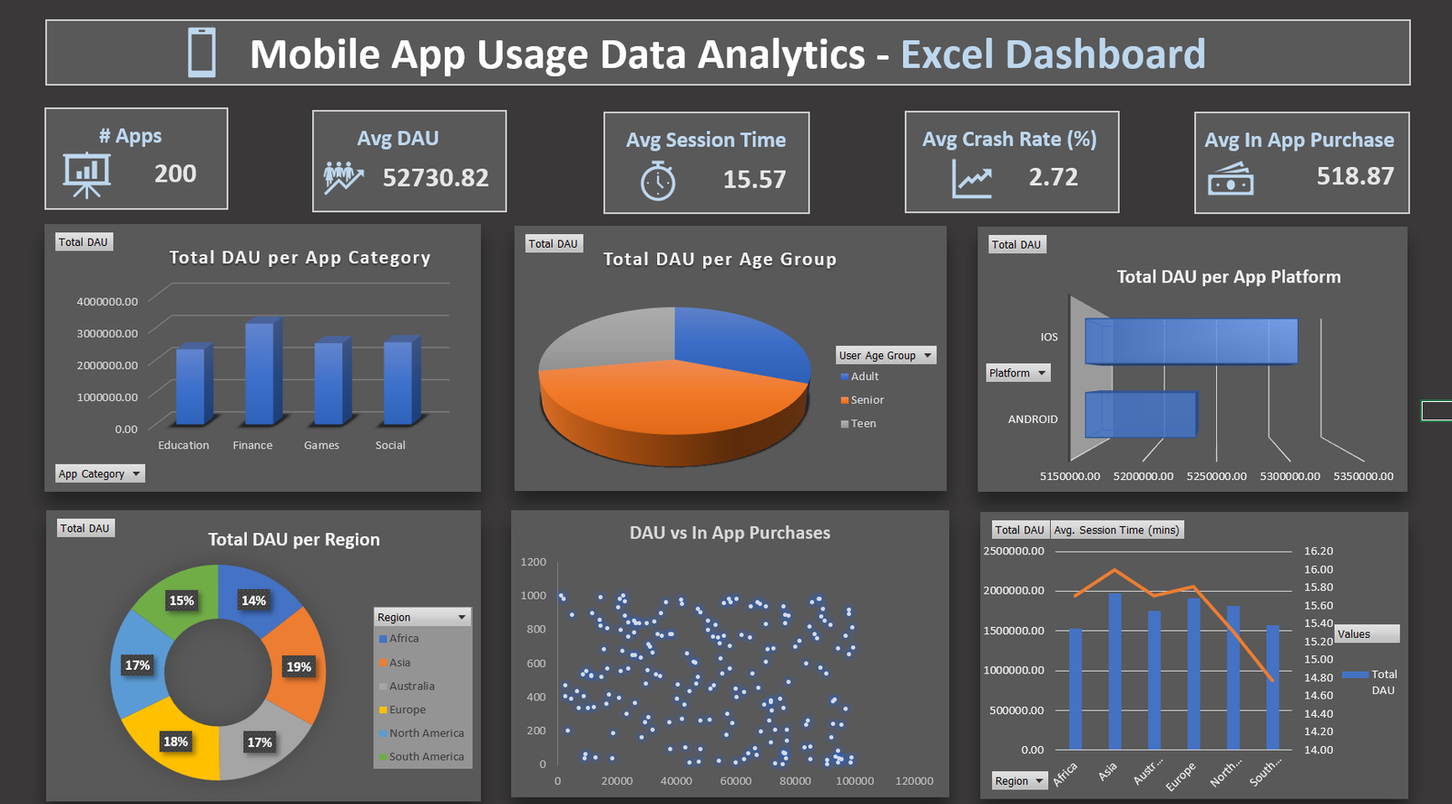
4. Creating Pivot Tables
Create Pivot Tables for each category of analysis:
- DAU by App Category
- Rows: App Category
- Values: Sum of Daily Active Users
- DAU by Age Group
- Rows: User Age Group
- Values: Sum of Daily Active Users
- DAU by Platform
- Rows: Platform
- Values: Sum of Daily Active Users
- DAU by Region
- Rows: Region
- Values: Sum of Daily Active Users
- DAU vs In-App Purchases (for Scatter Plot)
- Use the same dataset with both columns selected.
Each Pivot Table will feed data into the charts used in the dashboard.
5. Visualizing the Data
Now it’s time to create engaging visuals.
Choose chart types that best represent each metric:
- Column Chart – DAU per App Category
- Pie Chart – DAU per Age Group
- Bar Chart – DAU per Platform
- Donut Chart – DAU per Region
- Scatter Plot – DAU vs In-App Purchases
- Combo Chart – DAU and Session Time comparison by Region
Each chart should have clear titles and formatted axes. Use consistent colors (e.g., blue tones for data visuals).
6. Designing the Dashboard Layout
The dashboard should be clean and visually balanced. Here’s how to arrange it:
- Top row: KPI summary boxes (Apps Count, Avg DAU, Avg Session Time, Avg Crash Rate, Avg In-App Purchase).
- Middle section: Three visuals — DAU by Category, Age Group, and Platform.
- Bottom section: DAU by Region, DAU vs In-App Purchases, and Region-wise DAU & Session Time comparison.
Use shapes and icons from Excel’s Insert tab to add visual appeal.
Ankit’s dashboard uses a dark theme background with soft shadows for contrast, enhancing readability.
7. Adding Interactivity
To make the dashboard dynamic:
- Add Slicers for filters such as App Category, Region, and Platform.
- Connect all Pivot Charts to the same slicer for synchronized filtering.
This allows users to analyze data across different parameters instantly.
8. Refining the Dashboard
Polish your visuals with professional formatting:
- Remove gridlines and unnecessary borders.
- Apply consistent fonts and text sizes.
- Add a branded title:
“Mobile App Usage Data Analytics – Excel Dashboard by Ankit Srivastava” - Adjust alignment and spacing for a clean, centered layout.
9. Interpreting Insights
From the completed dashboard, we can derive insights such as:
- Finance apps have the highest DAU among all categories.
- iOS platforms show higher user engagement time compared to Android.
- Regions like Asia and North America lead in total DAU.
- Crash rates are lower in Teen user groups, indicating stable performance.
These insights help developers and product managers optimize their apps for better performance and user experience.
10. Exporting and Sharing the Dashboard
Once ready:
- Save your Excel file with charts linked to Pivot Tables.
- Export to PDF for sharing with management or clients.
- Optionally, record a walkthrough video explaining the dashboard insights.
Final Words from Ankit Srivastava
This project demonstrates how Excel can be a powerful tool for App Usage Analytics without needing advanced BI software.
By combining Pivot Tables, Charts, and Design Thinking, you can transform plain data into strategic insights.
If you found this tutorial useful, explore more dashboard creation lessons in Ankit’s Excel Analytics Series and strengthen your data visualization portfolio.