
By Ankit Srivastava – Lead Digital Marketing Analyst & IT Trainer at Slidescope Institute
🌟 Introduction
In the age of data-driven decisions, interactive dashboards have become the bridge between complex data and actionable insights. Whether you’re analyzing hospital treatment data, financial performance, or marketing KPIs, dashboards empower users to explore information visually — without deep technical intervention.
While Power BI and Tableau are popular visualization tools, the Python ecosystem now allows us to create fully interactive dashboards using libraries like Plotly and Pandas — right inside Jupyter Notebook or Google Colab.
In this tutorial, I’ll walk you through how to create a hospital treatment recovery analysis dashboard using real-like data. We’ll leverage Python Pandas for data manipulation and Plotly for visualization, creating an interactive, multi-chart layout that looks professional and insightful — just like a Power BI report.
🏥 The Dataset: Hospital Patient Treatment Data
Let’s start by understanding the dataset used in our dashboard.
It contains information about patient treatments across different hospital departments. Each record represents a patient and includes columns like:
| Column | Description |
|---|---|
| Patient ID | Unique identifier for each patient |
| Department | Medical department (e.g., Pediatrics, Orthopedics) |
| Treatment Type | Type of treatment (e.g., Surgery, Therapy, Medication) |
| Doctor Name | Attending physician |
| Gender | Male / Female / Other |
| Age | Patient’s age |
| Treatment Cost | Total treatment expense |
| Hospital Stay (Days) | Number of days admitted |
| Recovery Score | Patient recovery score (0–100 scale) |
Get the Dataset hospital-patient-treatment-dataset-for-analysis
🧮 Step 1: Load and Inspect Data using Pandas
import pandas as pd

# Load dataset
df = pd.read_csv('hospital_patient_data.csv')

# Basic info
print(df.head())
print(df.describe())
The Pandas library allows quick inspection and cleaning of data.
Before visualization, check for missing values and correct any inconsistencies — especially in numeric columns like Age and Treatment Cost.
🧠 Step 2: Summarize Key Metrics (KPIs)
Let’s compute high-level indicators similar to Power BI KPIs.
num_patients = df['Patient ID'].nunique()
avg_age = df['Age'].mean()
avg_stay = df['Hospital Stay (Days)'].mean()
avg_recovery = df['Recovery Score'].mean()
avg_cost = df['Treatment Cost'].mean()

print(f"Patients: {num_patients}, Avg Age: {avg_age:.2f}, Avg Stay: {avg_stay:.2f}, Avg Recovery: {avg_recovery:.2f}, Avg Cost: ${avg_cost:,.0f}")
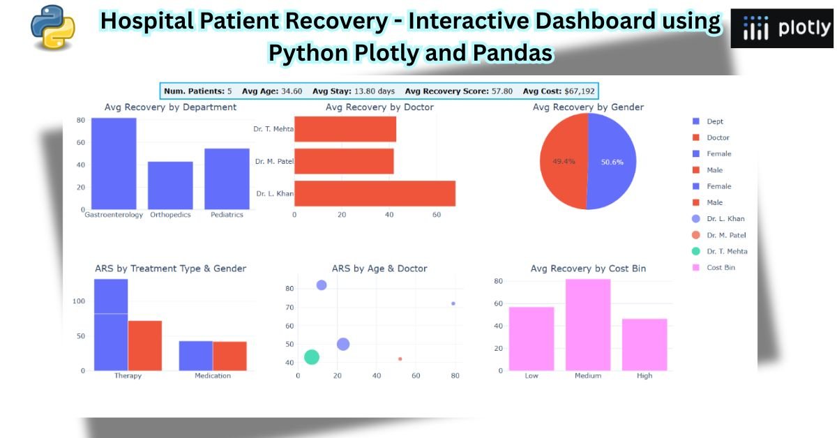
These metrics will later be displayed visually at the top of our dashboard — providing instant insights at a glance.
🎨 Step 3: Create Interactive Visualizations using Plotly
We’ll now use Plotly Express and Plotly Graph Objects to design charts.
Install dependencies (if not already available):
!pip install plotly pandas
Then import the required modules:
import plotly.graph_objects as go
from plotly.subplots import make_subplots
🔹 Chart 1: Average Recovery Score by Department
fig1 = go.Bar(
    x=df['Department'].unique(),
    y=df.groupby('Department')['Recovery Score'].mean(),
    marker_color='cornflowerblue',
    name='Avg Recovery Score by Department'
)
🔹 Chart 2: Average Recovery Score by Doctor
fig2 = go.Bar(
    x=df.groupby('Doctor Name')['Recovery Score'].mean().index,
    y=df.groupby('Doctor Name')['Recovery Score'].mean().values,
    orientation='h',
    marker_color='tomato',
    name='Avg Recovery by Doctor'
)
🔹 Chart 3: Recovery Score Distribution by Gender
fig3 = go.Pie(
    labels=df['Gender'].value_counts().index,
    values=df.groupby('Gender')['Recovery Score'].mean(),
    hole=0.4,
    name='Avg Recovery by Gender'
)
🔹 Chart 4: Recovery by Treatment Type and Gender
fig4 = go.Bar(
    x=df['Treatment Type'],
    y=df['Recovery Score'],
    color=df['Gender'],
    name='ARS by Treatment Type and Gender'
)
🔹 Chart 5: Recovery by Age Groups and Doctors
We can create age bins to see patterns across patient age ranges.
df['AgeGroup'] = pd.cut(df['Age'], bins=[0,20,40,60,80,100],
                        labels=['0-20','21-40','41-60','61-80','81-100'])

fig5 = go.Box(
    x=df['AgeGroup'],
    y=df['Recovery Score'],
    boxmean='sd',
    name='Recovery by Age Group'
)
🔹 Chart 6: Recovery Score vs. Treatment Cost
fig6 = go.Scatter(
    x=df['Treatment Cost'],
    y=df['Recovery Score'],
    mode='markers',
    marker=dict(size=10, color='seagreen', opacity=0.7),
    name='Recovery vs Cost'
)
🧩 Step 4: Combine All Visuals into a Single Interactive Dashboard
To make a cohesive dashboard, we’ll use Plotly Subplots.
from plotly.subplots import make_subplots

fig = make_subplots(
    rows=2, cols=3,
    specs=[[{'type':'xy'}, {'type':'xy'}, {'type':'domain'}],
           [{'type':'xy'}, {'type':'xy'}, {'type':'xy'}]],
    subplot_titles=(
        "Avg Recovery by Department",
        "Avg Recovery by Doctor",
        "Avg Recovery by Gender",
        "Recovery by Treatment Type and Gender",
        "Recovery by Age Group",
        "Recovery vs Treatment Cost"
    )
)
Now, add the traces:
fig.add_trace(fig1, row=1, col=1)
fig.add_trace(fig2, row=1, col=2)
fig.add_trace(fig3, row=1, col=3)
fig.add_trace(fig4, row=2, col=1)
fig.add_trace(fig5, row=2, col=2)
fig.add_trace(fig6, row=2, col=3)
🧾 Add KPI Summary and Title
To display KPIs at the top (similar to Power BI cards):
kpi_text = (
f"<b>Num. Patients:</b> {num_patients} "
f"<b>Avg Age:</b> {avg_age:.2f} "
f"<b>Avg Stay:</b> {avg_stay:.2f} days "
f"<b>Avg Recovery Score:</b> {avg_recovery:.2f} "
f"<b>Avg Cost:</b> ${avg_cost:,.0f}"
)
fig.add_annotation(
text=kpi_text,
xref="paper", yref="paper",
x=0.5, y=1.12,
showarrow=False,
font=dict(size=13, color="black"),
align="center",
bgcolor="#E8F4FA",
bordercolor="#00A8E8",
borderwidth=2,
borderpad=6
)
🧭 Add Layout and Styling
fig.update_layout(
    title=dict(
        text="🏥 Hospital Patient Treatment Data - Recovery Analysis<br><sup>Interactive Dashboard with Plotly & Pandas</sup>",
        x=0.5, xanchor="center"
    ),
    height=900,
    width=1300,
    template="plotly_white",
    margin=dict(t=180)
)
fig.show()
You’ll now have a fully interactive dashboard with dynamic tooltips, hover effects, legends, and beautiful styling — all running in your Google Colab notebook.
🔄 Step 5: Add Dropdown Filters (Optional Enhancement)
To make the dashboard more interactive, you can add dropdown filters for departments or doctors.
Example:
import plotly.express as px

fig = px.bar(df, x="Department", y="Recovery Score", color="Doctor Name",
             title="Interactive Filter - Recovery by Department")

fig.update_layout(
    updatemenus=[
        dict(
            buttons=list([
                dict(label="All", method="update",
                     args=[{"visible": [True]*len(df['Doctor Name'].unique())}]),
                *[
                    dict(label=doc, method="update",
                         args=[{"visible": [d==doc for d in df['Doctor Name']]}])
                    for d, doc in enumerate(df['Doctor Name'].unique())
                ]
            ]),
            direction="down",
            showactive=True,
        )
    ]
)
fig.show()
This enables users to filter and explore data dynamically, similar to slicers in Power BI.
🧠 Key Takeaways
- Pandas simplifies data preprocessing and KPI calculation.
- Plotly allows stunning visuals with interactivity — no need for a full BI tool.
- With make_subplots(), you can replicate professional dashboards easily.
- Adding filters, dropdowns, and interactivity makes analysis engaging.
- Google Colab or Jupyter Notebooks provide a perfect platform for such analytics without heavy installations.
🎓 Final Thoughts
As a data professional and educator, I’ve seen how dashboards transform how teams understand performance, whether in healthcare, marketing, or finance.
Creating dashboards using Python Plotly and Pandas is not only cost-effective but also deeply customizable — ideal for learners, analysts, and developers who want to bridge coding with analytics.
If you found this tutorial insightful, try recreating your own dashboard with datasets from your domain — it’s one of the best ways to learn data storytelling through Python.
📊 Learn Data Analytics, Power BI, and Python Dashboards – Contact Us