
By Ankit Srivastava | Data Analytics Trainer at SlideScope
In this tutorial, I’ll walk you through how I created the Customer Purchase Behavior and Shipping Analysis Dashboard entirely in Microsoft Excel — from raw dataset to interactive insights. This project is perfect for learning how to use Excel for Business Intelligence (BI), Exploratory Data Analysis (EDA), and Data Visualization.
🧩 Step 1 – Understanding the Dataset
The dataset includes essential columns such as:
- Review Rating – Customer feedback score for their purchase experience.
- Subscription Status – Indicates whether a customer is a recurring subscriber.
- Payment Method – Includes options like Cash, Credit Card, PayPal, Venmo, and Bank Transfer.
- Shipping Type – Standard, Express, or Priority shipping.
- Discount Applied and Promo Code Used – Show marketing effectiveness.
- Previous Purchases – Helps analyze repeat purchase behavior.
- Preferred Payment Method and Frequency of Purchases – Used for retention and loyalty insights.
- Date, Year, and Month – Allow time-based trend analysis.
I cleaned and formatted the data using Excel features like Remove Duplicates, Data Validation, and Text to Columns. Then, I converted the dataset into an Excel Table, which makes dynamic analysis easier.
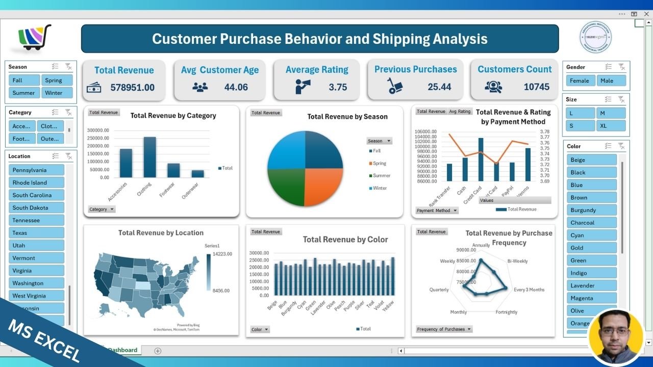
📈 Step 2 – Creating Pivot Tables
To make the dashboard dynamic, I created several Pivot Tables, each focusing on a different business metric:
- Total Revenue by Category – Summarized Accessories, Clothing, Footwear, and Outerwear sales.
- Total Revenue by Season – Grouped data by Spring, Summer, Fall, and Winter.
- Total Revenue by Payment Method – Combined both Total Revenue and Average Rating for dual-axis visualization.
- Total Revenue by Location – Used the Country or State field to prepare data for the Map Chart.
- Total Revenue by Color – Analyzed customer preferences based on color trends.
- Total Revenue by Purchase Frequency – Helped identify how often customers buy (Weekly, Monthly, Quarterly, etc.).
Each pivot table was placed on a separate sheet first to verify data accuracy. Once confirmed, I brought them together onto a single Dashboard sheet.
🧮 Step 3 – Adding Calculated Fields
To make the insights richer, I added calculated fields such as:
- Average Rating = AVERAGE(Review Rating)
- Customer Count = COUNTA(Customer ID)
- Total Revenue = SUM(Sales Amount)
These calculations were inserted using PivotTable Analyze → Fields, Items & Sets → Calculated Field.
🎨 Step 4 – Designing the Dashboard Layout
I began with a clean, modern layout:
- A top banner showing the dashboard title.
- Four KPI Cards:
- Total Revenue
- Average Customer Age
- Average Rating
- Previous Purchases
- Customer Count
These were created using simple shapes and cell references for live values. Conditional formatting was applied to highlight key metrics dynamically.
📊 Step 5 – Creating Charts
I used different chart types for visual diversity and clarity:
- Column Chart: Total Revenue by Category
- Pie Chart: Total Revenue by Season
- Combo Chart: Revenue and Rating by Payment Method
- Filled Map Chart: Total Revenue by Location
- Clustered Column Chart: Total Revenue by Color
- Radar Chart: Total Revenue by Purchase Frequency
Some charts like Map and Radar are not directly supported by PivotTables. To make them dynamic, I first inserted the chart, then used Select Data → Add → Range linked to Pivot Table values. This ensures filters still work properly.
🎛 Step 6 – Adding Interactive Filters (Slicers)
I added Slicers for quick interactivity:
- Season
- Category
- Location
- Gender
- Size
- Color
These slicers are connected to all pivot tables via Report Connections so users can interactively explore the data.
For instance, selecting “Summer” automatically updates all charts and KPIs to show performance during that season only.
🎯 Step 7 – Dashboard Formatting and Final Touches
- Applied a consistent color palette using blues and greys for a professional BI look.
- Removed unnecessary gridlines and chart borders.
- Used icons and shapes to make the top KPI section visually appealing.
- Added the SlideScope logo and footer credit.
Once finalized, I adjusted the layout for presentation mode and protected the sheet to prevent accidental edits.
🧠 Step 8 – Key Insights from the Dashboard
- Clothing generated the highest revenue overall.
- Payment methods like Cash and Credit Card showed the best average ratings.
- Purchases were balanced across all seasons, showing stable demand.
- States on the East Coast contributed more revenue compared to others.
- Frequent (weekly or monthly) buyers contribute a major portion of total sales.
🧩 Step 9 – Why This Dashboard Matters
This Excel dashboard goes beyond static reporting. It allows interactive business analysis — helping marketing teams identify customer patterns, finance teams track revenue sources, and managers understand which payment modes or colors drive higher satisfaction.
Even though this was built in Excel, it demonstrates BI principles similar to Power BI or Tableau.
✅ Step 10 – Learn With SlideScope
If you want to learn how to build such dashboards from scratch — including formulas, pivot charts, and dynamic design — join our Data Analytics and Business Intelligence Training Program at SlideScope.com.