
I’m Ankit Srivastava. I built this Fitness & Health Tracking — Exploratory Data Analysis (EDA) dashboard in Excel to quickly surface the health patterns that matter: steps, calories, workout time, sleep, and member counts. Below is a step-by-step walkthrough of how I created the dashboard, why I used certain Excel techniques, and a practical trick for making dynamic scatter plots (since PivotCharts don’t support XY scatter directly).
Get the dataset Fitness-health-tracking-dataset-for-data-analysis-and-ml-projects
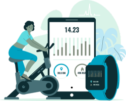
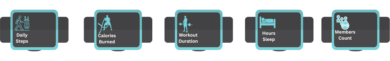
Project Images to use in Dashboard:
Step 1 — Prepare the raw data and convert to a Table
Start with a clean dataset: columns such as MemberID, Date, Gender, Age_Group, Diet_Preference, Activity_Type, Daily_Steps, Calories_Burned, Workout_Duration, Hours_Sleep. Select the range and press Ctrl+T to convert it into an Excel Table. Tables give you structured column names and automatic expansion — ideal for dashboarding and dynamic charts.
Step 2 — Create PivotTables for aggregated metrics
Insert one or more PivotTables from the Table. Use pivot rows like Age_Group, Gender, Diet_Preference, and values aggregated as averages or counts (e.g., Avg Calories_Burned, Avg Workout_Duration, Member Count). These pivot summaries become the backbone for most charts and KPI calculations.
Step 3 — Build KPI cards
At the top of the dashboard I created KPI cards for quick glance values (Daily Steps, Calories Burned, Workout Duration, Hours Sleep, Members Count). I used simple formulas referencing PivotTable cells (or GETPIVOTDATA) to keep the KPI values dynamic with slicer filters. Large fonts, shapes, and consistent color fills make the cards readable at a glance.
Step 4 — Add Slicers for interactivity
Insert Slicers for Gender, Diet_Preference, Age_Group, and Activity_Type and connect them to the relevant PivotTables (right-click slicer > Report Connections). Slicers let you filter the whole dashboard interactively — great for ad-hoc comparisons like male vs female or one diet preference at a time.
Step 5 — Create PivotCharts for standard visuals
For categorical comparisons I used PivotCharts:
- Combo chart (clustered column + line) for Avg Calories Burned and Avg Workout Duration by
Age_Group. - Pie charts for Avg Calories by Gender and Calories by Activity.
- Horizontal bar chart for Calories Burn by Diet Preference.
PivotCharts are quick to build from pivots and respond to slicers automatically.
Step 6 — The scatter plot challenge (PivotCharts don’t support XY scatter)
Excel’s PivotChart types don’t include XY scatter, so to build Workout Duration vs Calories Burned and Steps vs Calories Burned scatter plots I used this approach:
- Create a small summary table (helper table) that holds the X and Y values you want. You can populate it dynamically via pivot output,
GETPIVOTDATA, or Excel 365 dynamic formulas (UNIQUE,FILTER,SUMIFS) so the helper updates when slicers change. - Insert → Charts → Scatter to create an empty scatter chart (or insert a placeholder scatter).
- Right-click the chart → Select Data → Add a new series. For Series X values, point to the helper table’s X column (e.g.,
Worksheet!$F$2:$F$100); for Series Y values, point to the Y column. Because the helper table is a proper Excel Table or named dynamic range, the scatter becomes dynamic and reacts to filter-driven helper values even though it’s not a PivotChart.
This method keeps scatter plots interactive while allowing aggregation logic to live in the Pivot/GETPIVOTDATA layer.
Step 7 — Style and formatting for clarity
Apply consistent colors, remove unnecessary gridlines, format axis labels, and use clear titles. KPI cards use bold numbers; charts should have legends and data labels only when they add value. Use subtle background shapes and spacing to separate sections visually (top KPIs, middle summary charts, bottom correlation scatter plots).
Step 8 — Validate insights and add annotations
After building charts, scan for outliers and add short annotations. In this dashboard you can quickly spot trends like higher average calories in the 36–50 group or a positive trend between workout duration and calories burned visible in the scatter. Use text boxes or callouts to highlight these observations.
Step 9 — Finalize interactivity and deliver
Ensure all slicers are connected and test combinations (e.g., Female + Vegan + 26–35 + Running). Save a copy as a template and consider protecting layout cells to avoid accidental edits. Provide a short guide for end users (which slicers to use and what KPIs mean).
Quick tips I follow
- Always use Excel Tables and named ranges for dynamic charts.
- Use
GETPIVOTDATAto keep KPI tiles linked and safe from pivot repositioning. - For scatter charts driven by pivots, create a helper summary table that aggregates values and base the chart on that table.
— Ankit