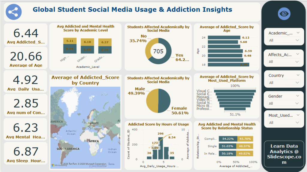
This Power BI dashboard titled “Global Student Social Media Usage & Addiction Insights” presents a comprehensive analysis of how students around the world use social media and how it impacts their academic performance, mental health, and overall lifestyle.
Power BI Course Tutorial for Beginners
Master Data Visualization and Business Intelligence!
4.4 Rating -
(Profile with 10,000+ Students)
How This Dashboard is Built in Power BI
🧩 1. Data Model
Data Sources : https://www.kaggle.com/datasets/adilshamim8/social-media-addiction-vs-relationships
- Survey responses from students globally
- Fields: Age, Gender, Academic Level, Country, Daily Usage Hours, Addiction Score, Mental Health Score, Platform Used, etc.
You should:
- Load the data into Power BI (via Excel, CSV, or database).
- Clean using Power Query (e.g., handling nulls, changing data types).
- Create calculated columns (e.g.,
Addicted_Score_Category) or DAX measures (e.g.,Average_Addicted_Score = AVERAGE(Students[Addicted_Score])).
🧮 2. Key Metrics and Cards (Left Column)
Visuals Used: Card Visuals
Purpose: Show overall averages to summarize dataset
Metrics:
- Average Addicted Score:
6.44 - Average Age:
20.66 - Average Daily Usage:
4.92hours - Average Number of Contacts:
2.85 - Average Mental Health Score:
6.23 - Average Sleep Hours:
6.87
📌 How to create:
Use a Card Visual and bind it to the respective Measure, e.g.:
Average_Age = AVERAGE(Students[Age])
📊 3. Bar & Column Charts
📌 Average Addicted & Mental Health by Academic Level
Visual Used: Clustered Column Chart
Shows:
- Addicted Score vs Mental Health Score for High School, Undergraduate, Graduate
💡 Tip: Use a shared axis (Academic Level) and two measures on Y-axis.
📌 Average Addicted Score by Age
Visual Used: Bar Chart
Y-axis: Age
X-axis: Average Addicted Score
Insight: Younger students (e.g., age 18) have higher addiction scores.
📌 Average Addicted Score by Most Used Platform
Visual Used: Bar Chart
Y-axis: Platform (e.g., Instagram, YouTube, Messaging apps)
X-axis: Addicted Score
You can create a DAX measure to calculate:
Avg_Addicted_By_Platform = AVERAGE(Students[Addicted_Score])
📍 4. Geographical Map
📌 Average Addicted Score by Country
Visual Used: Filled Map (Choropleth Map)
Shows how average addiction score varies across countries
💡 Tip: Ensure Country is formatted as Country/Region in Power BI to map correctly.
🍩 5. Pie Charts
📌 Students Affected Academically by Social Media
Visual Used: Donut Chart
Shows:
- 64.26% say YES
- 35.74% say NO
Filter Field: Affects_Academics (Yes/No)
📌 Gender Distribution of Academic Impact
Visual Used: Donut Chart
Shows impact split between male and female students:
- Female: 50.61%
- Male: 49.39%
📈 6. Scatter/Line or Bar + Count
📌 Addicted Score by Hours of Usage
Visual Used: Bar Chart with Line Overlay
- X-axis: Avg Daily Usage Hours (Grouped bins)
- Bar: Count of Students
- Line: Avg Addicted Score
Create a calculated column to bin hours and use dual-axis chart.
💕 7. Relationship Insights
📌 Avg Addiction & Mental Health by Relationship Status
Visual Used: Stacked Column/Clustered Column
Categories: Complicated, Single, In Relationship
Metrics:
- Addiction Score
- Mental Health Score
Helpful Measures:
Avg_Addicted_Rel = AVERAGE(Students[Addicted_Score])
Avg_Mental_Rel = AVERAGE(Students[Mental_Health_Score])
🧰 8. Filter Panel (Right Sidebar)
Filters/Slicers Added:
- Academic Level
- Affects Academics (Yes/No)
- Country
- Gender
- Most Used Platform
📌 How to create: Use Slicer Visual for each categorical field, set to dropdown for space efficiency.
📦 Extra Tips for Building This Dashboard:
- Use themes to match your design to the topic (youth-focused, vibrant).
- Keep your layout balanced – KPIs on the left, visuals center/right.
- Make sure tooltips are enabled for user interactivity.
- Drill-through pages can add deep-dives per country or platform.


