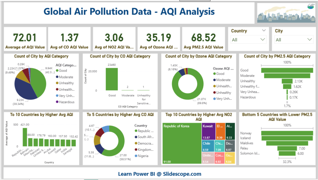
This Power BI dashboard titled “Global Air Pollution Data – AQI Analysis” is a comprehensive visualization of air quality index (AQI) metrics across cities and countries. Here’s a simple tutorial-style overview to help you understand its components and functionality:
Dataset Link : Click Here
🔷 Dashboard Title and Theme
- Title: Global Air Pollution Data – AQI Analysis
- The dashboard focuses on analyzing global AQI indicators like CO, NO2, Ozone, and PM2.5.
🔢 KPI Summary Cards (Top Row)
These cards display the global average values:
- Average of AQI Value – 72.01
- Avg of CO AQI Value – 1.37
- Avg of NO2 AQI Value – 3.06
- Avg of Ozone AQI Value – 35.19
- Avg of PM2.5 AQI Value – 68.52
These KPIs give a quick glance at overall air quality across pollutants.
📊 Visualizations Explained
1. Count of City by AQI Category (Pie Chart)
- Categories: Good, Moderate, Unhealthy, etc.
- Majority of cities fall in Moderate and Unhealthy categories.
2. Count of City by CO AQI Category (Bar Chart)
- Most cities show Good CO levels (over 23,000).
- Very few cities are in other categories.
3. Count of City by Ozone AQI Category (Donut Chart)
- Dominated by Good Ozone levels (89.8%).
4. Count of City by PM2.5 AQI Category (Bar Chart)
- Shows varying PM2.5 levels across AQI categories.
- Good and Moderate are most common; Hazardous is rare.
🌍 Country-wise Analysis
5. Top 10 Countries by Higher Avg AQI (Bar Chart)
- Republic of Korea, Bahrain, and Pakistan have high average AQI values.
- Republic of Korea tops with 500 AQI.
6. Top 5 Countries by Higher Avg CO AQI (Donut Chart)
- Shows contribution of countries like:
- Republic of Korea
- South Africa
- Nigeria, etc.
7. Top 10 Countries by Higher Avg NO2 AQI (Tree Map)
- Republic of Korea and Kuwait have highest NO2 levels.
8. Bottom 5 Countries with Lower PM2.5 AQI (Bar Chart)
- Cleanest air (lowest PM2.5):
- Norway
- Iceland
- Maldives
- Palau
- Solomon Islands
🔍 Filter Controls (Top-Right)
- Country Dropdown – Filter data by selected country.
- City Dropdown – Further drill down into city-level analysis.
📝 Summary
This Power BI dashboard offers a multi-angle view of global air pollution data:
- It’s useful for comparing air quality across countries and cities.
- The use of various visual types (bar, pie, donut, treemap) enhances clarity.
- Filters help users perform customized exploration.

