
import pandas as pd
import seaborn as sns
import matplotlib.pyplot as plt

# Define column names
columns = [
    "age", "workclass", "fnlwgt", "education", "education_num",
    "marital_status", "occupation", "relationship", "race", "sex",
    "capital_gain", "capital_loss", "hours_per_week", "native_country", "income"
]

# Load dataset
url = "https://archive.ics.uci.edu/ml/machine-learning-databases/adult/adult.data"
data = pd.read_csv(url, header=None, names=columns, na_values=" ?", skipinitialspace=True)

# Drop rows with missing values
data.dropna(inplace=True)

# Convert income to binary for better visualization
data['income'] = data['income'].apply(lambda x: 'Above 50K' if '>50K' in x else 'Below 50K')

# Set Seaborn style
sns.set(style="whitegrid")

# 1. Age distribution
plt.figure(figsize=(8, 5))
sns.histplot(data=data, x='age', kde=True, bins=30, color="blue")
plt.title("Age Distribution")
plt.xlabel("Age")
plt.ylabel("Frequency")
plt.show()

# 2. Income distribution by gender
plt.figure(figsize=(8, 5))
sns.countplot(data=data, x='income', hue='sex', palette='pastel')
plt.title("Income Distribution by Gender")
plt.xlabel("Income")
plt.ylabel("Count")
plt.legend(title="Gender")
plt.show()

# 3. Education level vs. income
plt.figure(figsize=(10, 6))
sns.countplot(data=data, y='education', hue='income', palette='cool')
plt.title("Education Level vs. Income")
plt.xlabel("Count")
plt.ylabel("Education Level")
plt.legend(title="Income")
plt.show()

# 4. Hours worked per week by income
plt.figure(figsize=(8, 5))
sns.boxplot(data=data, x='income', y='hours_per_week', palette='muted')
plt.title("Hours Worked per Week by Income")
plt.xlabel("Income")
plt.ylabel("Hours per Week")
plt.show()

# 5. Workclass distribution
plt.figure(figsize=(10, 6))
sns.countplot(data=data, y='workclass', palette='viridis', order=data['workclass'].value_counts().index)
plt.title("Workclass Distribution")
plt.xlabel("Count")
plt.ylabel("Workclass")
plt.show()

# 6. Pairplot for numerical features
numerical_features = ['age', 'fnlwgt', 'education_num', 'capital_gain', 'capital_loss', 'hours_per_week']
sns.pairplot(data=data, vars=numerical_features, hue='income', palette='coolwarm', diag_kind='kde', corner=True)
plt.suptitle("Pairplot of Numerical Features", y=1.02)
plt.show()
What is kde?
- KDE (Kernel Density Estimation) is a way to estimate the probability density function (PDF) of a continuous variable.
- It smooths the data using a kernel (usually Gaussian) to show the underlying distribution as a continuous curve, making it easier to identify trends or patterns.
When kde=True in Seaborn’s histplot, a smoothed curve is overlaid on the histogram, representing the data’s estimated density.
Observations from the Age Distribution:
- Shape:
- The distribution is positively skewed, with most individuals clustered around the middle age range (25–50 years).
- Fewer people are present at the extreme ends (young and old ages).
- Key Insights:
- The working-age population dominates the dataset, which aligns with the dataset’s focus on income and work-related attributes.
- A KDE curve helps highlight the smooth age density, showing peaks where the most frequent age groups lie.
This suggests that the dataset heavily represents individuals in their prime working years.
What is Box Plot
A box plot (or whisker plot) is a visualization tool used to summarize the distribution of a dataset and identify outliers. It provides a five-number summary:
- Minimum (Lower Whisker): The smallest value within 1.5 times the interquartile range (IQR) below the first quartile.
- First Quartile (Q1): The 25th percentile (the value below which 25% of the data falls).
- Median (Q2): The middle value (50th percentile) of the data.
- Third Quartile (Q3): The 75th percentile (the value below which 75% of the data falls).
- Maximum (Upper Whisker): The largest value within 1.5 times the IQR above the third quartile.
Key Features:
- Box: Represents the IQR (Q3 – Q1), showing the middle 50% of the data.
- Line inside the box: Indicates the median.
- Whiskers: Extend to the minimum and maximum non-outlier values.
- Outliers: Displayed as individual points beyond the whiskers.
Uses:
- To compare distributions across groups.
- To detect skewness and outliers.
- To observe variability in data.
It provides a concise summary of the data’s spread and central tendency.
Based on the box plot provided, here are some key observations for Hours Worked per Week by Income:
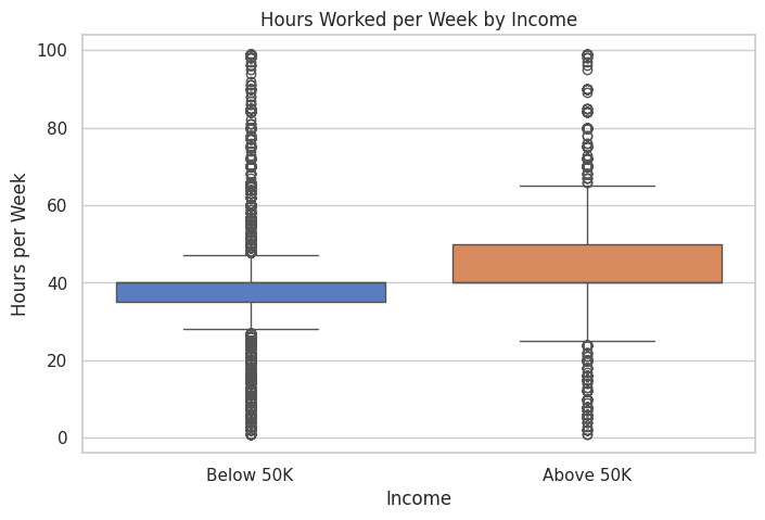
Observations:
- Median Hours Worked:
- People earning Above 50K tend to work more hours per week, as their median is higher than those earning Below 50K.
- Median for “Below 50K” is around 40 hours, while for “Above 50K,” it appears slightly higher, closer to 45 hours.
- Interquartile Range (IQR):
- Below 50K: The IQR is narrower, indicating less variability in hours worked.
- Above 50K: The IQR is wider, suggesting more variation in hours worked among higher earners.
- Whiskers:
- Below 50K: The range extends to both low and high hours, with more lower-hour outliers.
- Above 50K: The range shows fewer people working very low hours, but there are many high-hour workers (close to 60–80 hours).
- Outliers:
- Both groups have outliers beyond the whiskers, indicating individuals working extremely high or low hours.
- There are more outliers for people working fewer hours in the “Below 50K” group.
- Key Insights:
- Those earning “Above 50K” tend to work longer hours, with a wider range of hours, suggesting a potential link between working hours and income.
- Many individuals working 40 hours appear in both groups, reflecting that working standard hours does not necessarily correlate with higher income.