
The dataset created by Slidescope is a Digital Marketing Analytics dataset designed to support dynamic Excel reports, Power BI Dashboards, Tableau Dashboards or Looker Studio Reports for marketing performance analysis. Here’s a detailed breakdown of its structure and contents:
Columns in the Dataset
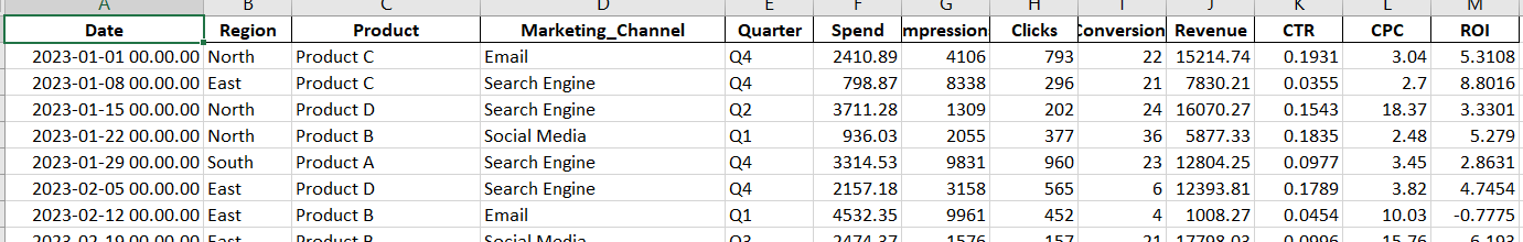
- Date:
Weekly dates starting from January 1, 2023, to represent when the marketing activities took place. - Region:
The geographical area where the marketing efforts were focused. Possible values:- North
- South
- East
- West
- Product:
The product being marketed. Possible values:- Product A
- Product B
- Product C
- Product D
- Marketing_Channel:
The channel used for marketing campaigns. Possible values:- Social Media
- Search Engine
- Direct Mail
- Quarter:
Indicates the quarter of the year in which the marketing activities occurred. Possible values:- Q1
- Q2
- Q3
- Q4
- Spend:
The amount spent on marketing activities (in USD). Randomly generated between $500 and $5,000. - Impressions:
The number of people who saw the marketing content. Randomly generated between 1,000 and 10,000. - Clicks:
The number of people who clicked on the marketing content. Randomly generated between 100 and 1,000. - Conversions:
The number of successful outcomes (e.g., purchases, sign-ups) achieved. Randomly generated between 1 and 50. - Revenue:
The revenue generated from marketing activities (in USD). Randomly generated between $1,000 and $20,000.
Derived Metrics (Calculated Columns)
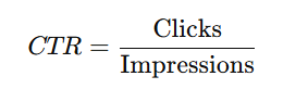
- CTR (Click-Through Rate):
The ratio of clicks to impressions, calculated as:
- CPC (Cost Per Click):
The cost of each click, calculated as:

- It measures the cost-efficiency of marketing campaigns.
- ROI (Return on Investment):
The return on investment for marketing efforts, calculated as:
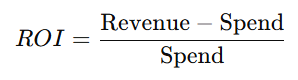
- A positive ROI indicates profitability, while a negative ROI shows a loss.
Potential Use Cases for Analysis
- Campaign Effectiveness:
Use CTR, CPC, and ROI to evaluate the success of different marketing channels and campaigns. - Regional Performance:
Analyze how products perform across different regions to optimize regional marketing strategies. - Quarterly Trends:
Identify seasonal patterns by observing changes in metrics across quarters. - Product Insights:
Assess which products generate the highest revenue or have the best ROI across various channels. - Channel Comparison:
Compare the performance of channels like Social Media, Email, and Search Engine to determine the most effective platform for marketing.
Why This Dataset Is Useful
This dataset simulates real-world marketing scenarios and provides a wide range of metrics to analyze. It is well-suited for:
- Data visualization in Excel, Power BI, or Tableau.
- Marketing campaign optimization.
- Exploratory data analysis for business insights.
- Training machine learning models for marketing predictions.
Marketing Performance Analysis Dashboard Ideas
Creating a Power BI dashboard for this Marketing Campaign Performance Dataset can provide valuable insights into marketing performance across various dimensions. Here’s a suggested structure for the dashboard:
Dashboard Name
“Marketing Performance Analytics Dashboard”
Sections and Visualizations
1. Campaign Overview (Summary Cards)
Display KPIs using cards for quick insights:
- Total Spend: Sum of Spend across all campaigns.
- Total Revenue: Sum of Revenue across all campaigns.
- Average ROI (%): Average ROI across campaigns.
- Total Conversions: Sum of Conversions.
- CTR (%): Average CTR across all campaigns.
- CPC: Average Cost Per Click.
2. Spend vs Revenue Analysis
- Visualization: Clustered column chart or waterfall chart.
- X-Axis: Marketing Channels or Products.
- Y-Axis: Compare Spend and Revenue side by side.
- Add a line for ROI (%) to highlight profitability per channel or product.
3. Channel Performance
- Visualization: Pie chart or donut chart.
- Breakdown: Spend, Conversions, or Revenue by Marketing Channel.
- Add tooltips to display key metrics (CTR, CPC, and ROI) per channel.
4. Regional Insights
- Visualization: Map visualization.
- Data: Display Revenue, Conversions, or Spend by Region.
- Use color gradients to represent performance (e.g., dark green for high revenue, red for low revenue).
5. Quarterly Trends
- Visualization: Line chart.
- X-Axis: Date (or Quarters).
- Y-Axis: Metrics such as Spend, Revenue, Conversions, or CTR.
- Filter by Region, Product, or Marketing Channel to analyze seasonal trends.
6. Product Performance
- Visualization: Treemap or bar chart.
- Breakdown: Revenue or Conversions by Product.
- Include a filter for Region or Quarter to narrow insights.
7. ROI and Profitability
- Visualization: Heatmap or matrix.
- Rows: Products or Marketing Channels.
- Columns: Quarters or Regions.
- Values: Display ROI (%) or Revenue to identify high-performing segments.
8. Clicks, Impressions, and CTR
- Visualization: Stacked bar chart or line and clustered column chart.
- X-Axis: Marketing Channels or Products.
- Y-Axis: Clicks and Impressions.
- Add a line for CTR (%) to assess engagement levels.
9. Filters (Slicers)
Add interactive slicers for:
- Date Range (Timeline slicer)
- Region
- Product
- Marketing Channel
- Quarter
- ROI Range (Numeric range slicer)
These slicers allow users to drill down into specific segments or campaigns.
Advanced Features (Optional)
- Drill-through Pages:
- Create drill-through pages to analyze specific channels, products, or regions in detail.
- Custom Tooltips:
- Add dynamic tooltips showing ROI, CPC, and CTR on hover for charts.
- KPIs with Conditional Formatting:
- Highlight positive ROI in green and negative ROI in red.
- What-If Analysis:
- Add a slider for “Projected Spend” to calculate and visualize the potential impact on revenue and conversions.
This dashboard provides a comprehensive view of marketing campaign performance, enabling stakeholders to track ROI, optimize budgets, and identify opportunities for improvement.